
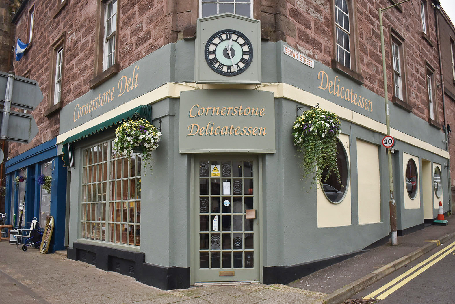
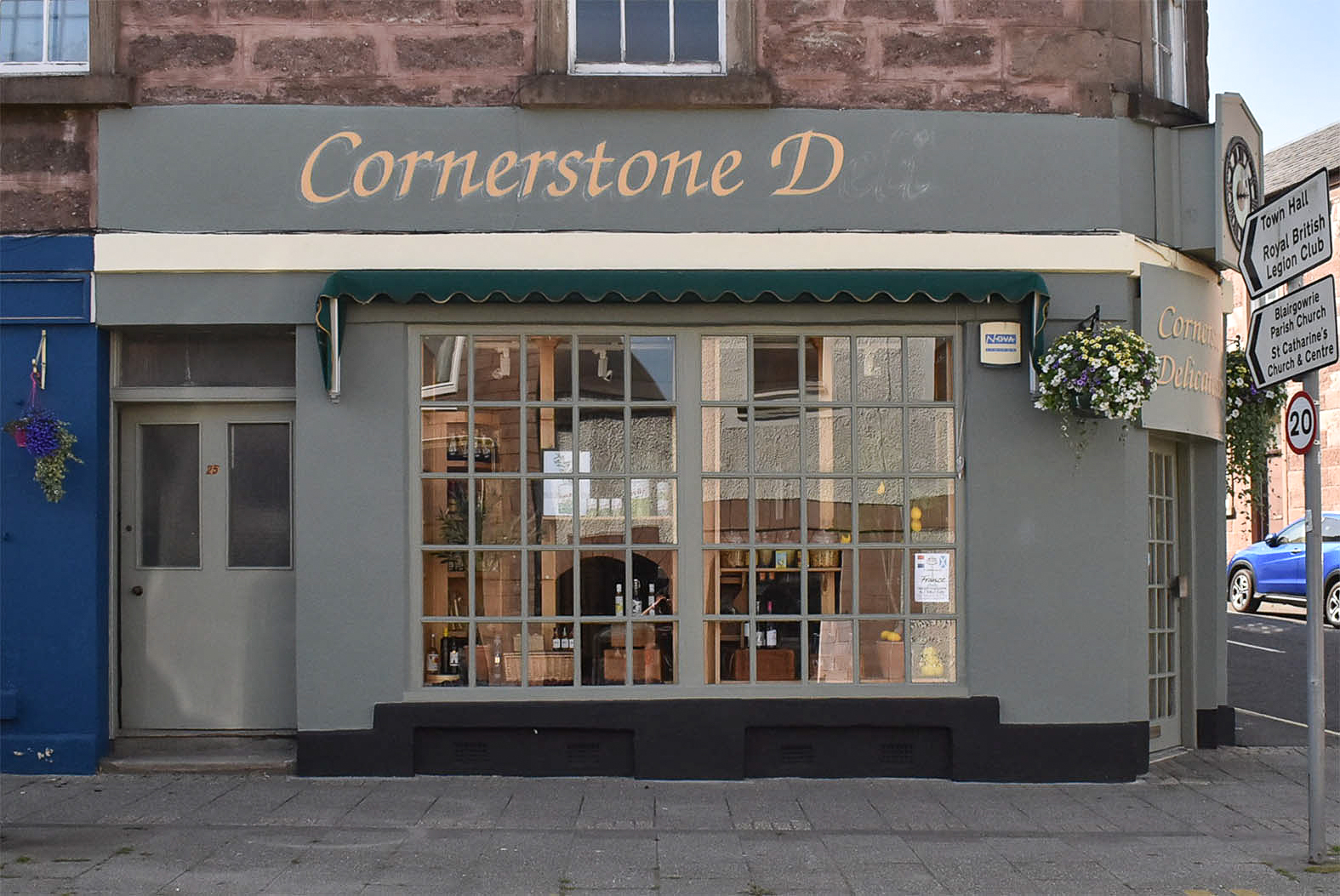
Adjustments to previous lettering design before signwriting Blairgowrie’s Cornerstone Deli produced clearer signs. More space between letters, reduced effects, and stronger colour contrast increased impact and made the words easier to read.
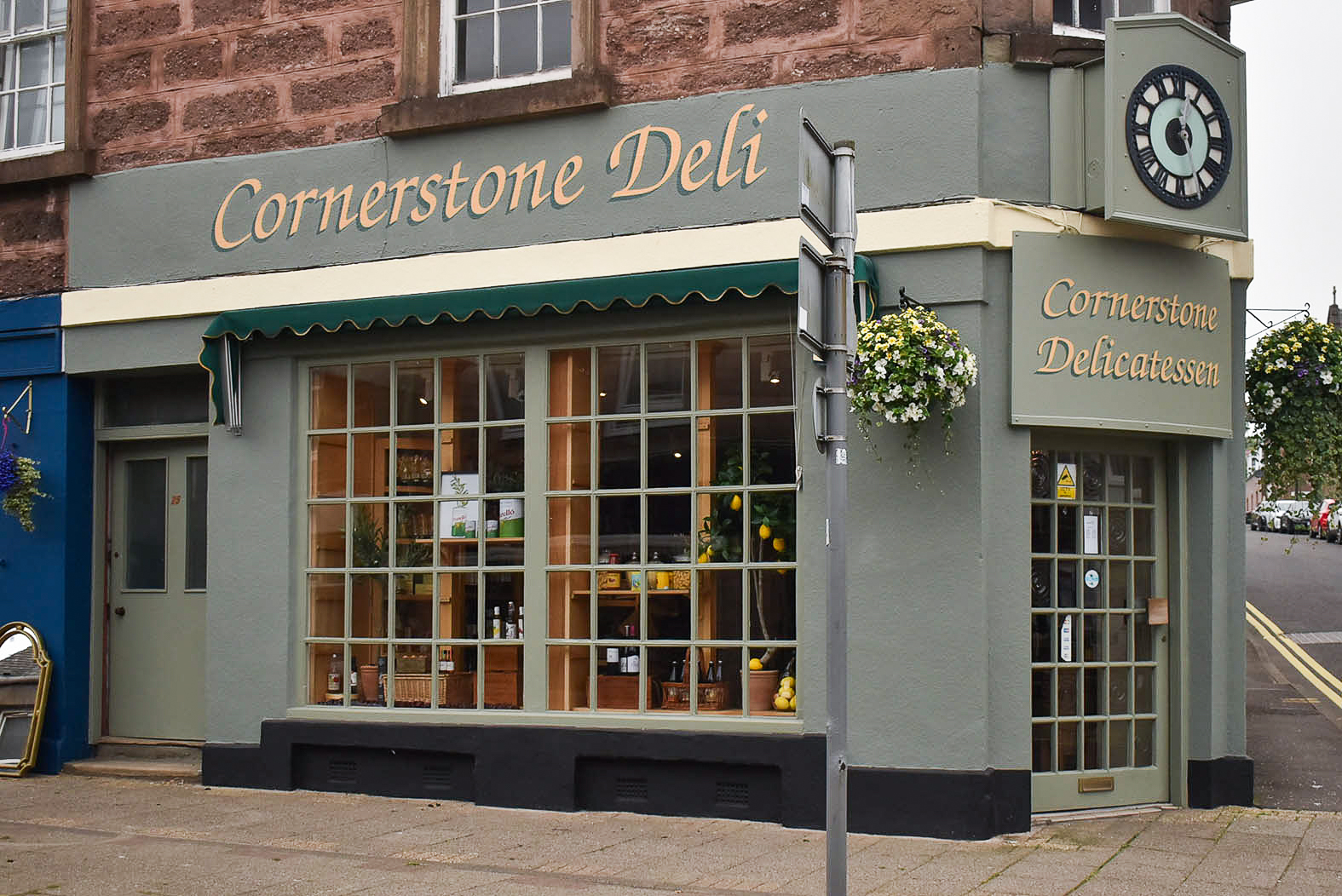
In spring 2026, a signmaker in (neighbouring city) Perth recommended me for signwriting Cornerstone Delicatessen in Blairgowrie, Perthshire – around twenty miles from my base in Dundee.
Kathy and Martin own and operate the deli. They were planning a full repaint of their traditional shopfront. Martin emailed to ask if I’d be interested in providing my quote for replacing hand painted lettering on two fascias. I phoned Martin and asked for a brief description of the deli’s signs, as well as shopfront photos and his expected timeline.
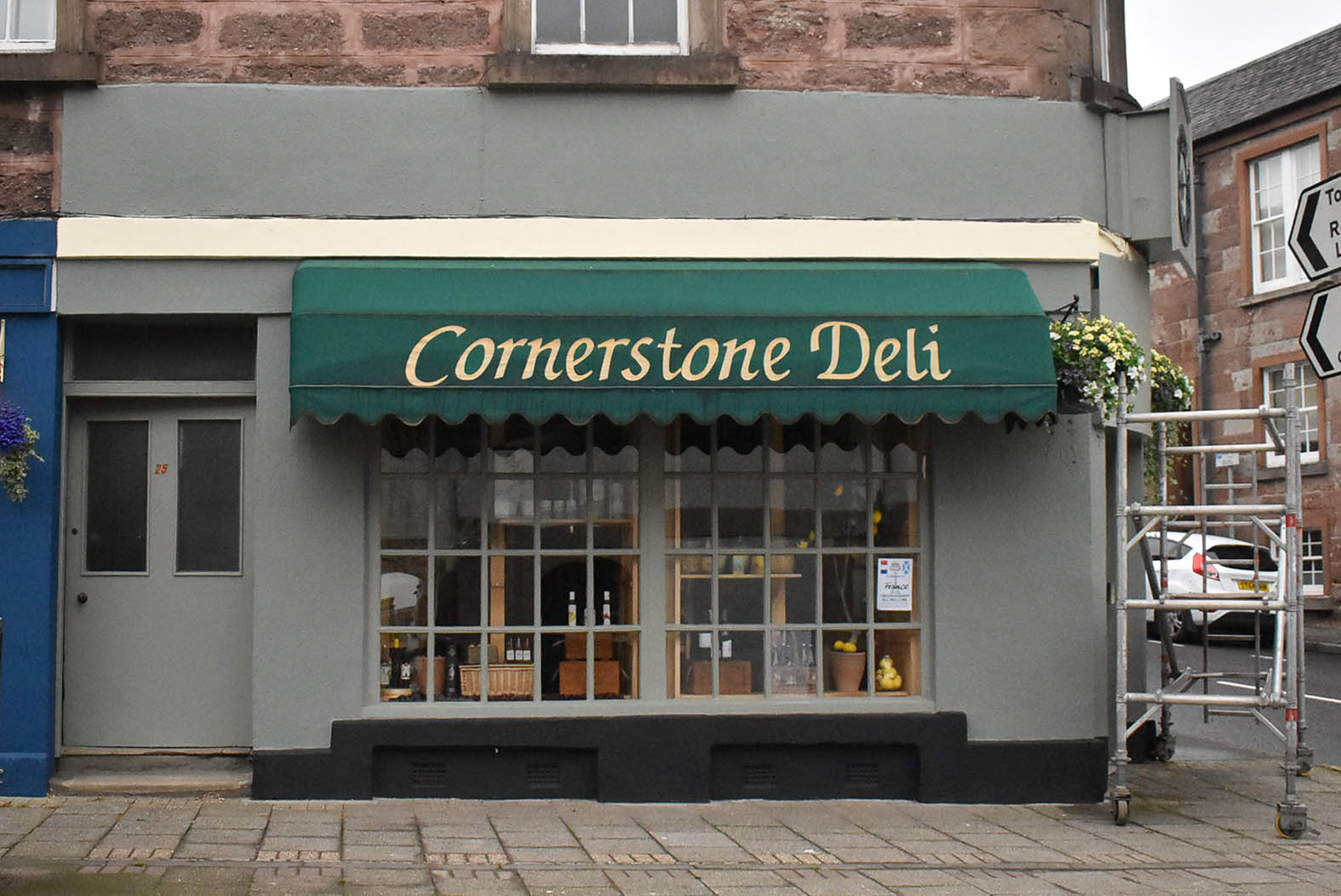
On receipt of Martin’s shopfront photos, I immediately recognised the modern classic font, Zapf Chancery.
Hermann Zapf (1918 – 2015) was a skilled calligrapher and type design pioneer. I’ve admired and studied his letterforms for over twenty years. Zapf created influential typefaces during his decades long, cross-Atlantic career. Zapf Chancery became ubiquitous. It’s often misused.
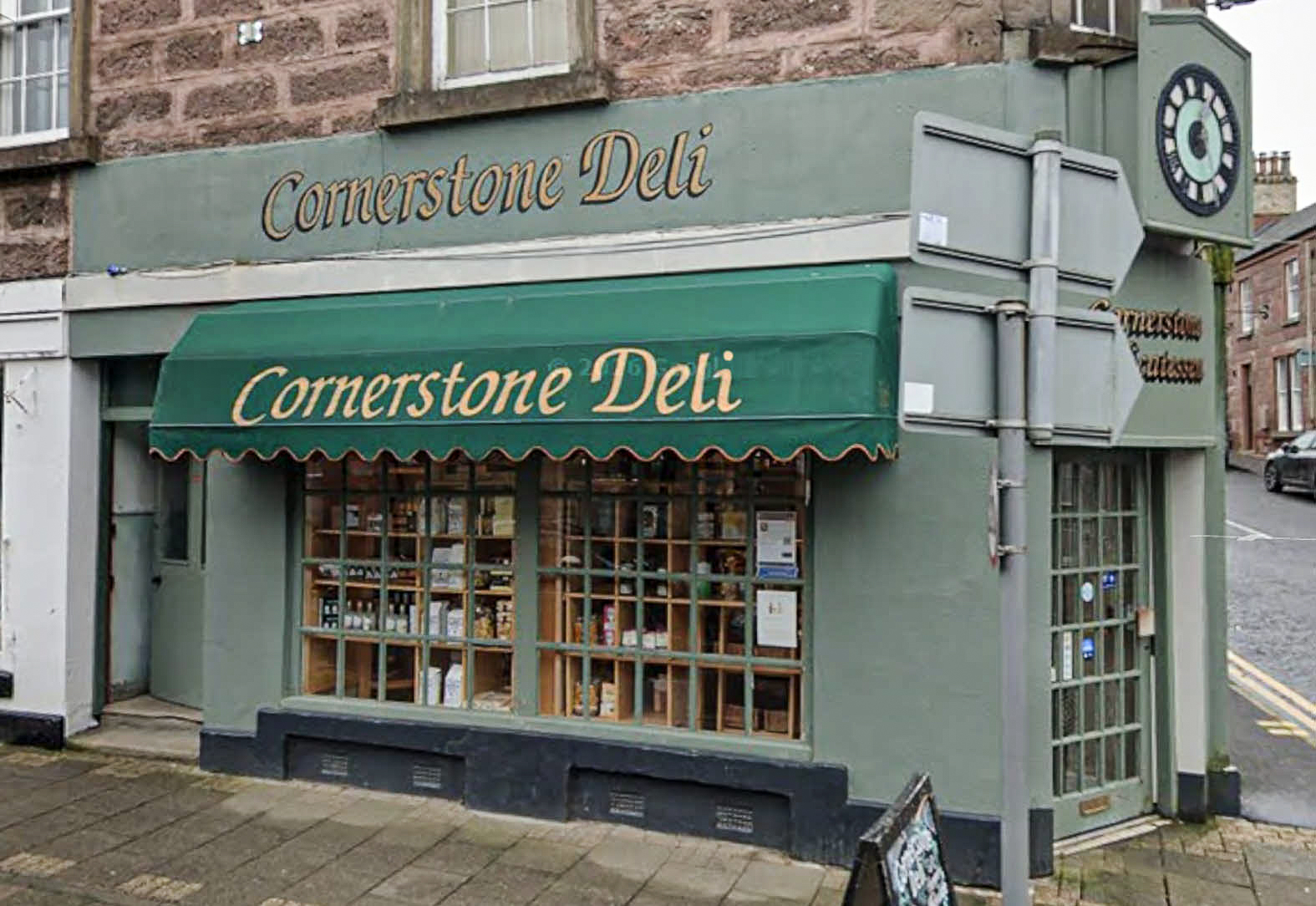
On both fascias of the deli, sadly, Zapf’s technically beautiful font displayed irregular, unparallel strokes. On the baseline, bottoms of curved letters were unlevel. Tight spacing inside and around each letter, as well as the expanse of the fascias made the words appear squashed.
Flat, faded gold lettering was difficult to distinguish on the sage green surface. A combined black outline and shadow overcomplicated the italics and hindered legibility.
Above the entrance, a curved panel displayed a replica of the fascia signwriting with an overly deep drop shadow. The entrance sign lettering was applied in vinyl. The vinyl’s finish didn’t match the fascia lettering.
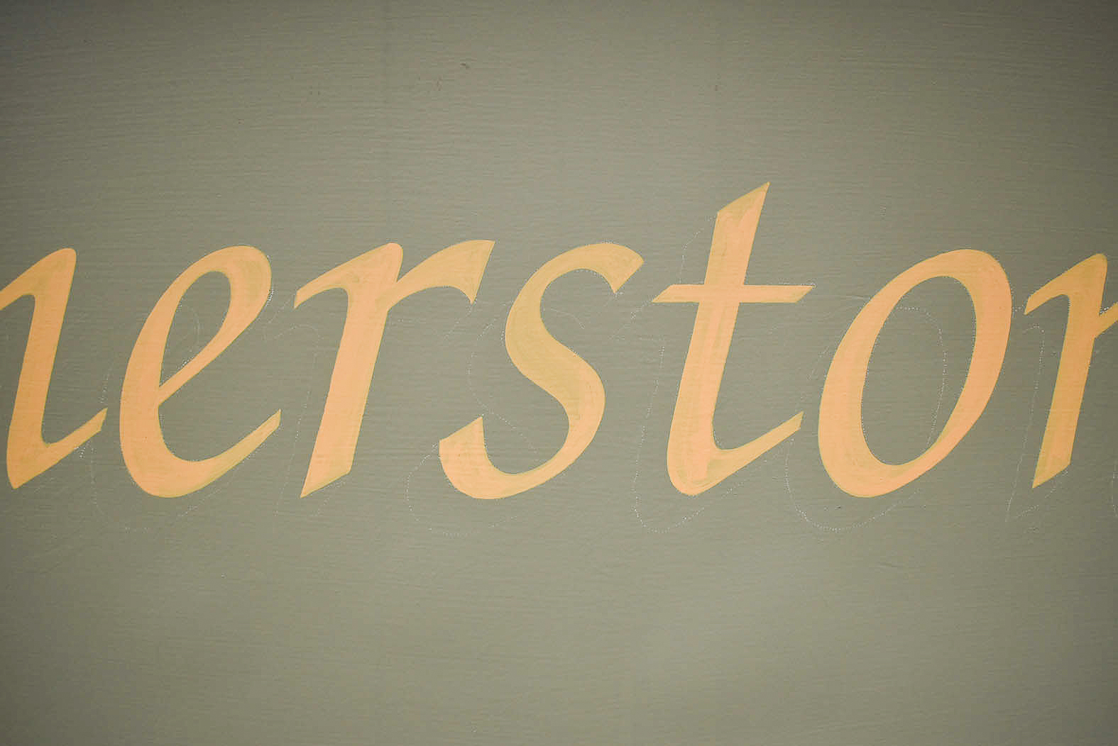
Zapf Chancery is modelled on cursive handwriting. Some lower case characters in the italic typeface possess upward flicks resulting in an almost conjoined script. Flourishes appear on some upper case characters. As such, pairing characters can prove challenging when formatting the type. Knowing where to position letters in relation to words they’re contained within balances pockets of negative space.
In the case of meticulously constructed Zapf Chancery, thick downward strokes are connected to thin upward strokes, including intentional negative space. Outlines add weight to strokes. In turn, thickening of thin strokes decreases necessary negative space, making letters more difficult to comprehend. Legibility is compromised.
On 3rd May 2026, I replied to Martin and asked questions relating to the placement of the signs as well as scaffolding access around the shopfront. I recommended simplifying the lettering design by removing the outline. I also suggested an alternative, brighter colour.
Although I could replace the vinyl lettering on the curved panel above the entrance, I offered to hand letter the sign. Doing so would ensure all shopfront lettering is unified with the same colour and finish.
Martin replied with answers, then a colour chart and said both he and Kathy looked forward to my proposal.
I was happy to show Martin options of how I’d reinstate the three signs.
On my signmaking software, I typed each sign’s words before formatting with attention to letter spacing and mindful of the drop shadow. I chose a rich buttercream colour for the letters before adding a more realistic and consistent depth of shadow behind each word. The shadow was coloured a darker shade of the sage green background to mimic natural light. Just enough to contrast and differentiate between lettering and background.
Each reformatted sign design was superimposed on Martin’s shopfront photos before attaching in my emailed proposal.
I explained to Martin why I wouldn’t try to mimic the existing lettering’s metallic gold on digital artwork mockups. I also wasn’t convinced the metallic gold would produce enough contrast for legibility at all light angles on the sage green background. If Martin chose to proceed, I’d visit and show him signwriting paint samples.
Ten days passed before Martin replied. We scheduled a call to discuss scaffold access and my process before agreeing to meet on 19th May.
On arrival at Cornerstone Deli, I realised the surface of each fascia is almost roughcast. Due to experience painting smooth edges on rough surfaces, I sensed Cornerstone Deli’s signwriting would entail more time than I’d anticipated.
Martin had arranged a painted sample panel which I daubed with my recommended matt finish buttercream in addition to metallic gold enamel I often use. The sage green shopfront would be coated with water based paint, and I explained I’d mix my recommended shade with oil based enamels.
On 21st May, I emailed my itemised quote for two differing lettering designs. The first option replicated the original gold and black signwriting, including my spacing adjustments. The second option was my recommended buttercream revision with the shadow only. I also included details for street pavement working permits issued by Perth and Kinross Council.
On 25th May, Martin approved my quote and explained that Kathy was pleased with my recommendation.
We initially planned mid June for signwriting to begin, depending on the progress of the shopfront painting.
Martin and I kept in touch. Over the following weeks, I made scaled patterns for transferring the lettering. By early July, the painters had completed the shopfront.
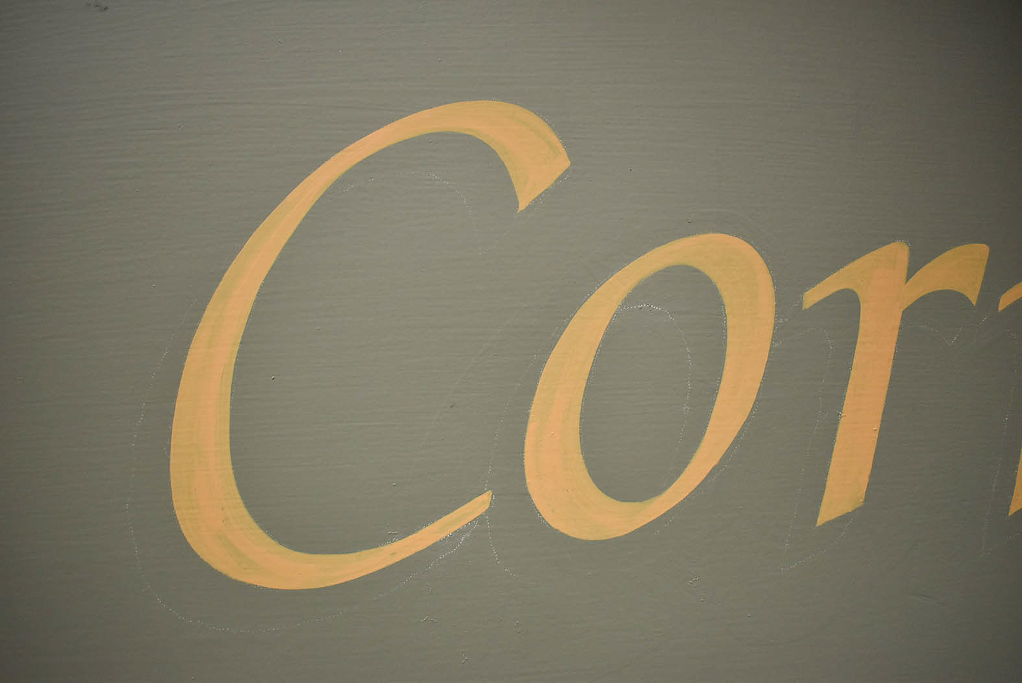
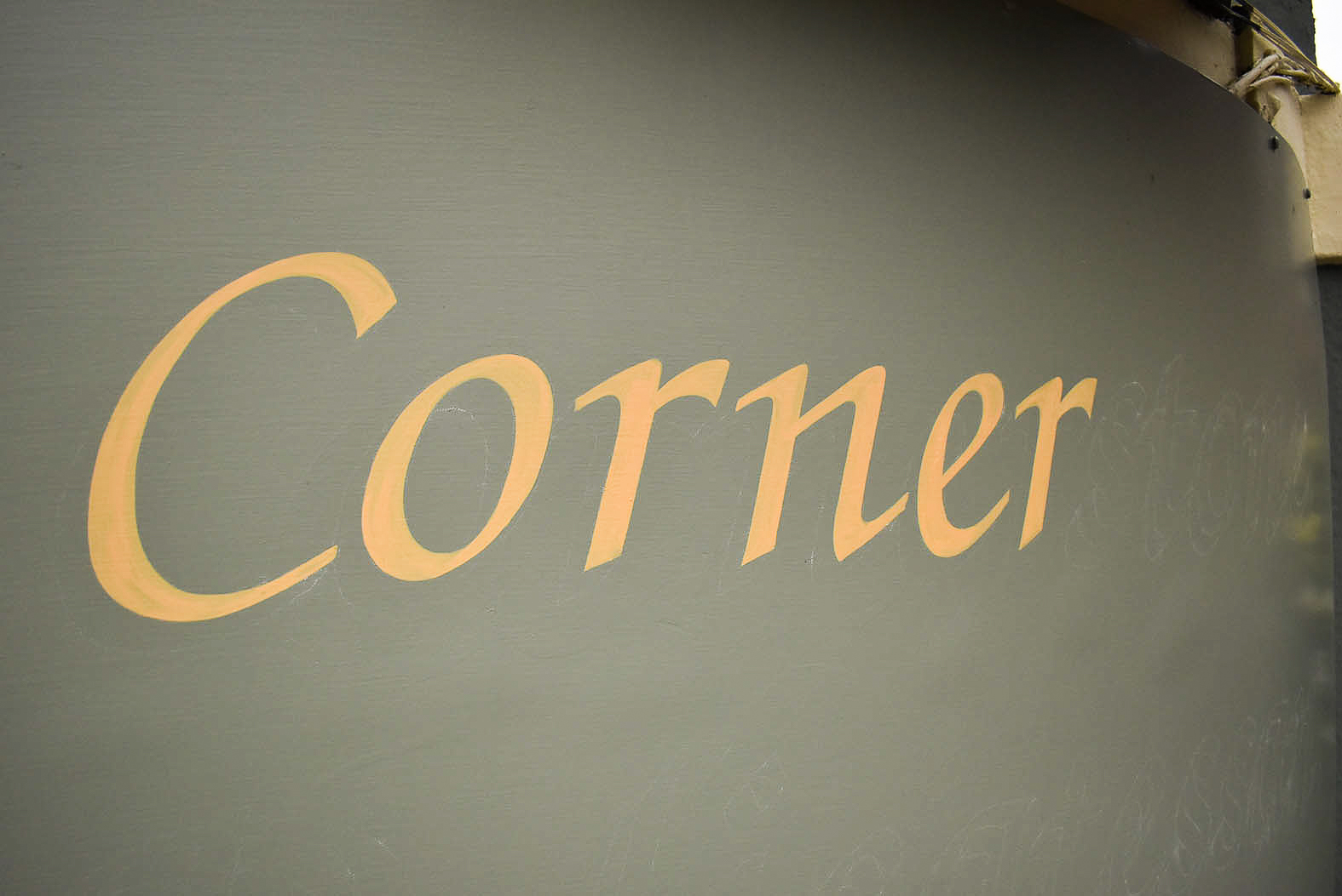
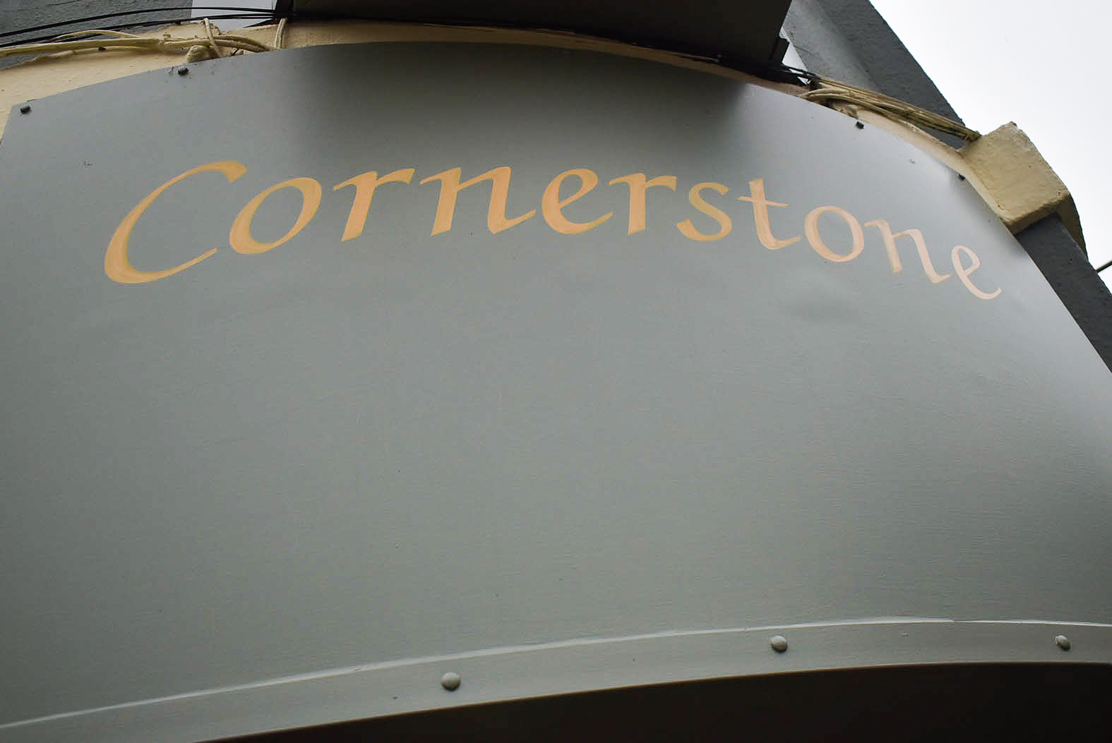
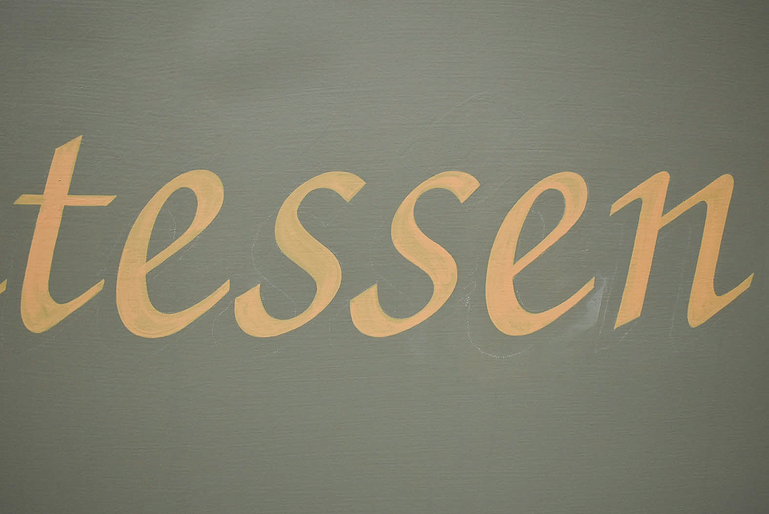
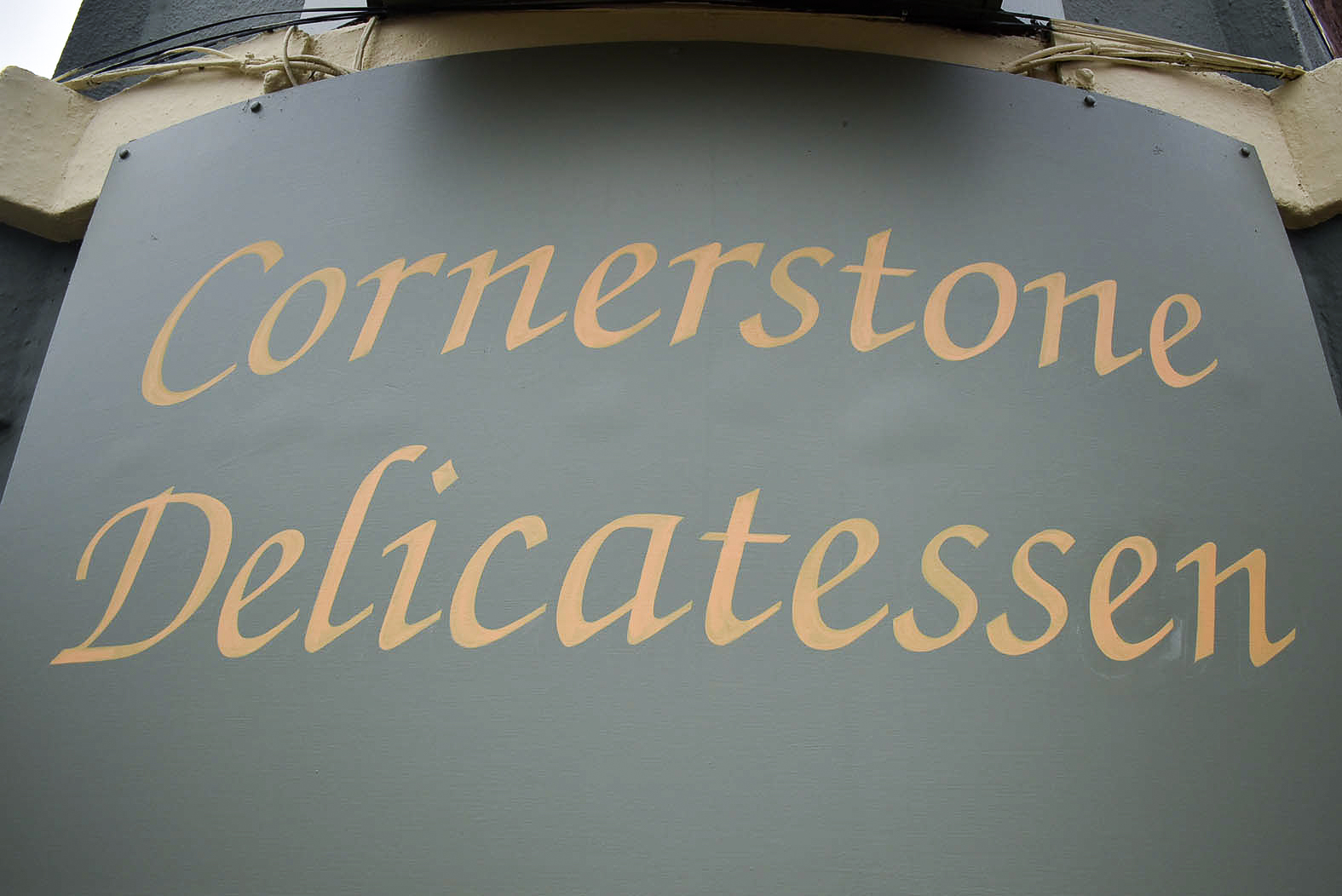
I drove to Blairgowrie early on Sunday 12th July. Hand lettering the sign above the door was tackled first as the deli is closed on Sundays and Mondays.
Working atop two differing heights of stepladders on the cornered, uneven pavement, I tacked my scaled drawing onto the curved panel. After repositioning, I was pleased with the placement and pounced through the paper.
With my trusty Kafka number two lettering brush, I steadily hand lettered the ‘C’. Balancing on the awkward corner, I continued painting each letter carefully. Pausing every so often, I leant back to check widths and spaces of each stroke were accurate and parallel. I was enjoying myself.
Two coats of the buttercream colour were painted on day one. By mid afternoon, I was satisfied with the solid lettering and headed back to Dundee. I then loaded my two scaffold towers into my van for the following four days’ work. Thereafter, I mixed enamels to make the colour for the shadow. A generous dollop of flattener was added to my mixture, which I hoped would turn my glossy enamel flat.
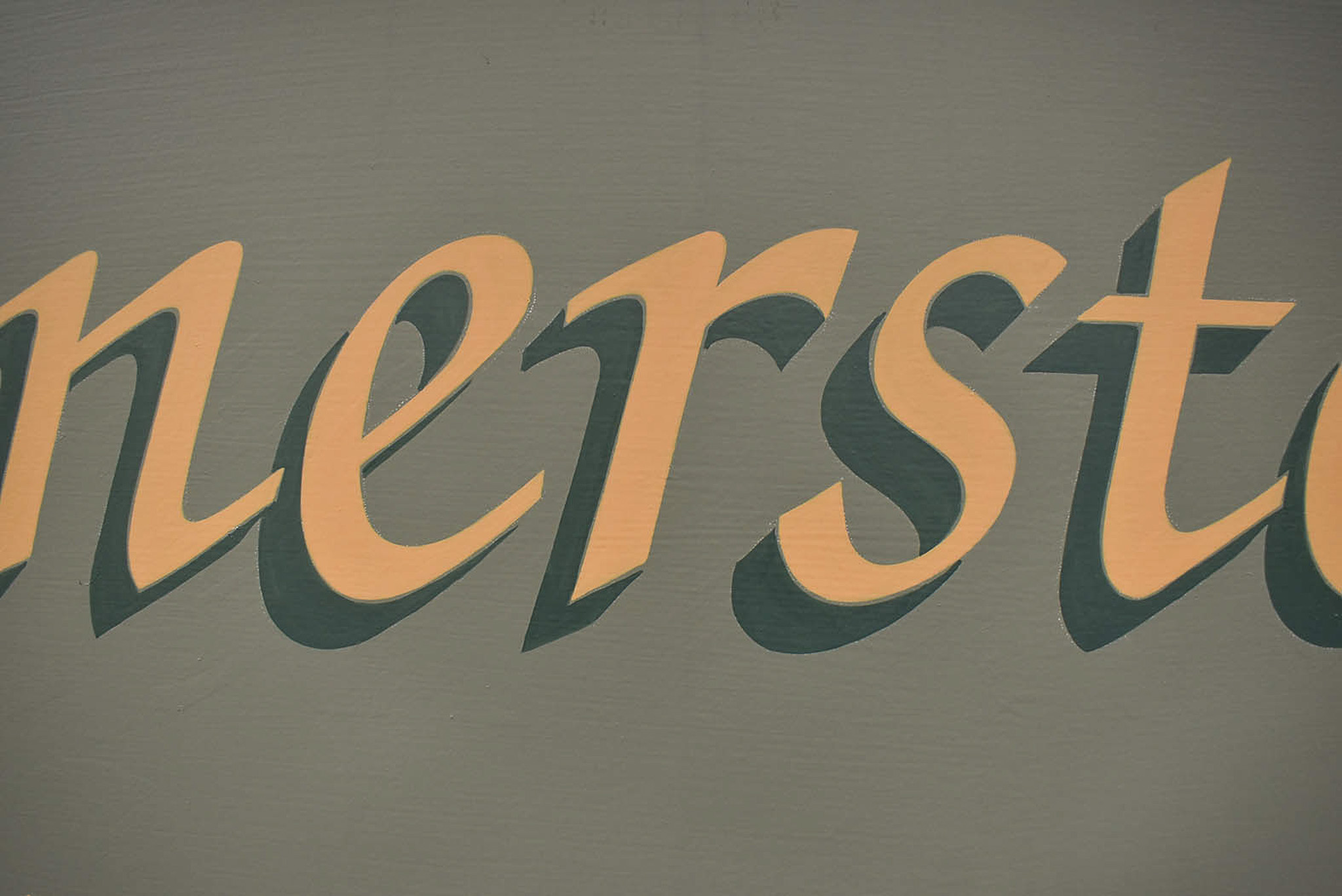
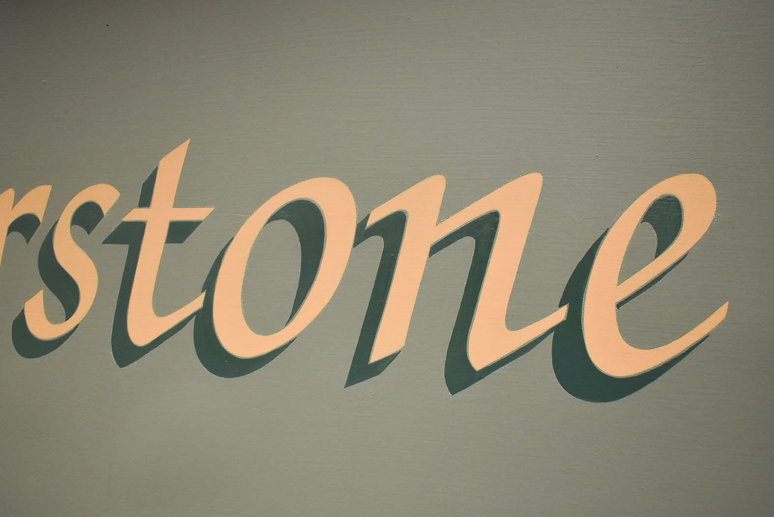
Nowadays, it’s uncommon for me to add effects to lettering. However, the original signwriting I was asked to reinstate contained a shadow. It certainly helps push the words off the sage green background.
But I was concerned with the quantity of shadow on the sign above the door. The strength of dark green behind the thinner stroke widths would potentially overpower the lettering. During the lettering design revision weeks before, I’d fussed over the shadow depth.
Monday’s signwriting started with carefully adding the shadow. Brush strokes coated parallel with the letters and sharp angled corners aided realism. To my delight, the mixed paint flowed wonderfully and dried to a pleasant matt finish.
The entrance sign was completed by late morning. It was time for lunch before building my scaffolding tower.
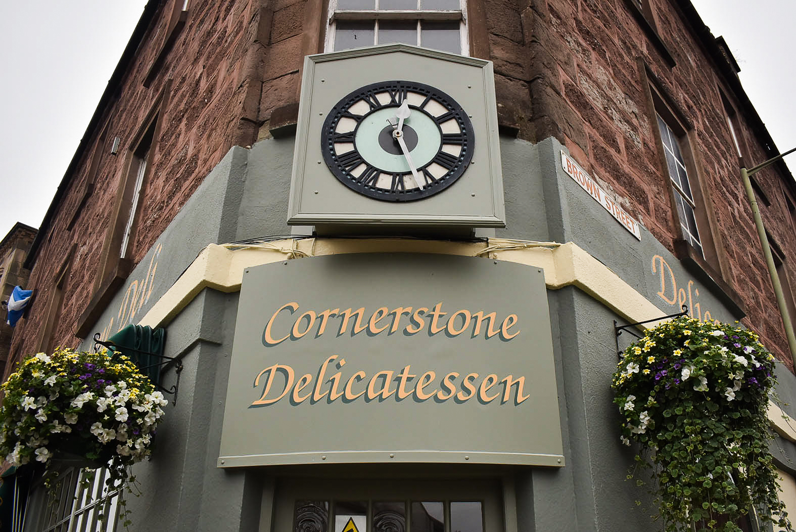
With the scaffold erect and traffic cones either side, my pounce pattern was unrolled and taped onto the High Street fascia. Following several climbs on and off my scaffold, I checked the lettering positioning from across the street. Assessing positioning of paper transfer patterns is crucial before painting. Space enables lettering to breathe. I dropped the pattern twenty millimetres before I was happy with the placement.
The upper case ‘C’ in Cornerstone dips below the following letters. It was important to think ahead and set the baseline of the High Street lettering at the same level I anticipated painting ‘Delicatessen’ around the corner on Brown Street.
It was early afternoon, and the sun was shining. I pounced most of the first sign onto the rough surface before moving my scaffold tower across to the right. After transferring the rest of the chalked skeleton ‘Deli’, it was time to cut in the first fascia lettering.
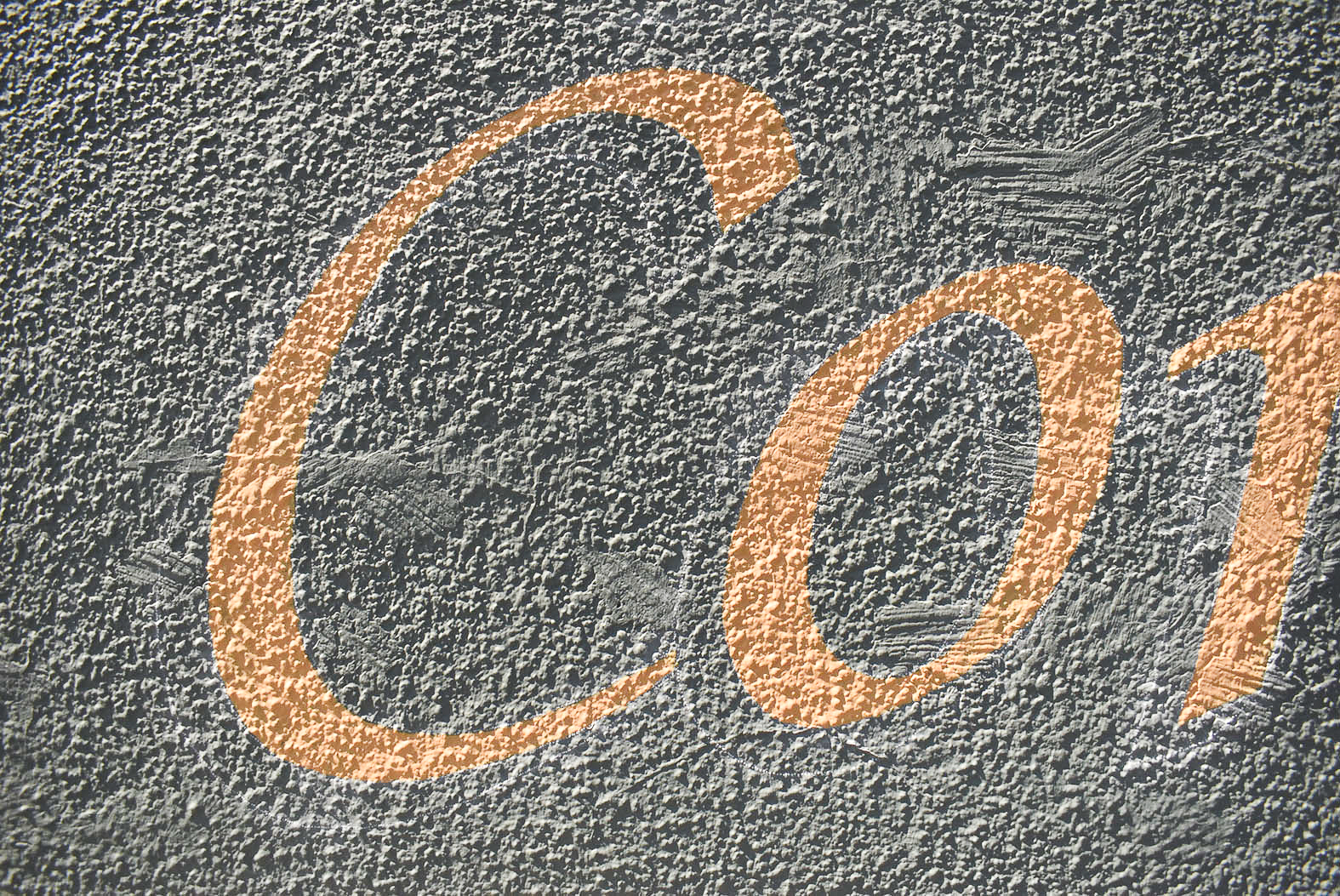

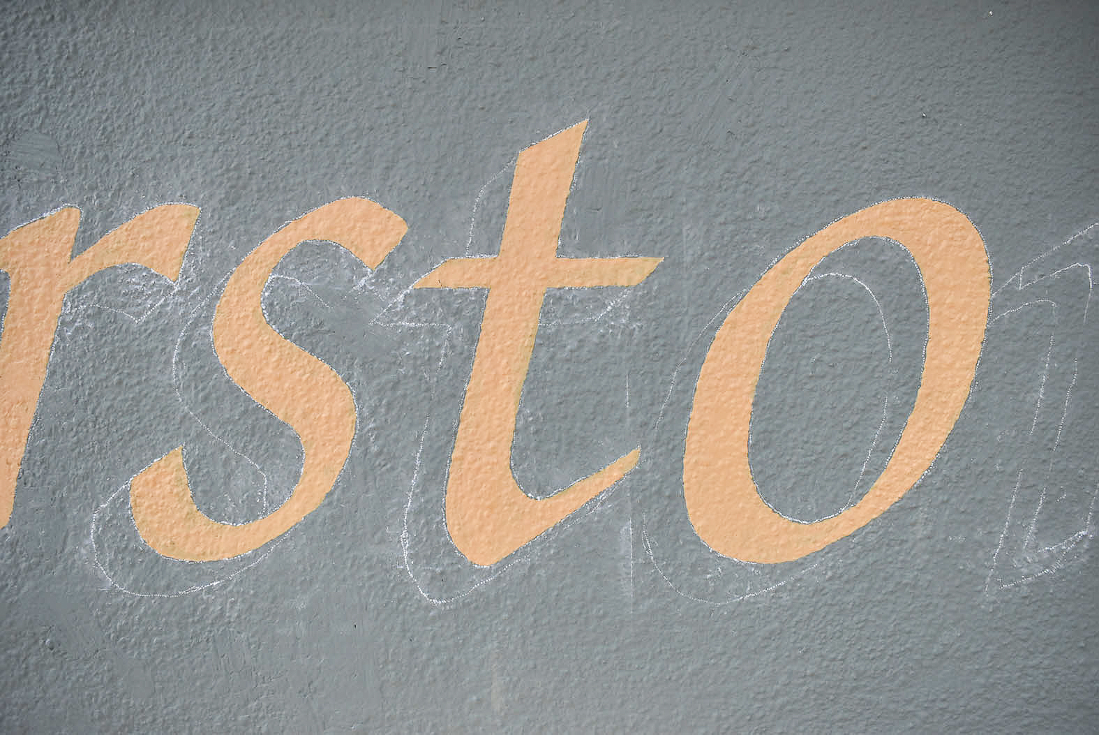
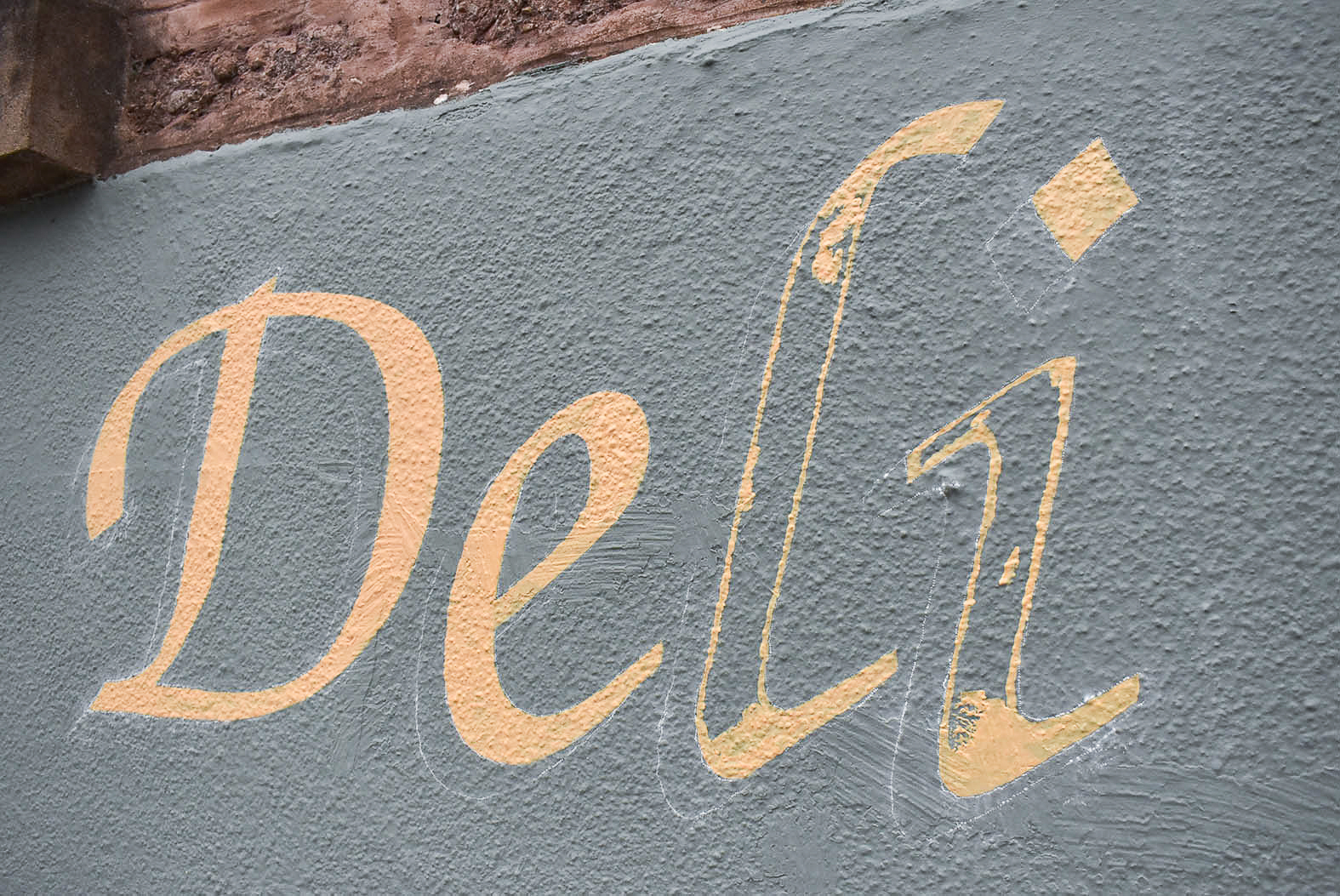
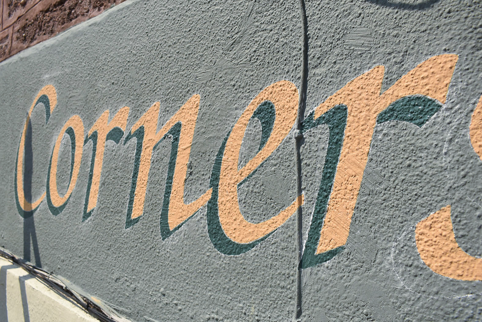
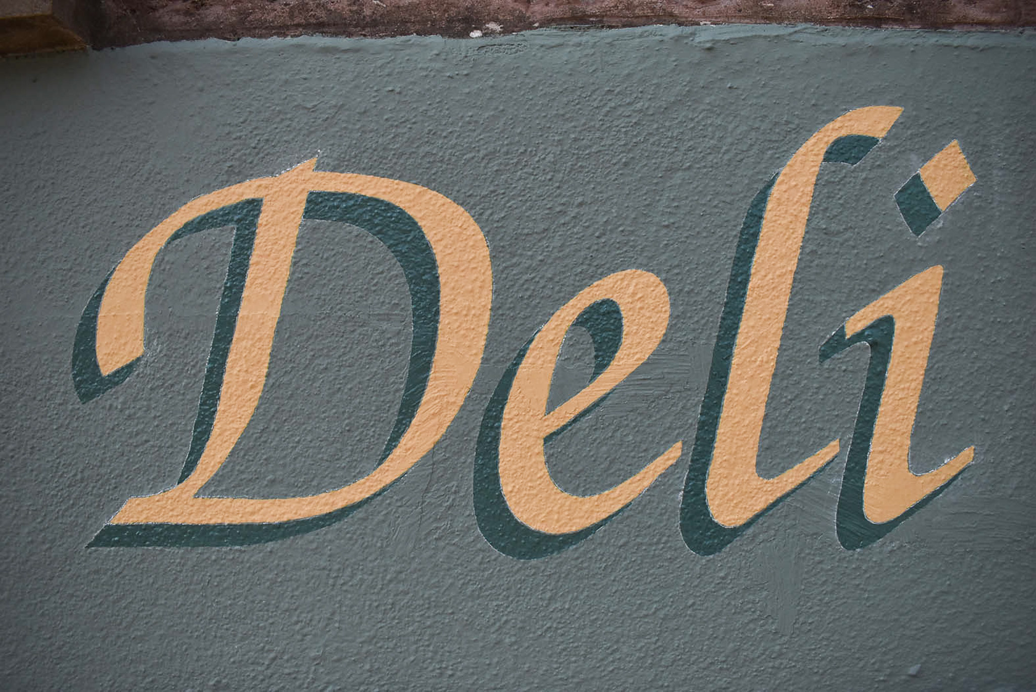
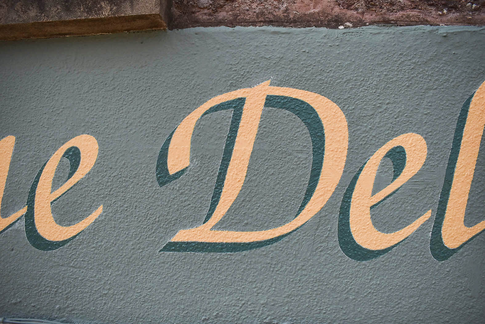
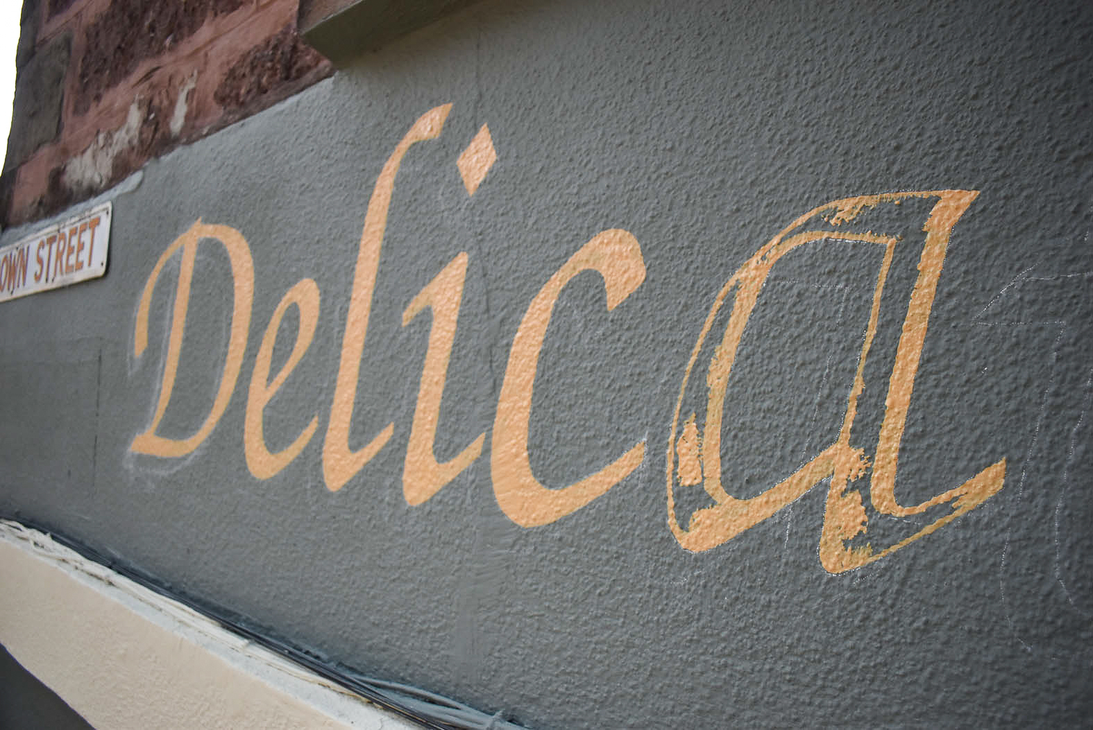
Progress was slow but accurate. The nobbly surface prevented long, swift strokes. My synthetic bristled brushes glided over raised areas and my hand angled back and forth to fill in all the nooks and crannies.
The paint required regular thinning. The temperature rose, and the matt finish enamel was setting on the east facing fascia. By 4pm on the second day, ‘Cornerstone D’ was first coated. With my confidence bolstered, I dismantled the scaffold and looked forward to the rest of the project.
Arriving early on Tuesday morning, I expected another scorcher. ‘Deli’ was completed by mid morning before second coating the rich buttercream. Second coating was quicker due to earlier accuracy.
Carefully, the shadow was added. Using two different widths of brushes to cut neatly behind acute angles, the shadow was satisfactorily solid after one coat. The fascia looked marvellous.

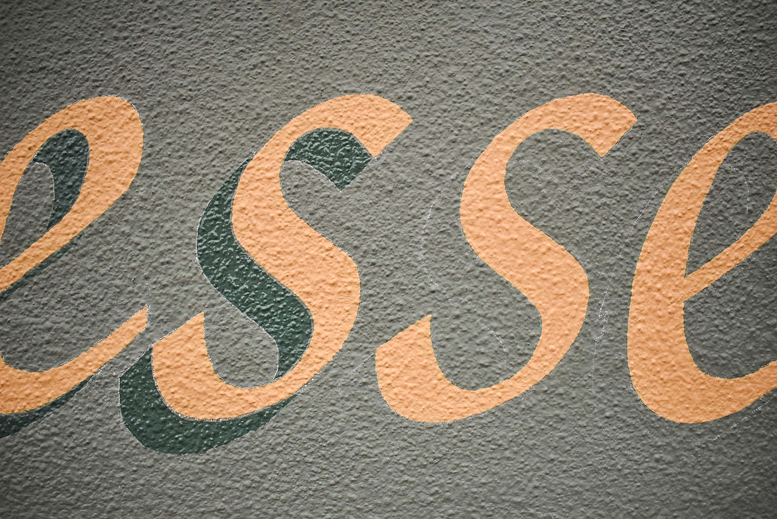
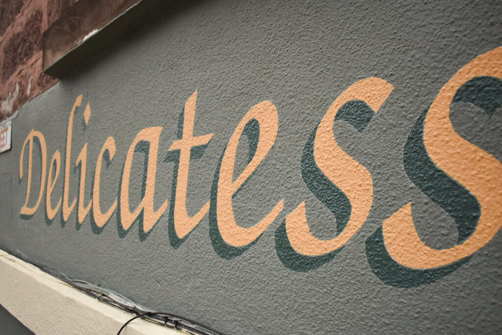
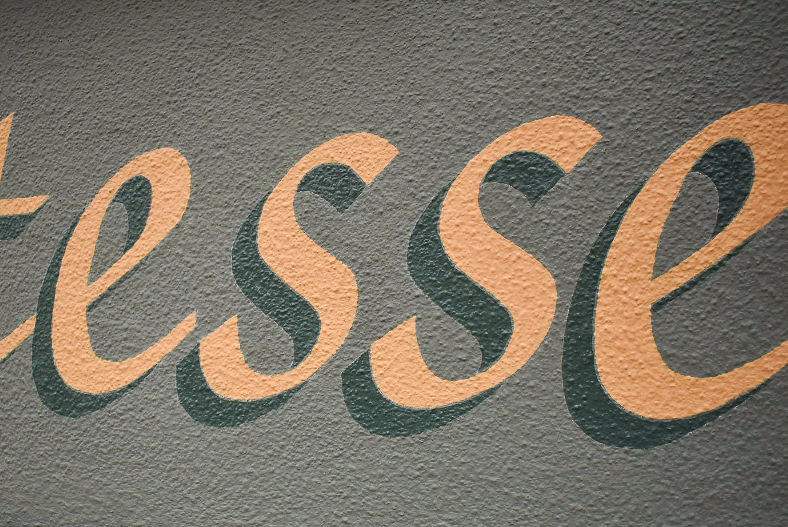
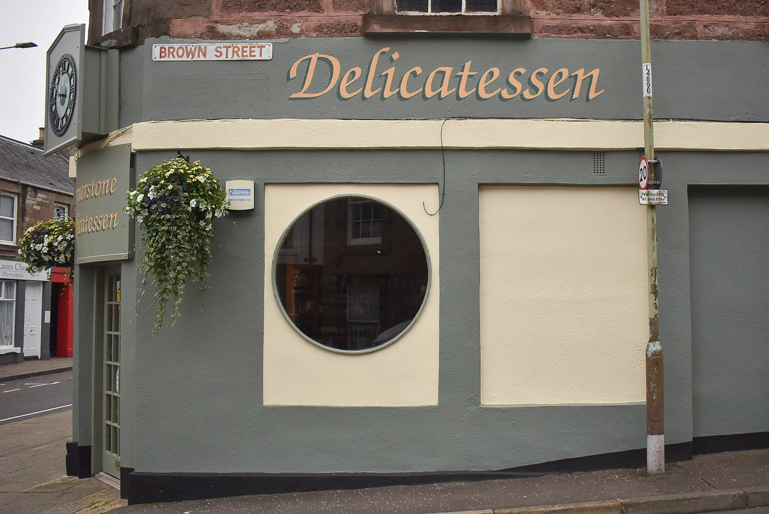
Day four brought fatigue. Logistics plus daily heavy lifting and climbing had tired me.
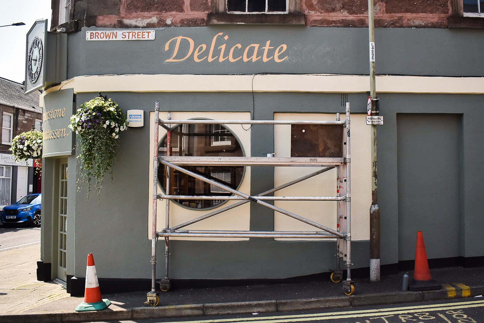
I built my scaffold on Brown Street’s steep pavement and adjusted the heights on the castors. Unfurling the pounce pattern on the second fascia proved to be an overstretch on the platform length. After nudging the scaffold back and forth, I stood on the ground and paid close attention to the lettering placement.
This was tricky. The street sign and lamp post added distractions, and the windowsill above the fascia was off centre with the two windows below. After some adjustments, the pattern was centralised over the windows and pounced.
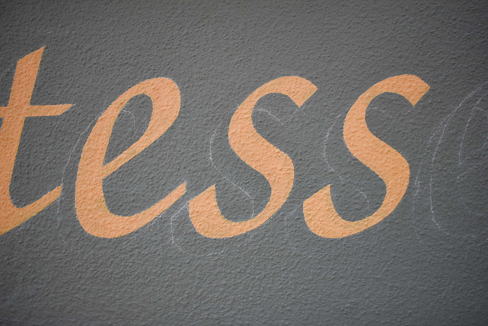
Hand painting lettering accurately requires concentration. Especially on rough walls. It’s easy to mistake where to turn and angle brush strokes to accomplish edges of skeleton letters. It’s also tempting to ad lib up close and at height. However, ignoring errors is risky and will present frustratingly noticeable bulges or wobbly lines when the signwriting is viewed from the ground.
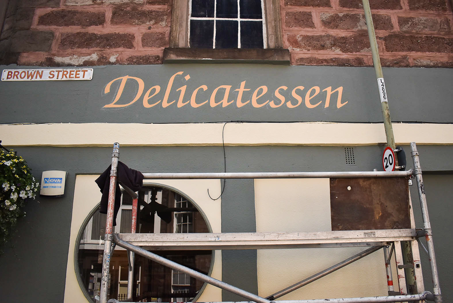
By late afternoon, ‘Delicatessen’ was coated twice and the lettering was solid. I was tired and happy. The final shadow could wait until the next day.
Arriving energised and early on Thursday morning, I built the scaffold for the final time. Casually, ‘Delicatessen’s shadow was filled in with generous lashes of paint. By this stage, my hand swiveling technique was primed, and I’d heightened admiration for Zapf Chancery.
Evidently, care and attention to detail during a shopfront refurbishment adds value to the business and the wider retail district. Kathy and Martin had received compliments throughout the week. Kathy explained that their customers recognised the effort and appreciated seeing signs hand painted.
Get in touch to discuss lettering design and signwriting for your shopfront.