
Professionally trained chef, Andy Dixon realised a gap in northeast Scotland’s mobile food van business. He also saw an opportunity to be his own boss and share his love of pizza.
Listening to Andy’s vision and learning of his investment in his one-of-a-kind pizza van convinced me to create a distinctive visual identity. Not just for Andy’s van but for everywhere The No Pineapple Pizza Project’s branding would appear.
My approach broadened Andy’s understanding of branding and communicated a mood which attracted his desired market.
Researching, designing, and implementing a visual identity proves much more effective than ‘just lettering on a van.’ It’s especially important for new public-facing businesses.
In February 2024, a fast-paced phone call with Andy built an image in my head.
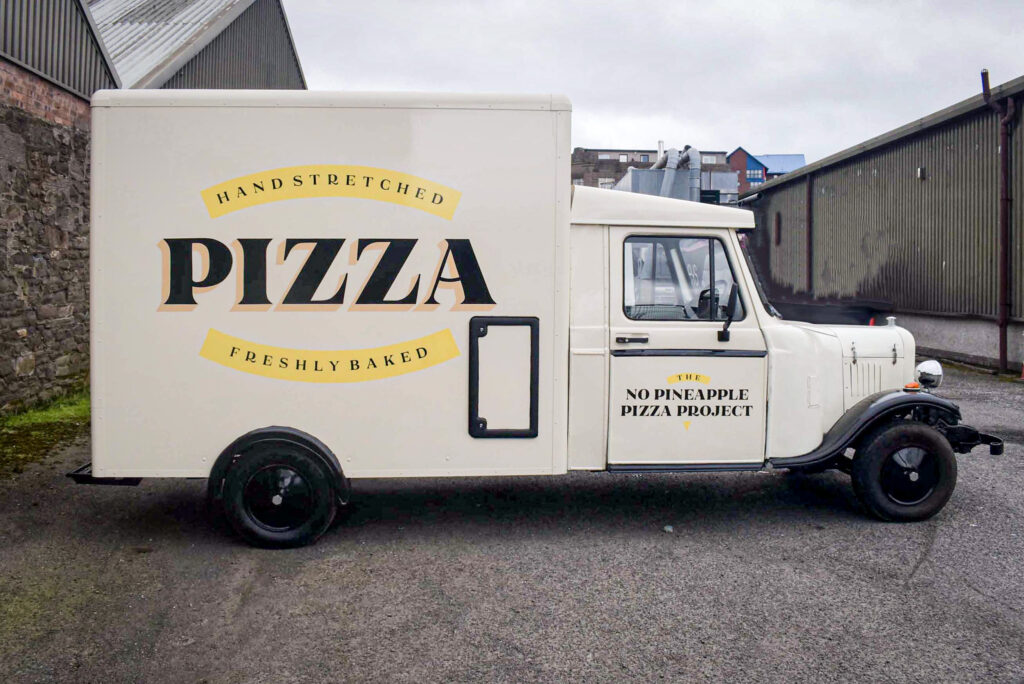
Andy’s modified LDV pick-up carries a state-of-the-art pizza kitchen. The cab is unusual, with 1920s vintage styling that easily turns heads. The identity had to relate to the cab’s era.
Andy’s menu and pricing reflect the category of clients he wants to attract.
His plan was to cater for special occasions such as weddings and exclusive parties. In addition, the van would visit social events at selected festivals and markets across the north of Scotland. Andy’s application for a street trader’s license was a frustratingly slow process and emphasized the importance of appealing to private hires.
My concept for the visual identity was beginning to take shape. Tapping into the persona of Andy’s desired clientele inspired me to design a livery which conveyed a warm, rounded character. A friendly, trusted chef.
‘I’ve received so many compliments about the signage at various events I’ve catered for,’ said Andy.
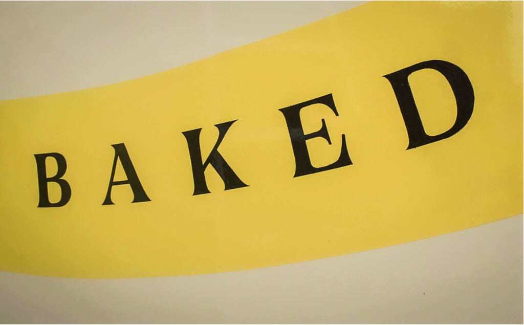
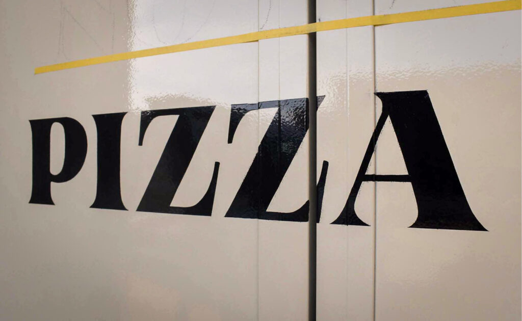
Andy wanted hand lettering. We both agreed signwriting would compliment the van’s aesthetic and appeal to his target market. The craft of accurately painted lettering suggests skill, mastery, and care – all aspects mirroring Andy’s professional demeanor.
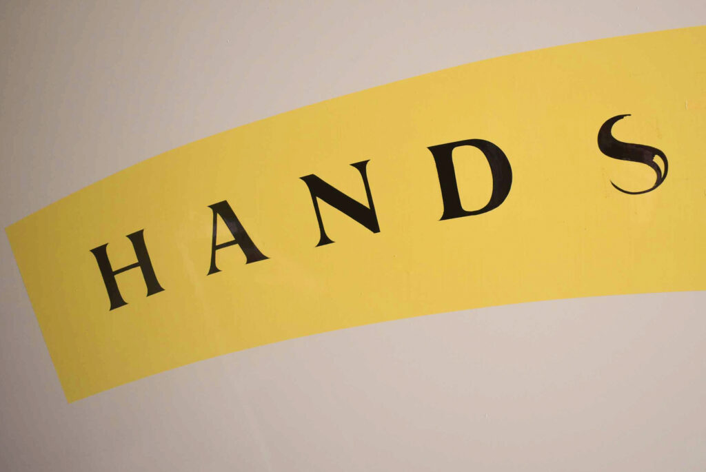
I focused my research on pizza company branding in North America. Paired with my impression of the Al Capone era, my thoughts guided me to choose a fat-faced letterform, circa 1900. The lettering also had to transmit the long but wonderful business name in small sizes.
I knew there’d be many touchpoints where not only the business name would appear, but elements of the visual identity. Menus, napkins, pizza boxes, aprons, and all the other stuff that should consistently communicate a business visually.
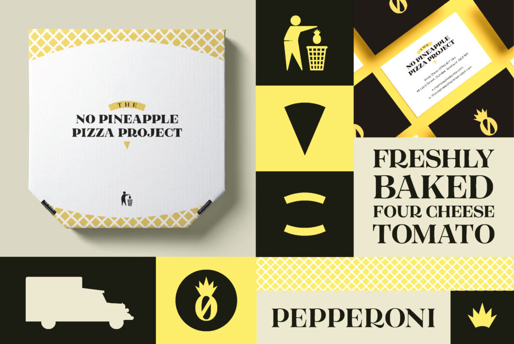
As such, I designed a visual identity system. This comprises of many visual elements with obvious relation in shape, form, and colour. Typography, logo, pattern, and texture all add to the familiarity necessary to connect everything together.
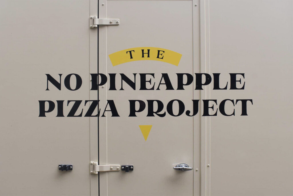
The logo design was borne for the necessity to encapsulate the word ‘THE’. I often suggest omitting the word ‘THE’ included before business names, but Andy was well into the formal process with his new enterprise. It had to stay.
The simple curved banner containing ‘THE’ reminded me of a pizza crust. I added a triangle below the words to complete the slice of pizza and create a logomark which could morph.
Shapes and portions dissected from the logomark add to the system, building a fuller suite of graphic assets. These can then be applied singularly to countless touchpoints, or paired with related elements to glue the identity together.
After presenting my design concept to Andy, he was blown away: ‘You’ve given the brand a unique identity which has surpassed my expectations.’
With Andy’s approval, we agreed on a date to begin lettering his van.
I’m blessed with a large network of regular clients I’ve known for years. One such organisation is Dundee Museum of Transport. I’d already mentioned DMofT to Andy as I thought they’d be interested in connecting with him to learn about his van modification.
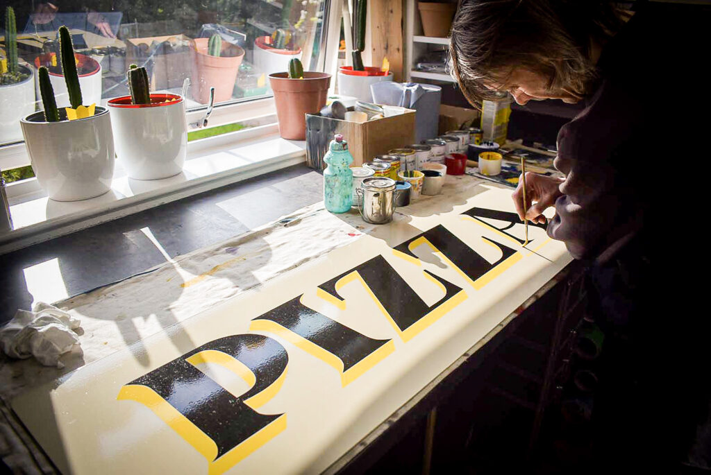
Former chair of DMofT, Peter Webber kindly allowed permission to store and work on Andys’ van at DMofT’s Seagate premises in Dundee city centre. The large space was ideal and a massive help for the five-day process of lettering the van.
With my scaled transfer patterns already made, I met Andy in the Seagate before measuring, taping, and first coating the yellow background shapes on the doors, rear, and cargo sides. Everything was painted with oil-based enamels and a second coat was necessary to make the yellow background banners opaque.
Accuracy in constructing letterforms is important to me. I respect my time designing letterforms, as well as those who have poured days into their typeface. I won’t rush hand lettering.
Over five consecutive days, the van gradually came to life. My dad, Brian, helped me with the cargo sides whilst I concentrated on the doors. As always, his speed with a brush is enviable.
It was long hours. My fingers were freezing white, with patches of black enamel. The rear web address and phone number were challenging me due to my four-day fatigue. But I was nearly there.
One more slice to go.
I completed the rear lettering early on a bank holiday Monday in May 2024. I then collected Andy and travelled back to the Seagate, excited to see his expression. He was delighted.
‘Again, thank you for the excellent job you’ve done with the van and your guidance in helping me with the brand.’ I’ve since learned of Andy’s growing popularity and success. His business has a visual foundation to build further awareness and strengthen his brand.
Looking for a distinctive visual identity for your brand? Get in touch and we’ll discuss.