
Nicholas and Damon contacted me for advice about signwriting in Fife’s coastal village of Crail. They own The Shoregate. A bar, restaurant, and hotel. I was recommended due to a previous hand lettering project at The Beehive Crail.
Their enquiry led me to The Shoregate website. Instantly captured, I read the story and admired the business plan. I was eager to learn more.
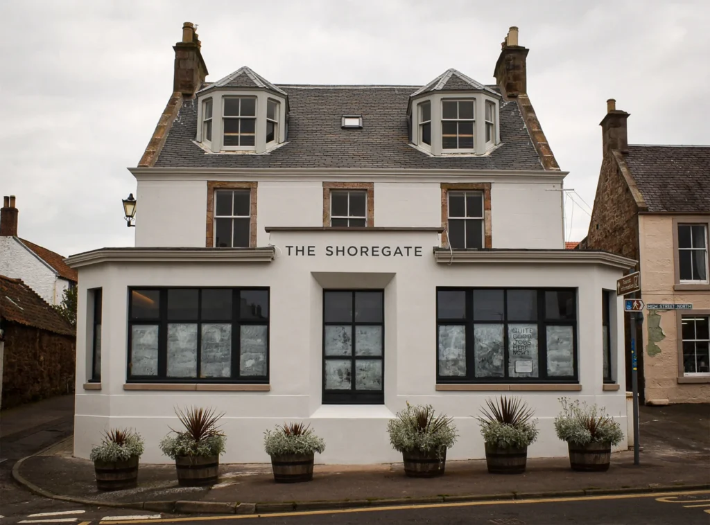
Minutes away from Crail’s working harbour, The Shoregate is a historic building. For centuries, it’s been used as a smokehouse and dwellings, as well as a tavern.
The building is located at the end of the main street in Crail. Once a busy community space, it was in need of attention.
In February 2022, Nicholas and Damon’s extensive renovation was nearing the final stage. It was time to arrange signs.
I learned more about the renovation in a phone call with Nicholas. Both of us were keen to discuss signwriting on site and we arranged to meet.
Nicholas wanted two exterior walls hand lettered. The artwork was still to be finalised but we had an indication of how it’d look. As well as approximate sizes, colour references, and planning consent.
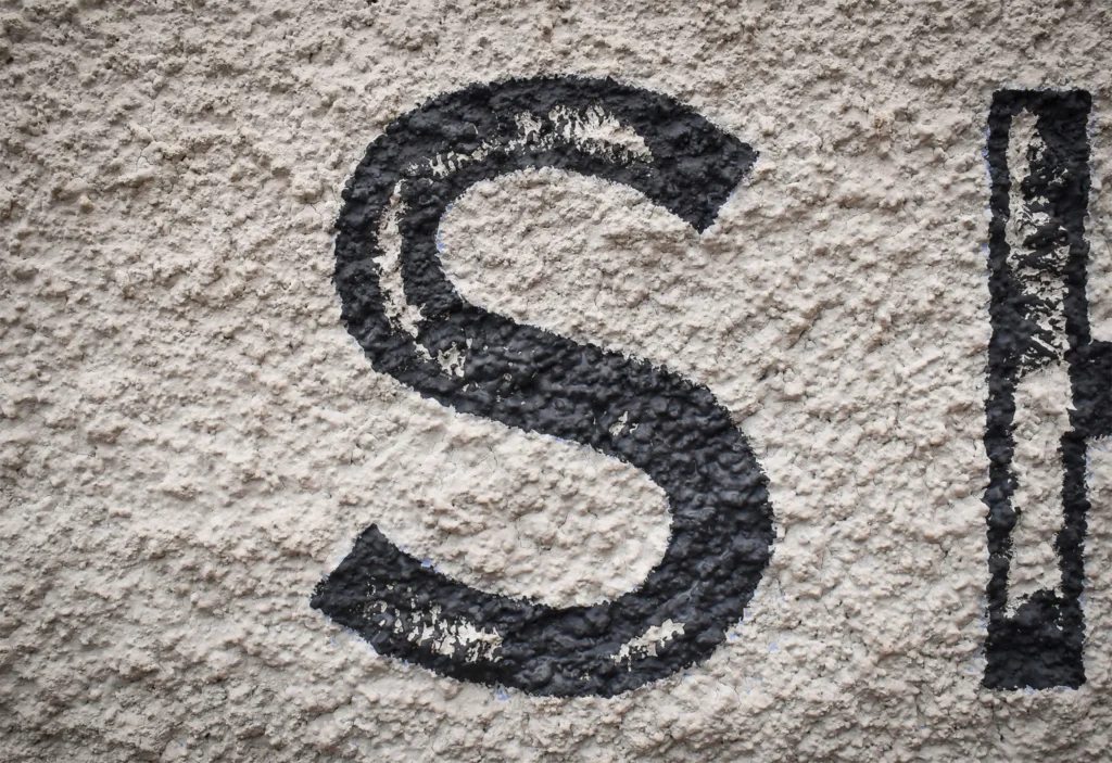
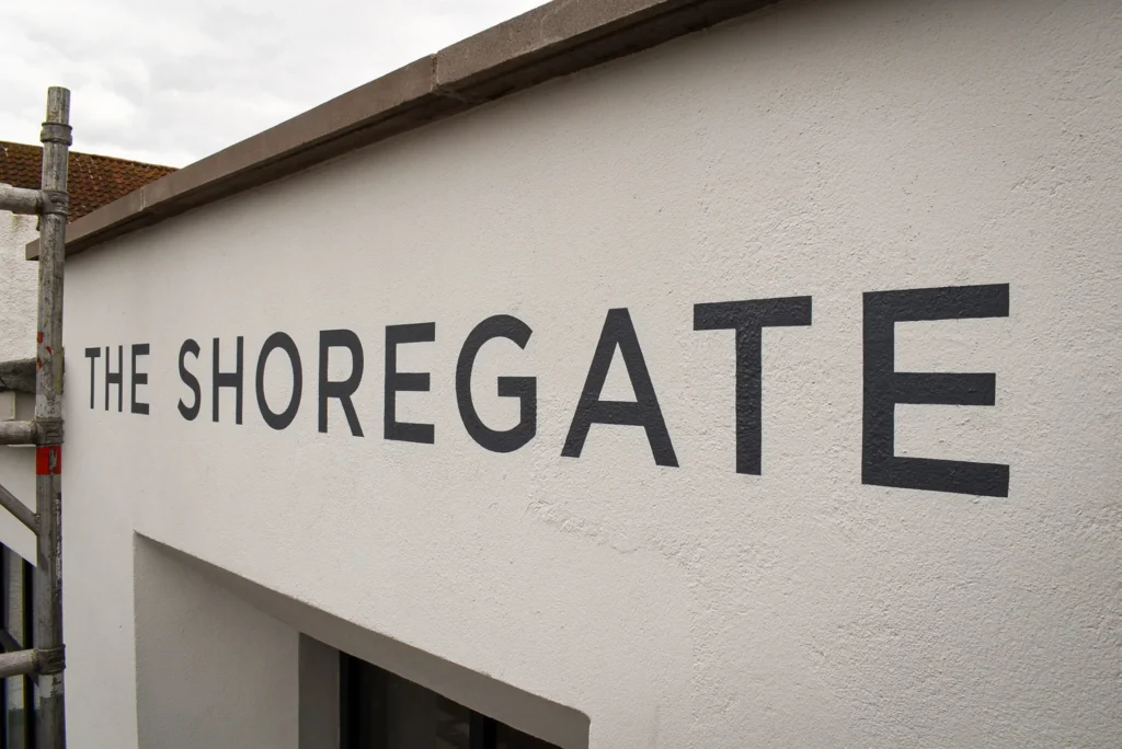
We met on a breezy Sunday morning and I tested painting a small portion of lettering on the gable. Testing was crucial in understanding how painted brush strokes would form on the very rough and pebble-dashed wall.
Painting straight, clean edged lines on a rugged surface is tricky. The tip of a brush is coerced into nooks and crannies. After painting two letters, I began to realise how I’d transfer the artwork onto the wall.
The other wall is south facing and appears smooth. However, the surface is coarse and similar to 180 grit sandpaper. I knew my signwriting brushes wouldn’t cope with the wall’s gritty texture and more robust, flat edged brushes were necessary.
Nicholas and I were satisfied with the test piece and agreed on the standard of finish. We planned to keep in touch.
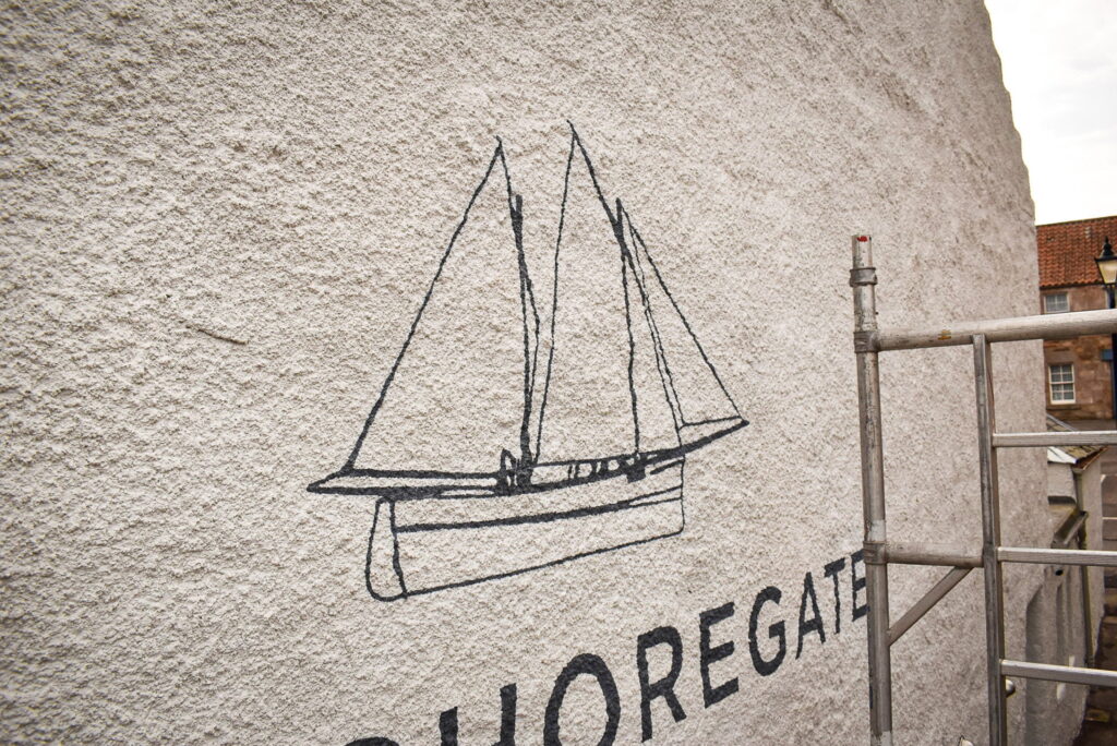
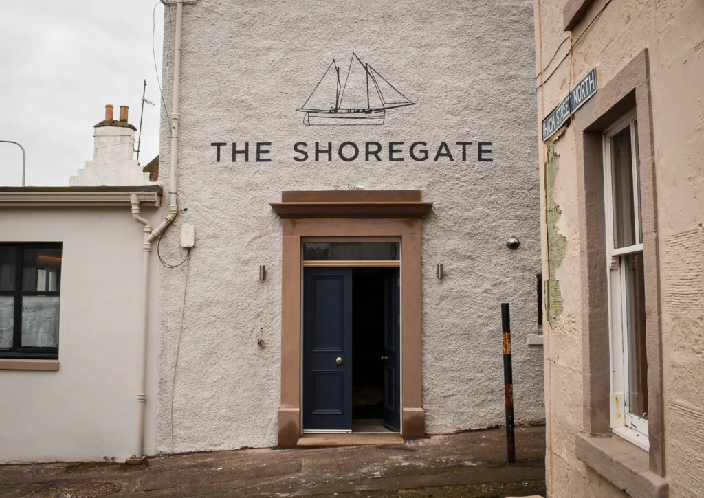
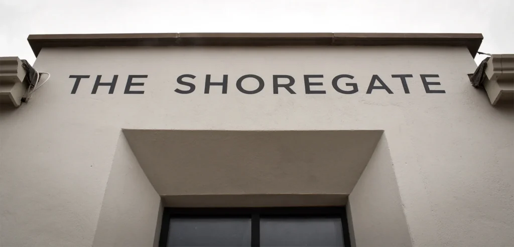
Understated and considerate to the building’s era, the newly approved artwork was inspired by old photographs of a nearby pub. The type’s character evokes mid-twentieth century wall lettering. Confident in its simplicity, the lettering compliments The Shoregate’s interior style.
Together with the illustration of a sailboat, the logo connects the signage to its coastal Fife location.
The boat is a Fifie. A traditional Scottish fishing boat used by fishermen who lived and worked in Crail. Tastefully drawn, the illustration is a nod to the heritage of Crail and the east coast of Fife.
Drawings were provided and I checked the artwork. The gable and south facing wall signs were scaled within the maximum dimensions and sent to Nicholas and Damon for proofing. Once the scaled artwork was approved, I scheduled our project.
Wall graphics on rough surfaces are often painted. Fixed panels and direct vinyl application are also options, but the advantages of using paint for this project were twofold.
Painted lettering would be more durable than digitally printed vinyl, as well as how it looks. Hand lettering has charm and the signage needed to convey human touch. Nicholas had considered flat panels but felt painted signs directly onto the surfaces would look naturally authentic.
As such, I made large paper patterns that would accurately transfer the artwork.
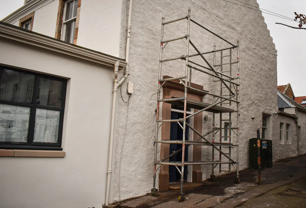
Equipped with my patterns, I headed to Crail with brushes and tower scaffold.
Painting The Shoregate’s walls would last two days. Most of the morning on day one was spent building scaffold and transferring the scaled artwork. As well as mixing enamels to the supplied colour reference.
I painted until early evening once the entire graphic was completed. The irregular surface and warped wall proved challenging, especially when painting the boat sails. After I was satisfied with the opacity of the finish, I dismantled the scaffold and loaded it back into my van.

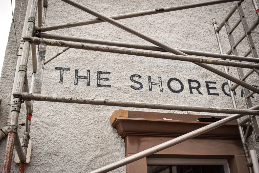
Day two was Good Friday. I was in a good mood for hand lettering. The previous day was demanding and I felt this wall would be easier. I was wrong.
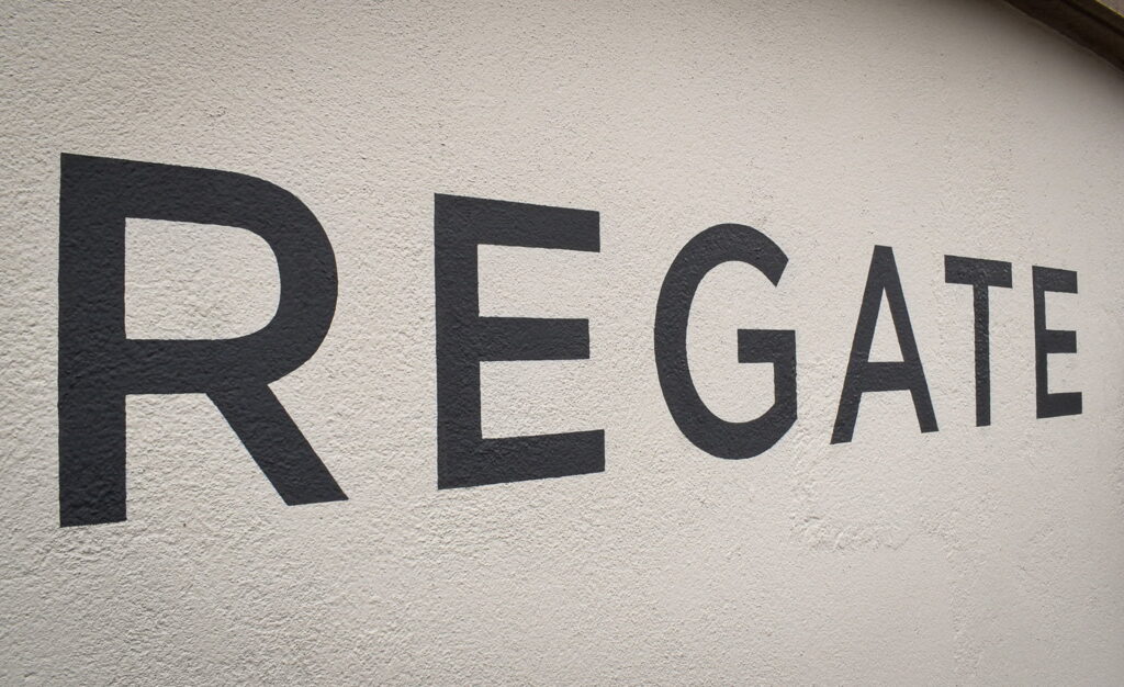
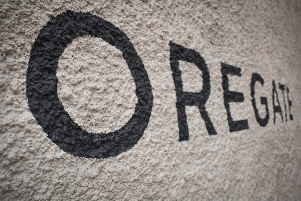
My signwriting brushes glided over the porous surface worse than I expected. Armed with a selection of fitches, I tried several before finding the right stiffness of bristle. Patiently, each stroke of each letter was slowly formed with as clean an edge as practically possible.
Regularly, I climbed off of the scaffold and viewed the sign from below. It was important to ensure the letters’ edges were smooth and the colour was solid. Gradually and with precision, the lettering came alive.
Hand painted lettering on The Shoregate’s walls aren’t standard signs. With it’s classic look, the signwriting improves the building’s appearance.
Passers-by immediately recognise the care and attention given to the signs. This message is reflected in the perception of the business’s visual identity.
Nicholas, Damon, and I were delighted with the result.
Get in touch to discuss your signwriting project.