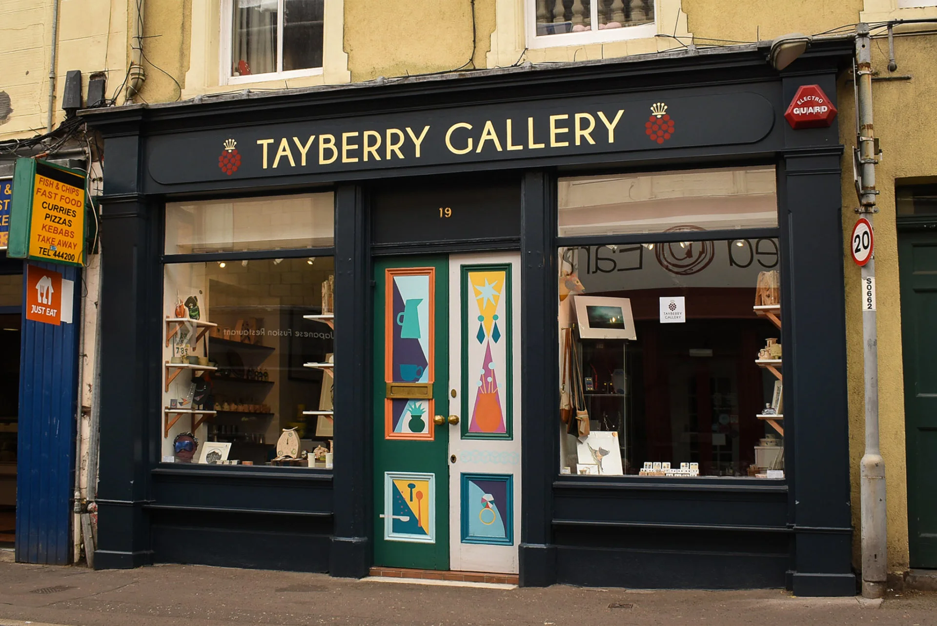
In 2021, Sarah Spalding and Louise Forbes contacted me to discuss signwriting in Perth, northeast Scotland. Following ten successful years of trading, Tayberry Gallery deserved a new hand painted fascia sign.
When I visited to survey the shopfront, gold acrylic flat cut letters were intact and in reasonable condition. The letters were bonded onto shaped plywood panels fixed to the shop fascia sign.
‘We want a more artistic sign to reflect our business’, said Louise. ‘We like the idea of hand lettering and gold leaf’.
Louise and I chatted, measured the fascia sign and looked at samples of various metal leaf used for gilding. Two days later, I emailed my indicative quote. Louise agreed to meet again.
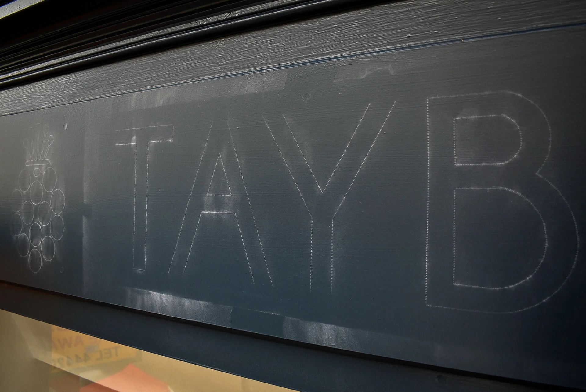
Several months later, Sarah and Louise visited me to discuss the details of their fascia sign. I’d asked Louise to send vector artwork to enable me to make scaled patterns for the new sign’s hand lettering. I also wanted to adjust the spacing between the letters.
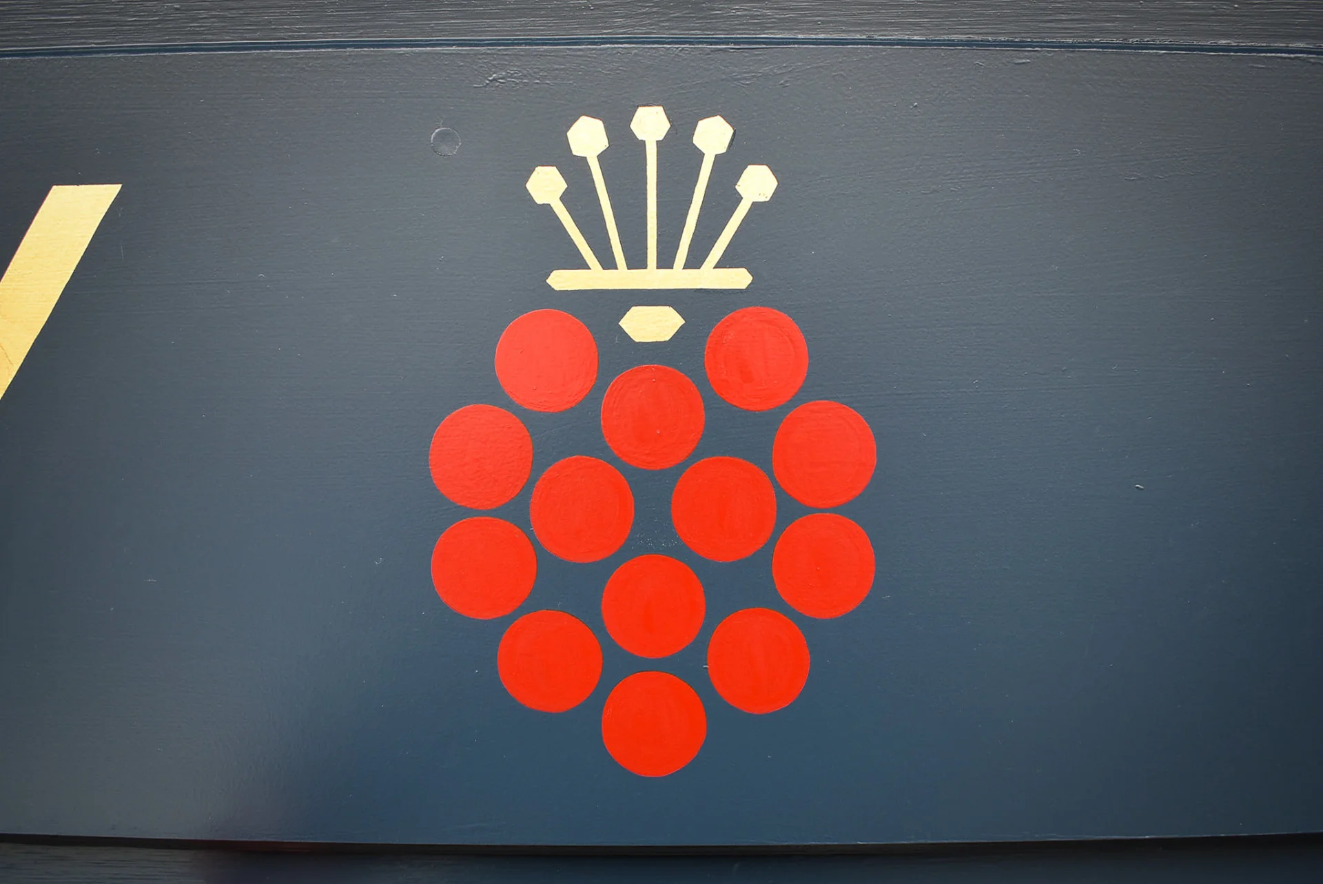
First, I re-drew their famous fruity logomark. The bright red circles were now mathematically balanced.
The letters’ spacing were then tightened. My adjustments improved the T-A-Y in Tayberry as well as preventing glaring gaps once the letters were enlarged for signwriting. Sarah and Louise approved the revised artwork and I emailed the digital artwork files for their future reference.
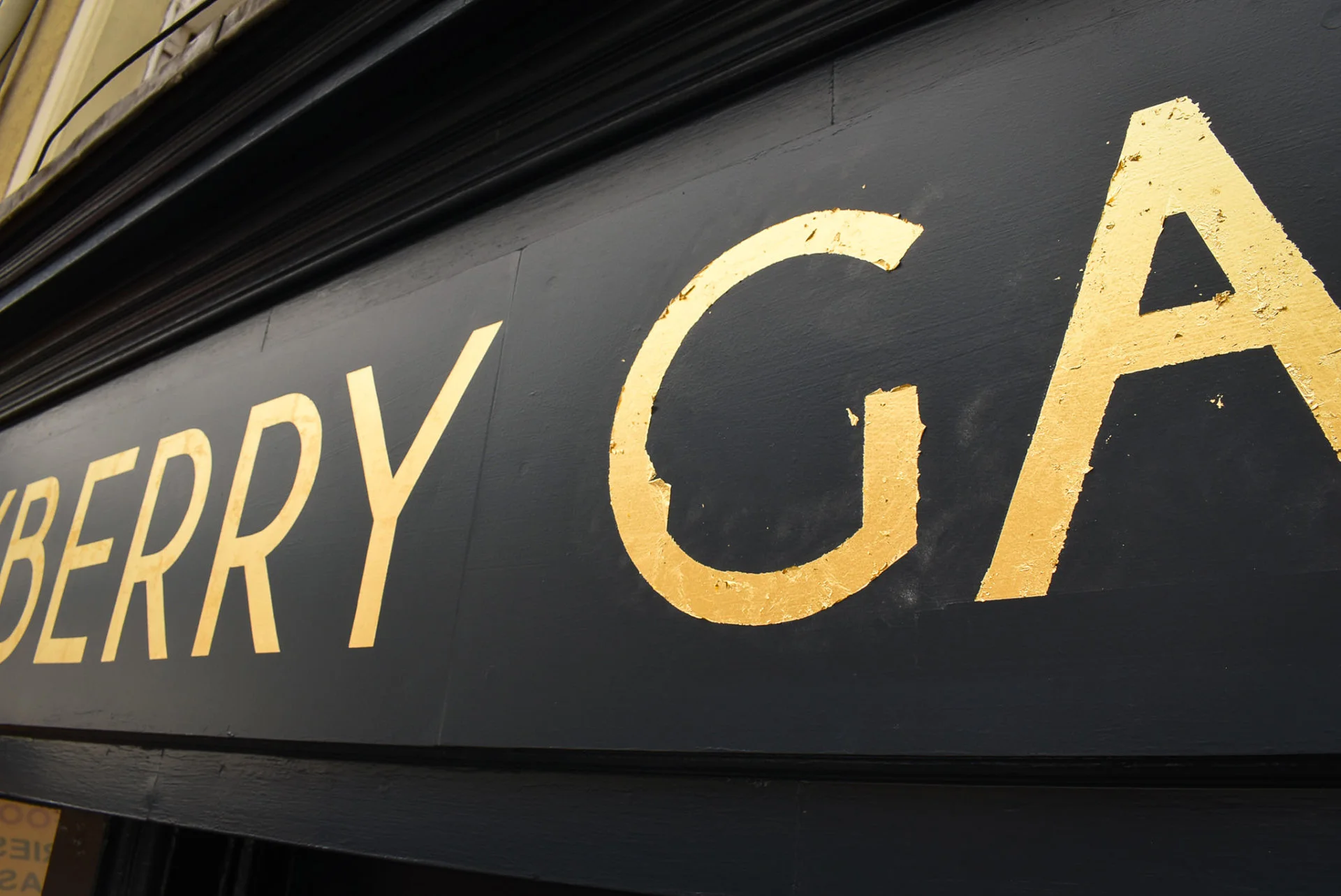
We also looked at colour samples and considered the the gold leaf finish. Louise and Sarah chose 23.5ct yellow gold leaf for its brilliance and durability.
Louise planned to remove the flat cut letters. We expected damage to the shaped panels due to the adhesive bonding the letters.
I suggested shaping 3mm thick aluminium composite panels and then fixing them on top of the existing plywood. This option avoided removing the plywood background, resulting in a smooth, glue-free surface ready for repainting.
I ordered and delivered the aluminium composite, cut to size and ready for shaping. Louise curved each end of the panels and arranged the installation, as well as scheduled the painter to paint the whole shopfront. In the meantime, I prepared scaled patterns for transferring the artwork.
My mobile scaffold tower was necessary to hand paint the fascia sign in Perth’s busy city centre. Using a platform is safer and steadier than stepladders, especially for hand lettering and gold leaf work. Fortunately, the pavement in front of the gallery was wide enough to avoid obstructing passers-by.
Nevertheless, Perth’s local authority stipulates scaffold permits for working on shopfronts. I contacted Perth and Kinross council for advice before double checking my insurance cover. With a date submitted to the council, I purchased the permit.
With the shop painted, the permit purchased and my patterns ready, I hoped for signwriting on a sunny day.
The sun was rising when I set off for Perth in the middle of June.
On arrival at the gallery, I soon built my scaffold and arranged my tools. Next, I tacked patterns on the fascia before choosing where to position the logomark.
Positioning lettering and images for signs and display is crucial. This stage shouldn’t be rushed or overlooked. Particularly with hand painted signs. I’ve made enough mistakes to know the importance of placement, so I’m keen to avoid my errors of judgement and I try to view the initial positioning of lettering and graphics from varying angles.
After patiently considering several adjustments, I was happy with the two tayberry logomarks. Not too close to the lettering. Nor too far from the end. Roughly centralised above each window and optically balanced overall.
Chill in the summer air and a breeze becoming windier, I surveyed the clouds over The Fair City.
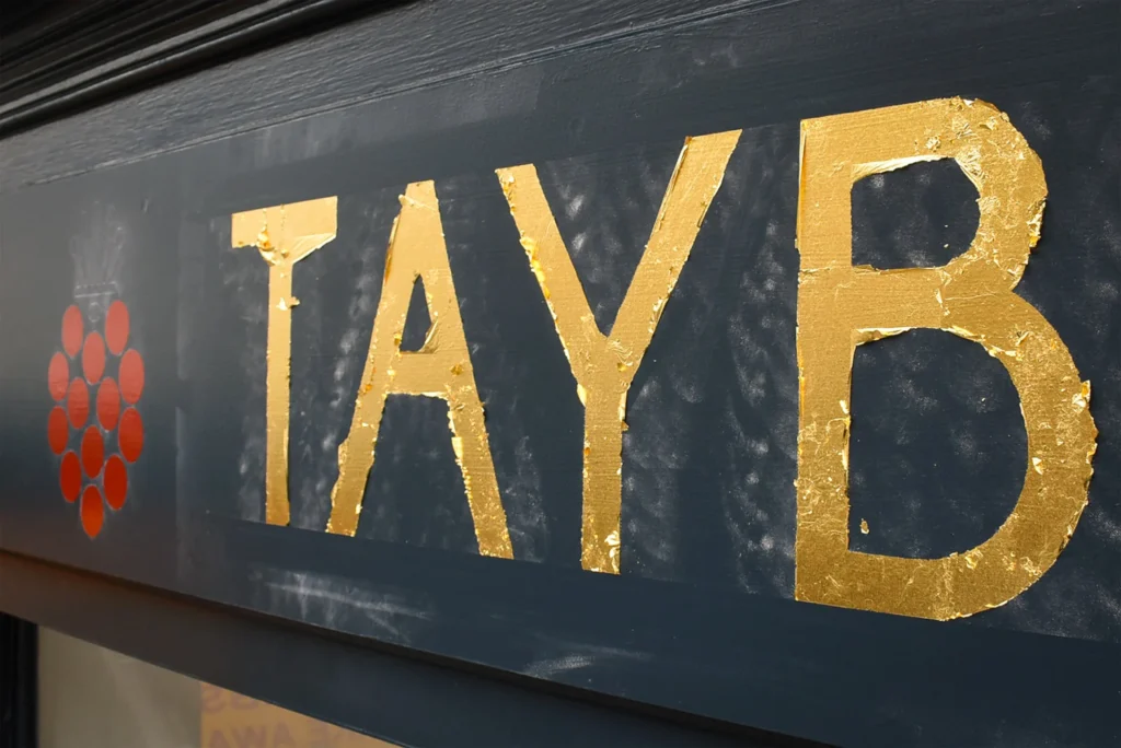
The first coat of red was painted on the tayberries. Then I began painting the gold size for the lettering. The wind became relentless. With my jacket zipped up and my brush steadied, I persevered painting three letters at a time.
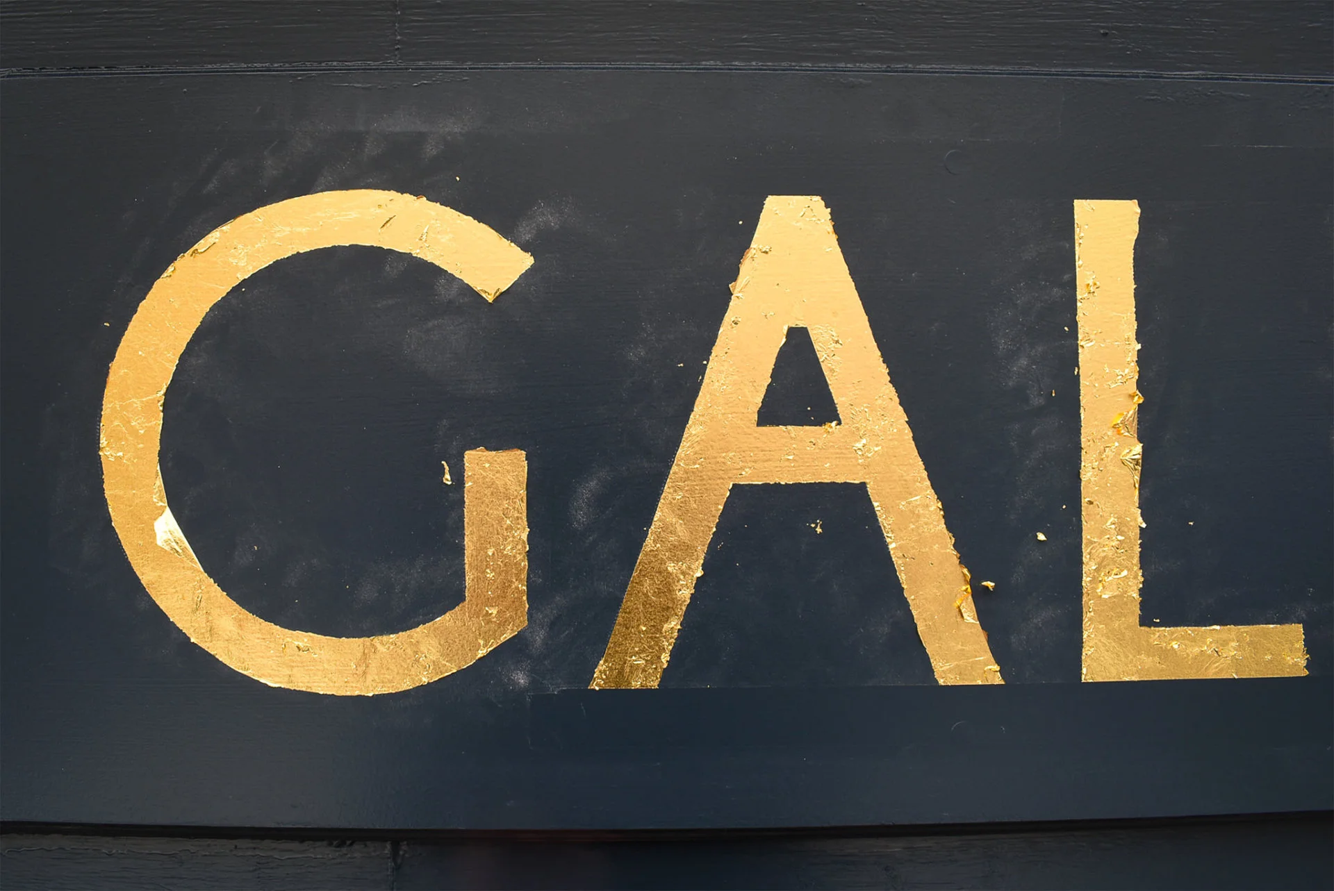
Handling gold leaf is a delicate affair, especially when working on the scaffold on a busy, windy street. Gold size sets to a certain tackiness before comfortably adhering to the leaf. Regularly checking the right level of tackiness involves planning and patience.
My pouch full of gold was gradually applied to each painted letter with a whistling wind on my left side. Working with three letters at a time, ‘Tayberry’ was gilded before removing the excess gold. The crowns in the logomark were gilded next before signwriting ‘Gallery’.
It was early evening when I finished burnishing the letters. The challenging wind began to settle as I tidied the panels and unzipped my jacket. A sunny sky revealed a tranquillity just in time for the second coat of the tayberry circles.
I mixed the red paint but wasn’t satisfied with the topcoat colour. At this hour, the deep red had to be a shade which I struggled to match. Disappointed but not deterred, I had to find a solution.
The serenity made me realise that the paint was too glossy. I added a flattener to the red paint and climbed the scaffold again. Carefully second coating the circles, my disappointment evaporated as the paint began to dry.
Now with a satin red finish complimenting the gold leaf crowns, I dismantled the scaffold and loaded my van.
With the durable new sign enriching the shopfront, Louise was delighted to tell me a few days later, ‘The lettering was shining as Sarah opened the shop this morning’.
Get in touch to discuss your signwriting in Perth.