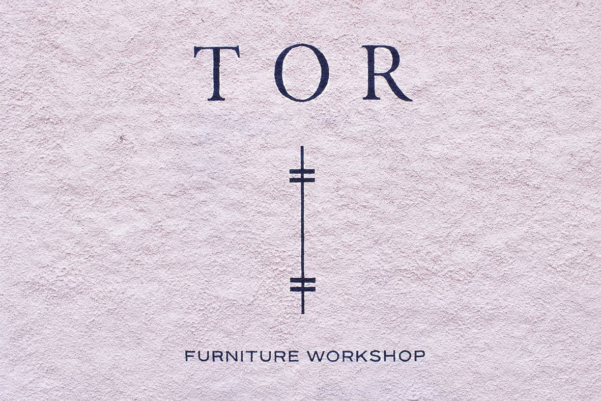
Aberdeen design studio, FortyTwo, wanted signwriting for their client in Braemar, northeast of Scotland.
TOR Workshop makes wooden furniture and has a showroom located in Braemar’s picturesque High Street. The showroom is inside converted stables opposite a popular hotel.
TOR director, Tom Addy wanted to increase footfall and chose a new sign on the exterior wall. The roughcast wall is adjacent to the showrooms’ entrance path in the busy tourist area.
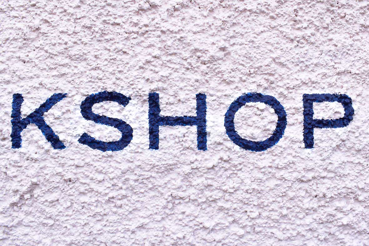
FortyTwo’s creative director, Sam Longmire phoned me to discuss the project. Sam had initial artwork showing a mock-up of where he wanted the sign positioned and asked me for my quote. My quote was approved and I scheduled my diary to visit Braemar.
Following phone calls with Tom, we determined the sign’s size. Large enough for ‘Furniture Workshop’ to be read, but not overpowering. Tom would decide on the positioning when we met, and space was left below for potentially more details.
Sam sent me revised artwork before I scaled the design and made the paper transfer pattern.
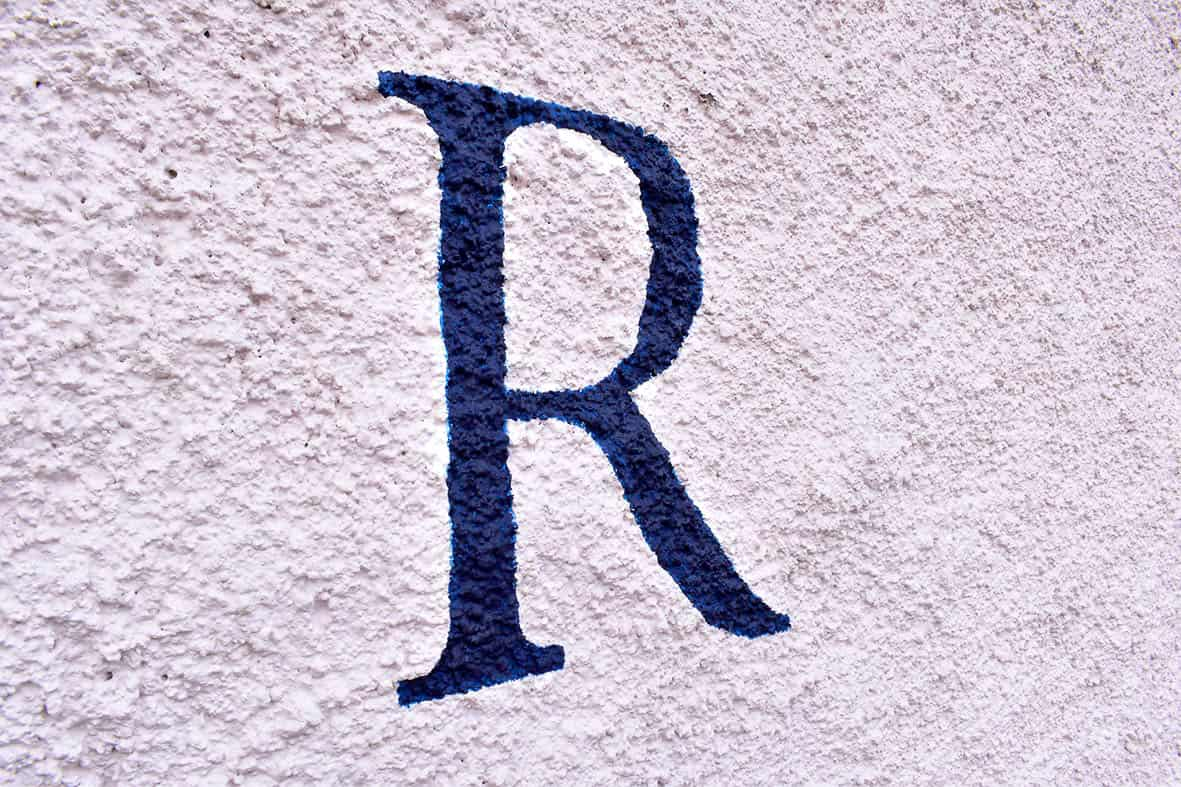
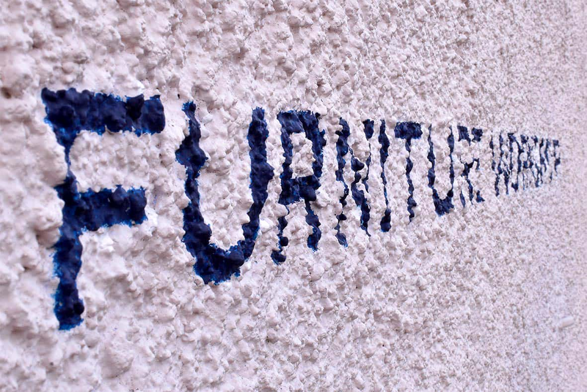
Dark blue was chosen for the sign’s colour and the finish had to be matt. Dark blue paint is notoriously poor covering and often requires more than one coat. I knew the paint would have to withstand the elements and survive on the roughcast surface.
The opacity and flow of signwriters’ paints are crucially important. Decorating, automotive and industrial paints are often not suitable for lettering with a brush. When desired colours aren’t available in signwriting paints, they’re often mixed to achieve a close match.
Fortunately, Tom was happy with the oil-based dark blue, straight out of the tin.
Braemar is approximately fifty miles from my base in Dundee. The drive is through scenic glens and winding roads which takes about seventy minutes in my van. A chance of light rain was forecast, and I set off early.
With one eye on the clouds, I met Tom and tacked the pattern into position. The rain became heavier when transferring the scaled artwork onto the wall.
Beginning at the top, the lettering was carefully cut in with the see-through blue. The skeleton of ‘TOR’ was formed and then steadily, the letters gained more weight.
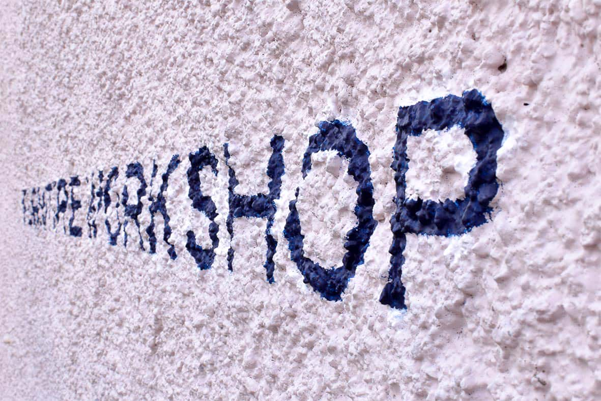
Straight lines on uneven surfaces are challenging. The harling creates kinks and requires constant adjustments. Standing back and analysing every corner and curve is necessary, as well as walking around and viewing from different angles. Minor tweaks are then painted.
I persisted with signwriting the first coat of ‘TOR’, but the rain continued. As well as a constant stream of water that was pouring from the missing guttering above. Despite my makeshift sponge plug, the water was bouncing off of my painting hand and hitting the lettering. I abandoned the project after just three letters.
Ten days later and with blue skies above, I travelled back to Braemar.
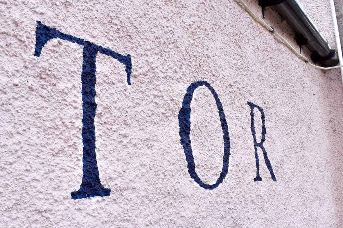
I had a clearer understanding of the wall texture this time and knew how I’d paint the rest of the sign. At around 8am, the logo was transferred first. Then two words at the bottom. The paint was thinned, fitches washed, and ‘TOR’ was second coated.
Tidying the lettering’s edges as I went, I was careful not to cause paint runs. The background colour paint wasn’t available so I tinted white masonry paint with a touch of pink.
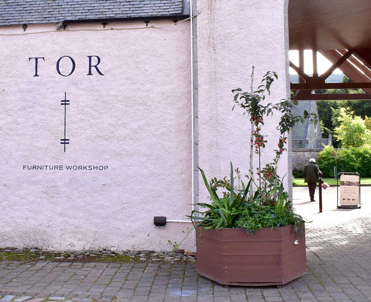
By mid-afternoon, everything had at least two coats of dark blue. Some lettering appeared hairy, so the tinted masonry paint was used to clean edges. From the planned viewing distance, the sign was as close as practically possible to Sam’s artwork.
Tom was delighted. The result was sure to grab attention of passersby from all over the world. Now with a sign on the showroom wall, TOR Workshop claimed a place on Braemar’s High Street.
Interested to find out how signwriting in Braemar can help your business?
Get in touch to discuss your project.