
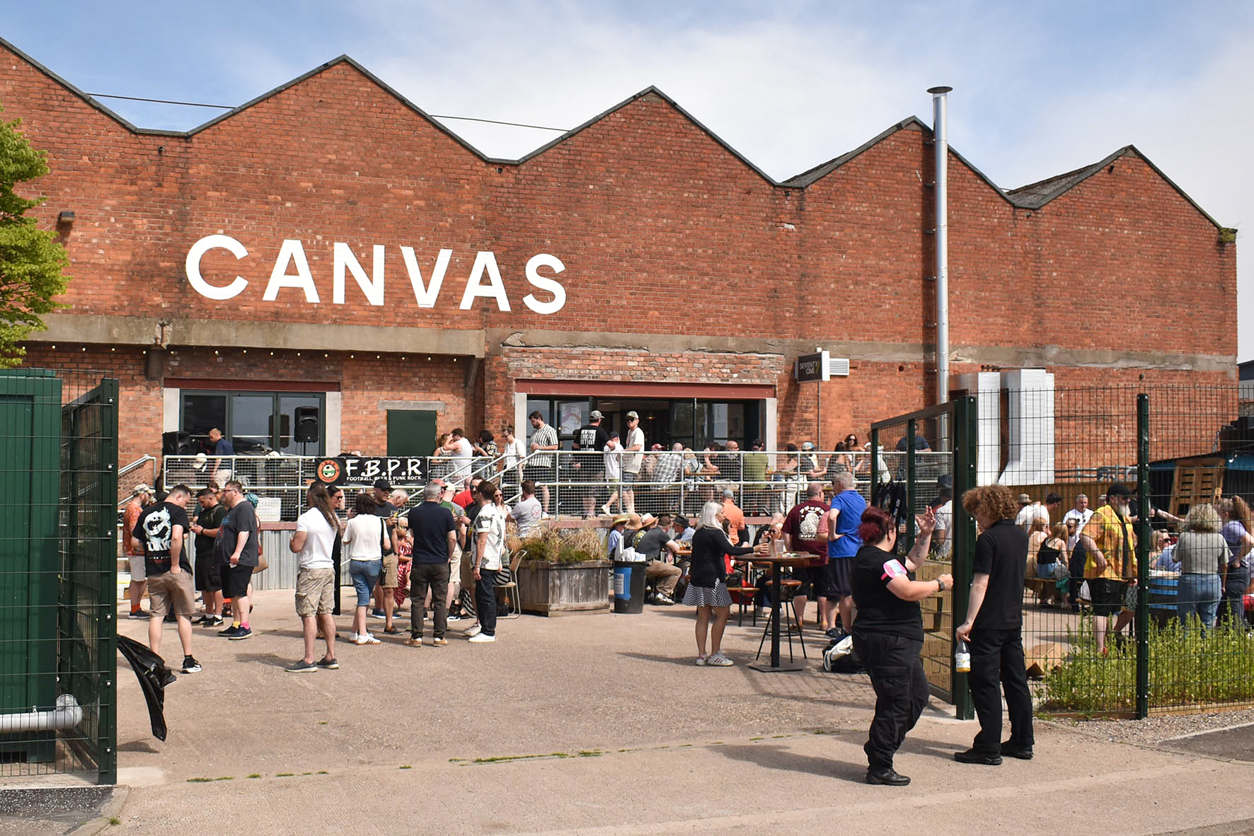
Situated near Dundee’s city centre is Canvas. An events venue and taproom living next door to its parent, Seventy One Brewing.
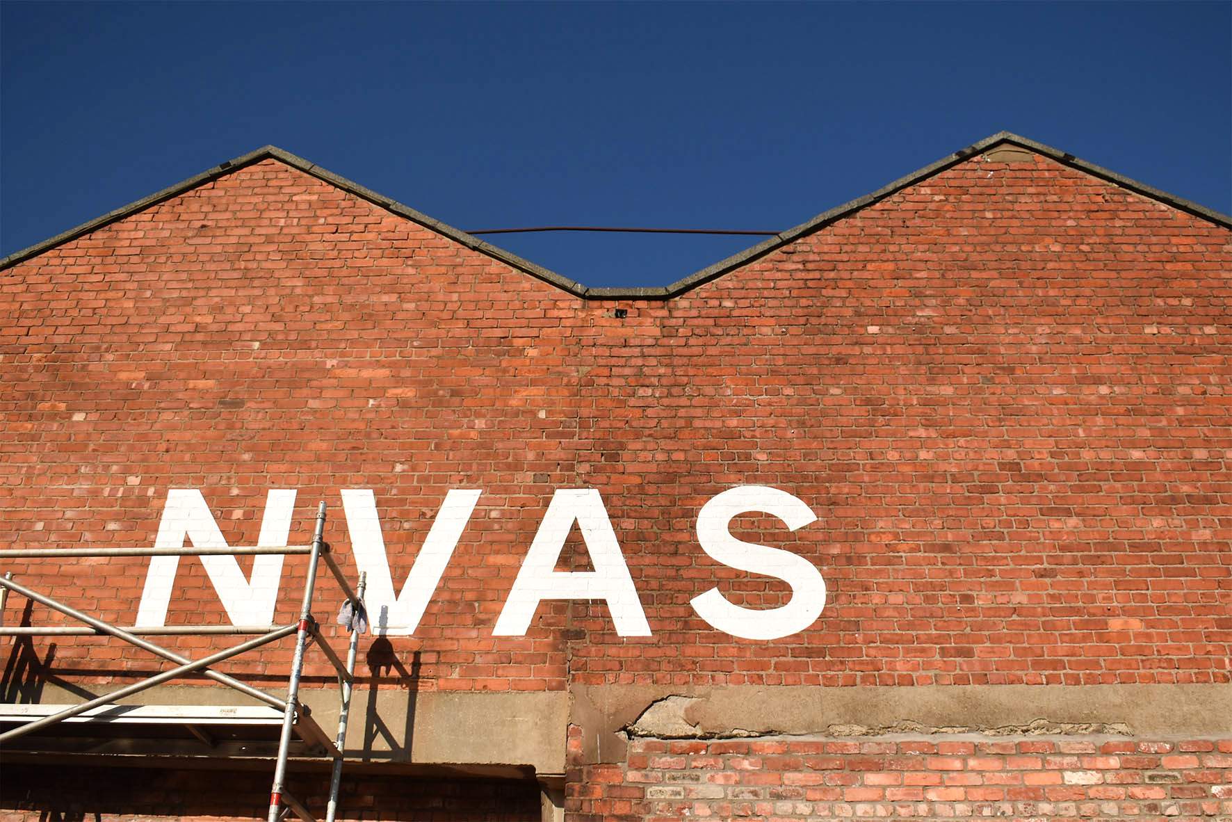
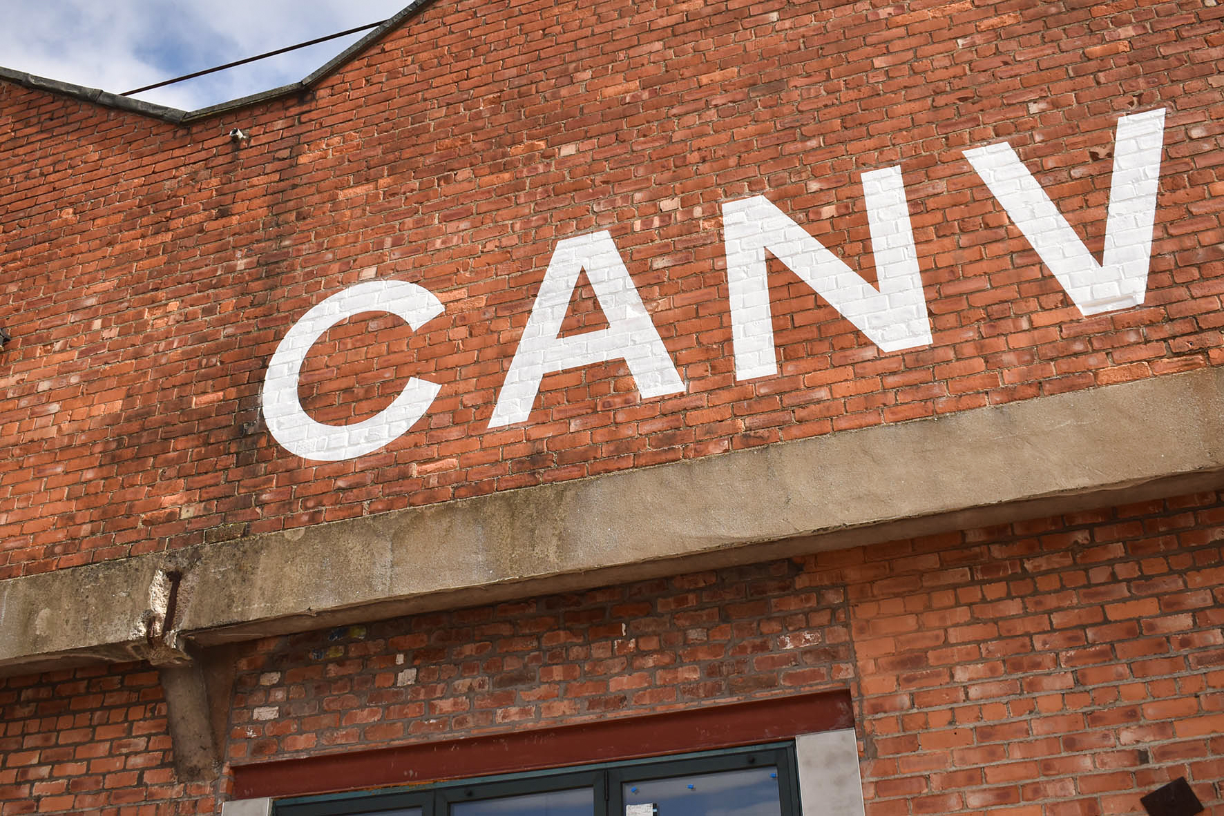
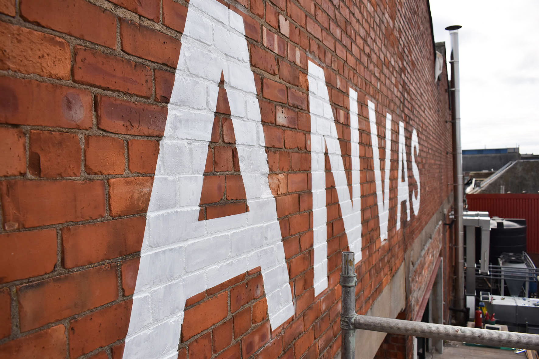
Over two gloriously sunny days in April 2025, 1150mm height uppercase letters were chalked onto the brick wall before two coats of masonry paint created the venue’s striking white sign.
Hand painting the letters above the venue’s entrance complements the ethos of the building’s purpose. Large painted letters introduce the presence of craft.
The signwriting is a nod to the building’s original era. Hand painted signs on brick walls were once a common sight throughout Dundee. This traditional signmaking method is again an effective and considerate solution for contemporary sign design.
Constructed in the early twentieth century, the building was part of a network of mills embedded in Dundee’s gritty heritage. Textile manufacturing machines were made inside. The former factory is a historic site located in what was known as ‘Hell’s Half Acre’ and part of the sprawling Blackness Iron Foundry.
Popular and established in the city, Seventy One Brewing steered its vision towards making a new social place inside its spacious building. Catering for the arts sector, private events, and live music, Canvas is a unique venue on a landmark site.
Deciding to hand paint the venue’s main sign arose as an alternative to a previous complicated signmaking concept. Large painted letters were preferred for striking simplicity and value.
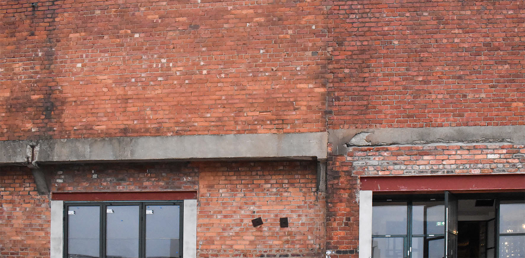
The building was treated with extensive renovation. Tradespeople were on site for months. After a century, the sight of the dominant red brickwork was ready for a facelift.
Janet Anderson, marketing manager with Seventy One Brewing, emailed me with a visual mockup of the original exterior sign concept. Janet asked me to provide my quote for hand painting something similar.
In my reply, I suggested a survey and to test paint a sample before confirming if the surface was suitable for painting. We were also yet to determine the size of the approved artwork to enable me to price the project. Janet agreed, and I visited the site entrance the following Saturday morning.
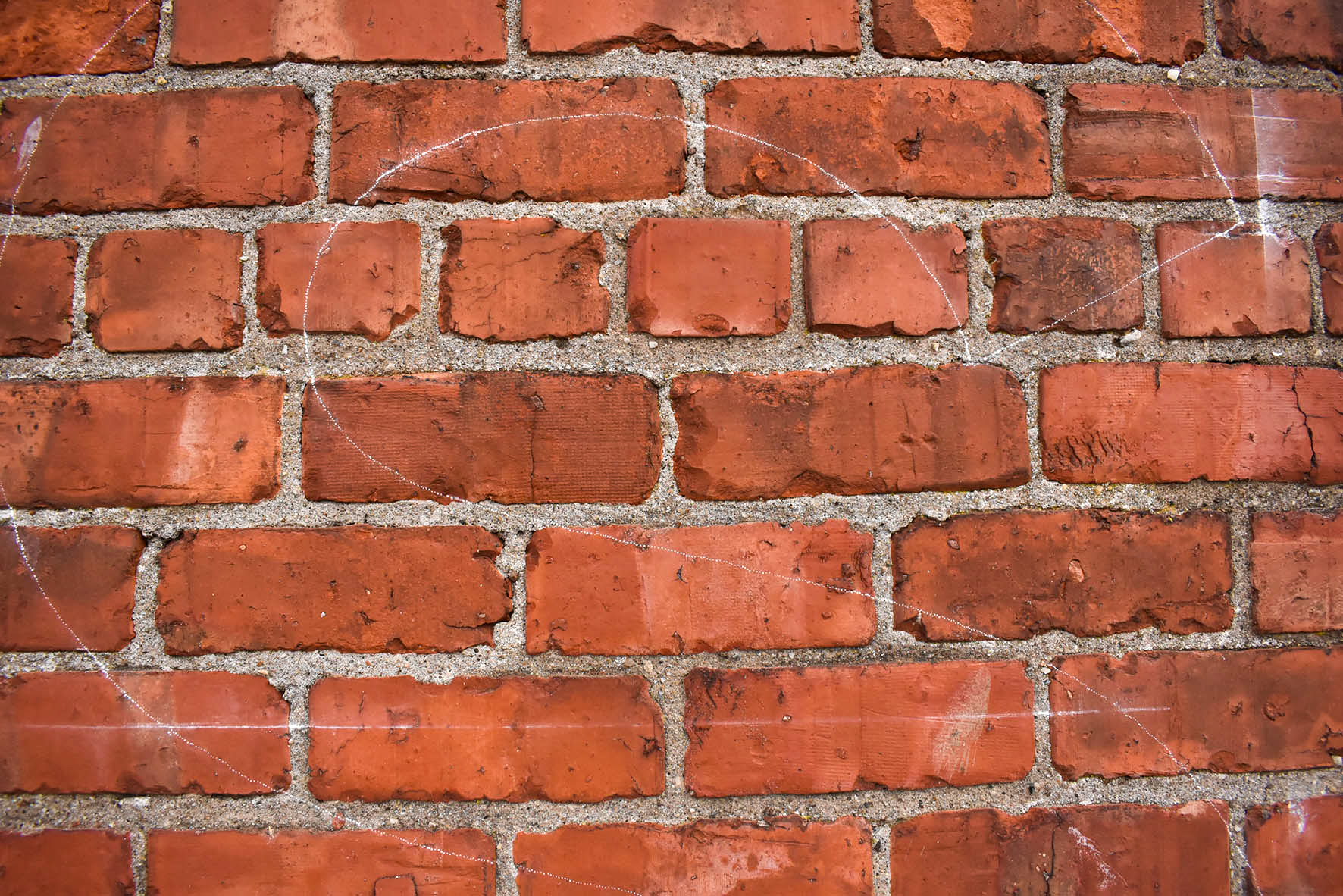
I’d prepared a small sample pattern to transfer onto an inconspicuous area of the brick wall. Once I’d chalked the pattern of the letter in place, I painted it over the height of around six bricks. This area was enough for me to gauge how clean an edge my paint and brushes would result in on the coarse surface.
Painted signs are often the most practical solution for large exterior lettering on brick walls. However, coarse texture will affect the flow of paint as well as the opacity. Painting tests are prudent and can help avoid unwelcome surprises once committing to a large painted sign project.
Following my test, I was confident in executing a sharp letter.
A brief encounter with Seventy One Brewing co-founder and director, Duncan Alexander, shed light on the size and positioning of the sign’s artwork. The large painted sign would be positioned above a raised platform leading to the venue’s main entrance.
We discussed the maximum working height I could reach from my scaffold tower as well as alternative access equipment. I reckoned my tower would be just tall enough.
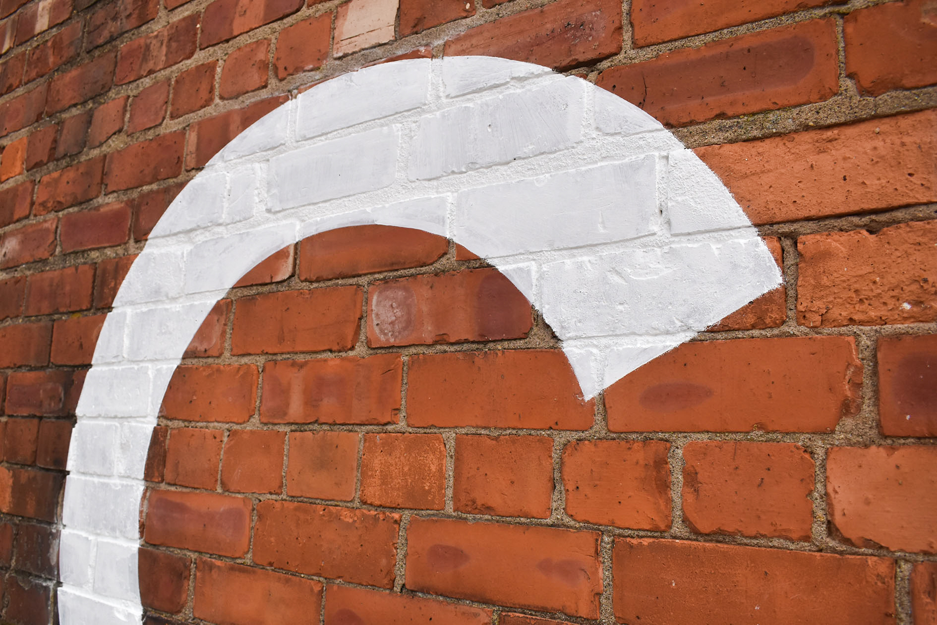
Duncan queried the longevity of the paints I planned to use. I explained their properties and the finish I’d expect. Duncan described his vision for his sign and said he’d be satisfied with the texture of the mortar and porous brickwork revealing through the painted letters.
We were both satisfied with the textural finish of the sample. I agreed not to obliterate the letters with white paint to allow a hint of the brickwork and mortar to shine through the sign.
The next morning, I prepared three different sizes of artwork, as close as practically possible in scale and form to Janet’s mock-up. I created new visual mockups and priced each size of the sign. My quote, indicative lead time, and artwork options were then sent to Janet and Duncan.
The largest of the three artwork options was chosen, and my quote was approved. Janet and I then scheduled the painting to commence shortly before the venue’s opening date.
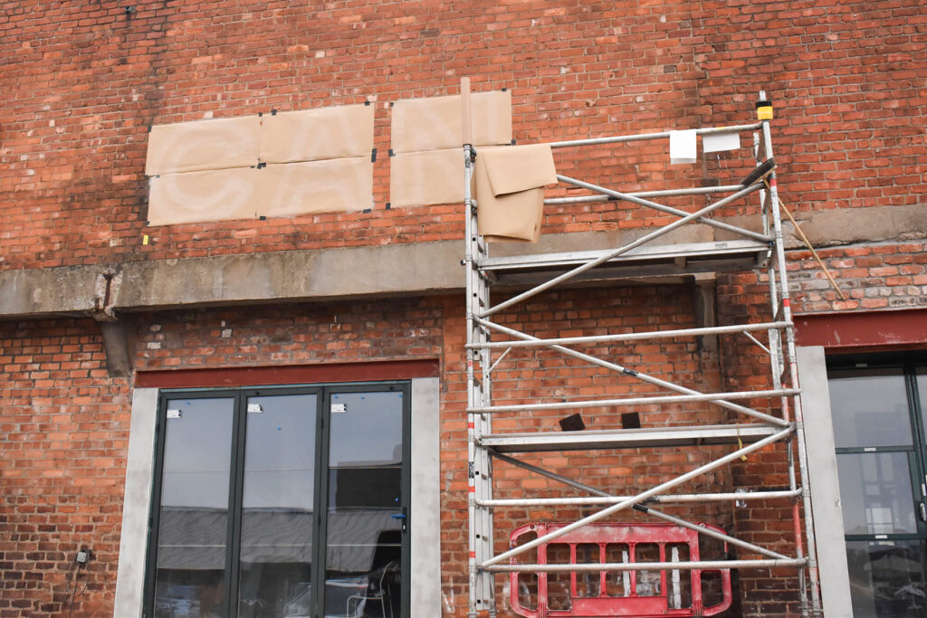
Two weeks later, on the Friday before the painting date was planned, I made perforated paper patterns to transfer the scaled letters onto the brickwork. I loaded my van with my aluminium scaffold tower, in addition to masonry primer, topcoat, and my selection of brushes.
The forecast looked decent for the following week. I was eager to start painting.
Arriving on site early with a hint of morning haar in the atmosphere, I put my jacket on and unloaded my van. I double checked my positioning measurements and was assured they were accurate. Mistakes in painting on the brickwork would be permanent.
The tower was built on the raised deck area and rolled into starting position. I climbed to the top and began by brushing loose dust and small debris off the brickwork. The surface was far from smooth, and the span looked bigger when viewed at height.
Naturally, I paint from right to left, leaving a wet edge. Beginning with the ‘S’, I tacked the paper pattern into position before levelling, measuring the space between and moving to the ‘A’. Two letters at a time were positioned before climbing down and rolling the scaffold along.
Once the six letters’ patterns were taped horizontally with gaffer tape, I checked my measurements a final time on the ground and was happy to proceed.
The patterns were chalked through onto the surface, then carefully peeled off.
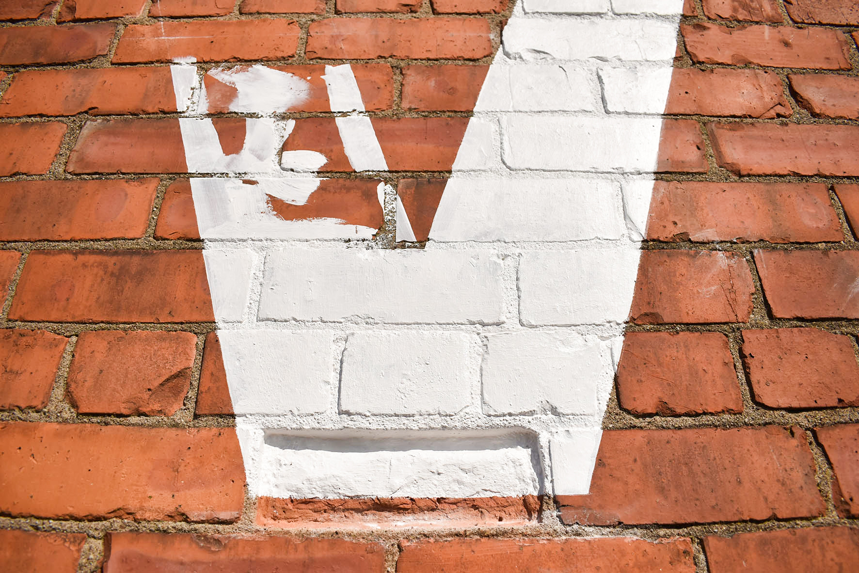
Loading my synthetic bristle, chiselled-edged brush with Zinsser Bullseye 123 primer, I began cutting in the ‘S’. At first, the paint was soaking into the bricks and mortar. Not what I wanted to see. I persevered and rapidly gained a technique to gradually adjoin curved segments inside my chalked area and progressively constructed the large letter.
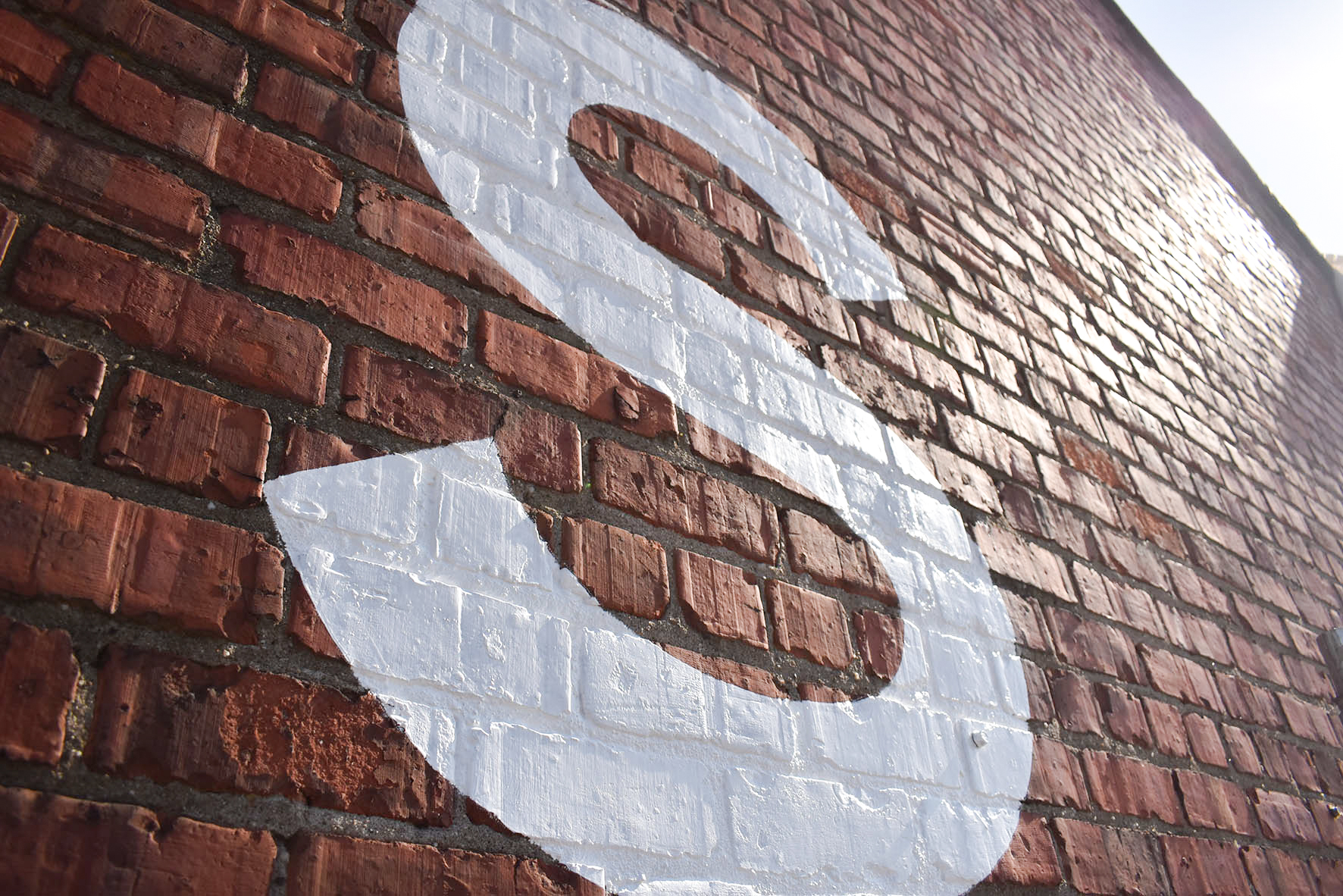
Already taking shape, the ‘S’ was looking tidy. Over the following six or seven hours, the sun shone bright, and I painted another three letters. By around 6pm, I was pleased with the progress and decided to finish.
The next day began with angling the ‘A’ before taking my time and curving that sweet circular ‘C’. The first coat went well. By mid morning, it was time for the second coat.
The paint flowed quicker and smoother this time around. I was already generous with primer in the deeper recessed areas. This aided the coverage of the topcoat, going back and forth to areas requiring a touch-up and assisted by the warmth of the sun.
By mid afternoon on day two, the letters were complete. I disembarked my scaffold tower and stood back, checking for any uneven edges or kinks in the curves.
I was pleased. The team in and around Canvas, as well as other tradespeople were kind with their praise, and I sensed they’d also arrived at a turning point in the months-long project.
Painting the sign on the building was a privilege and a pleasure to witness a new, exciting era.
Get in touch to discuss your next signwriting project.