
Historically, traditional hand painted signs convey a warm welcome. Especially for pubs and restaurants. Painted signs set a tone. They can create a lasting impression and contribute positively to an establishment’s aesthetic.
Investing in well executed painted signs also signals artistry and arguably good taste. All valuable attributes which should be considered as part of an overall visual identity before choosing the method to make a sign.
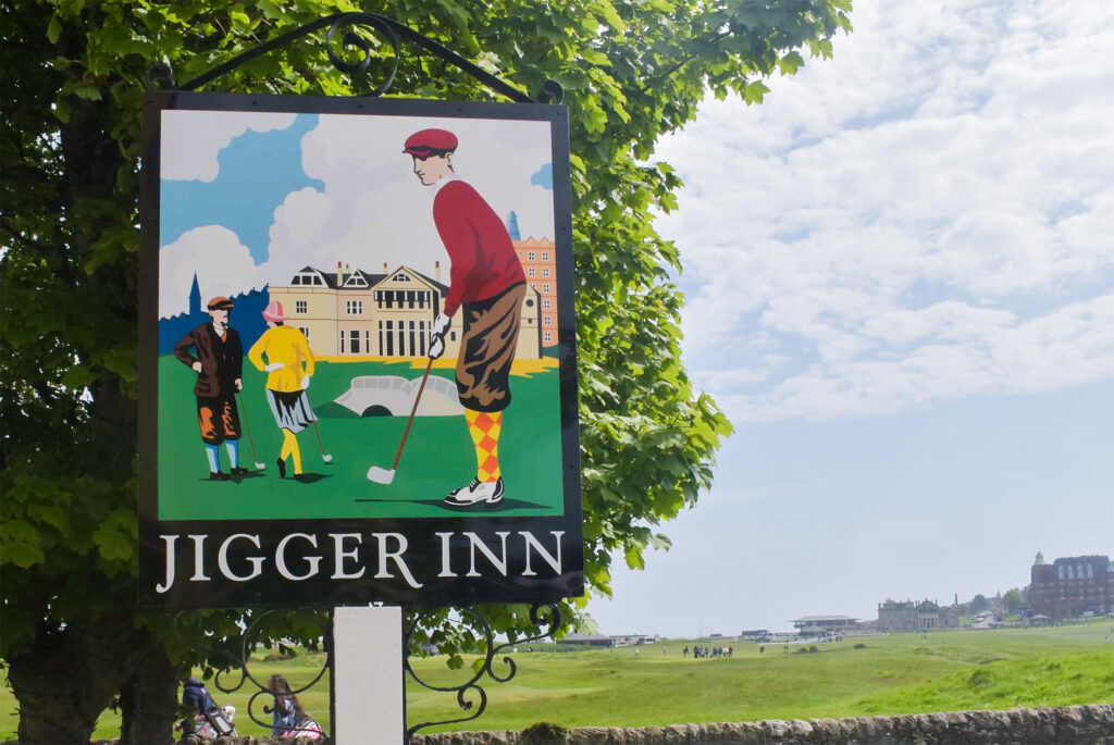
Neighbouring the legendary Old Course in St Andrews, Scotland, the world’s most famous nineteenth hole, Jigger Inn sits in the heart of the home of golf.
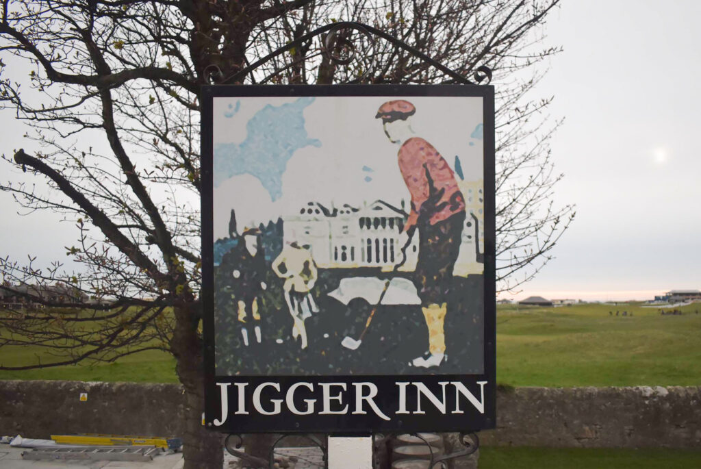
In March 2024, Jigger Inn’s refurbishment was nearing completion. The head of marketing at the Old Course Hotel, Will Grewar emailed me to ask about traditional hand painted signs. Jigger Inn’s existing double sided, exterior freestanding sign displayed a Photoshop effect illustration which transmitted a blurred and barely recognizable image.
Will included one older photo of the freestanding sign with a painted illustration which the current blurred image derived from.
It was time to revert to the original illustration and attention to detail. The objective was to replace the two panels with revised artwork replicating the painted illustration shown on the freestanding sign years before.
‘We would like the illustration to be bright and colourful’, said Will.
The result involved redrawing the illustration shown on only two available photographs of the original painted sign. We think the original painting was introduced around 2010 by an unknown signwriter. No scaled artwork was available.
I visited the site twice in April 2024. My initial meeting with Will and the hotel’s operations director, Sarah, outlined the Jigger Inn’s renovations, the history of the sign, and applications for the revised artwork. The plan was to replace the blurred image throughout all of Jigger Inn’s visual marketing. We discussed materials, durability, and indicative costs too.
I explained my approach and the materials I’d use to replace the two existing aged sign panels. Three millimetres thick aluminium composite would replace the existing signs. The substrate is rigid, relatively lightweight and can be painted. It’s a common material used extensively throughout the sign and display industry.
The freestanding signpost was sound however, after prising one corner of one existing sign, I discovered the framework behind it to be badly corroded. Rotting metal lugs which connected the panels to the post would need attention before new sign panels were attached.
Oil based signwriting enamels would be used for their colour saturation and exterior durability. I’d also mentioned the option of varnishing the painted illustrations once completed. In some cases, varnishing improves ease of maintenance for painted lettering and graphics. However, discolouration can occur. Testing the varnish on the enamels would be necessary before deciding if it would work.
I returned to my studio in Dundee and reflected on our meeting before sending my quote and lead time to Will. Will and Sarah approved my quote and a few days later, I returned to St Andrews for another investigative survey. Equipped with stepladders, I double checked the dimensions and had a thorough look at the encased framework.
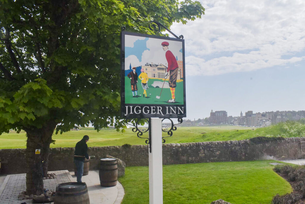
The late nineteenth century setting depicts a golfer carefully considering a putt, with the famous Swilcan Bridge and fellow golfers in the background. The Swilcan Bridge straddles the first and eighteenth holes on the acclaimed Old Course with the Royal and Ancient clubhouse in the distance, reinforcing the story and origin of the sport.
Will searched through archives and discovered another photo of the previous hand painted sign. Both photos of the original painting were taken from approximately ten metres away – each at differing angles. Most detail could be recognized in the photos, but the background areas were more difficult to define.
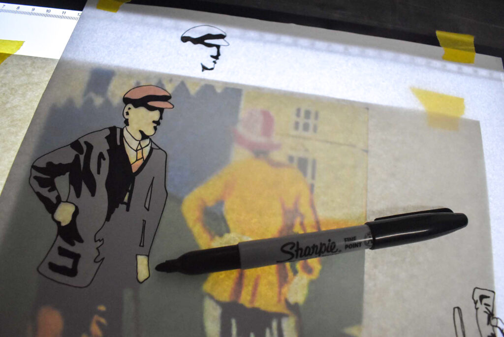
I had to decide how to redraw the photographic image to scale at approximately one metre in height and refrain from too much artistic license. I decided to avoid texture and not complicate shadows.
In my experience, it’s easy to overdo artwork. The brief was to replicate the original painted illustration as close as I could interpret from the photos.
Anomalies were also evident in the previous and existing fonts used on the signs. I recognized the fonts as variations of Goudy Old Style but both versions had been adapted. The Goudy typeface is a broad classic with countless mimics so determining which font to choose was Will’s decision.
I preferred to remain true to Goudy Old Style Bold, with no descenders. The downward stroke of the ‘J’ as well as the stylized diagonal of the ‘R’ interrupts a clean black border surrounding the illustration. In my opinion, the extended letters interfere with the sign’s black perimeter and diminish the impact of the illustration.
However, Will wished to replicate the lettering as close as possible to the previously painted sign which I accepted and understood. The lettering would ultimately appear on many different touchpoints throughout Jigger Inn’s visual marketing.
Both photographs’ perspectives were straightened to begin the redrawing process. Combining pen tracing, scanning, and digital redrawing, I pieced the illustration together on my signmaking software. The illustration would eventually be produced full scale as a perforated paper pattern, allowing me to transfer each coloured layer onto the two aluminium panels throughout the painting process.
The artwork was gradually digitised as a vector drawing. Vector artwork is infinitely scalable and provides the sharpest output available. As such, the illustration can now be replicated by third parties for countless mediums ranging from website pages to embroidered garments.
This stage of detailing took approximately fifteen hours. The more elements I could segment into layers, the simpler the colouring process would be with a brush.
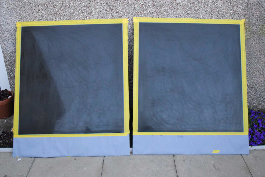
During the digital drawing phase, I was also building coats of paint on two black aluminium composite panels. I wanted an opaque white background to layer the colours on top. This part of the process lasted around one week with five coats of oil based paints providing a crisp white canvas.
After taking longer than I’d anticipated drawing the scaled artwork on my signmaking software, I was satisfied and e-mailed the vector artwork to Will. He was over the moon with the result. It was time to transfer the line drawing.
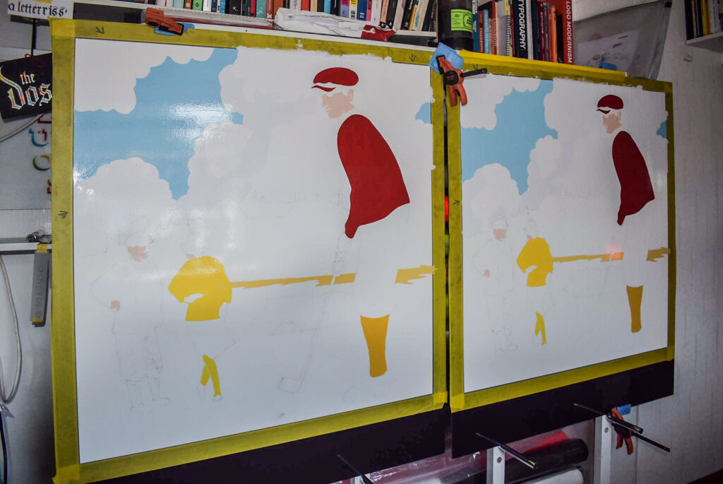
Pounce patterns were made, and sections were transferred onto each white rectangular canvas. I didn’t want the entire line drawing transferred initially because most of the large areas of background (the sky, the grass, the R&A clubhouse) would obliterate the detailing for the smaller amounts of colour.
I’d underestimated the extent of the colour palette. In addition to the necessary multiple coats of enamels to make each colour solid, the painting began to stretch my days and evenings. I’m always juggling several projects at once and my underestimation resulted in my overcommitting to scheduled projects. I called my dad and asked for his help.
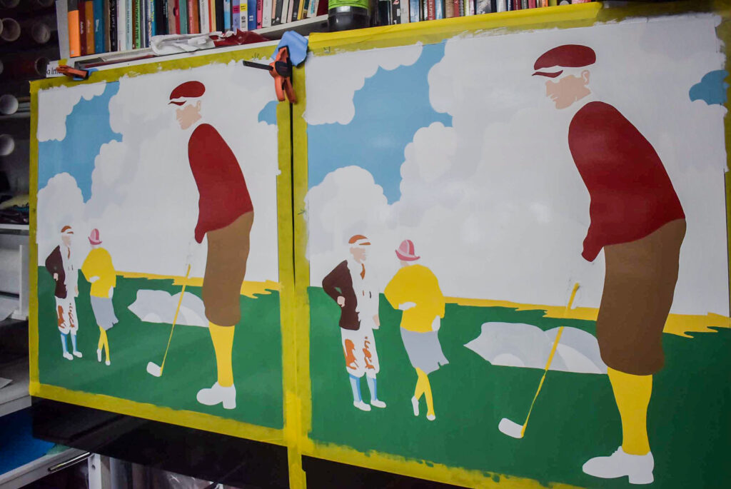
Two pairs of hands sped the process. We spent a couple of days in my studio, weaving back and forth, mixing paints, coating, and recoating. The pace of the painting depended on drying times and solid colour. One of the reasons I use only bonafide signwriting enamels is due to their properties for good flow and opacity. Decorators’ paints don’t cut it.
With my dad’s assistance on a third consecutive day, we were approaching the end of the colouring in. I had planned to begin the black outlines the following day, but I wasn’t pleased with the colour of green. Will wanted saturated colour but I felt that the green looked too muddy. I hadn’t nailed the colour mixing for this segment and frustratingly recoated that evening.
Following approximately ten days of layering paints, it was time for the black outlines. With my trusted Kafka number two brush, I carefully defined each area where black was apparent. Not everywhere. Just the right amount to separate and shadow areas around the golfers and building.
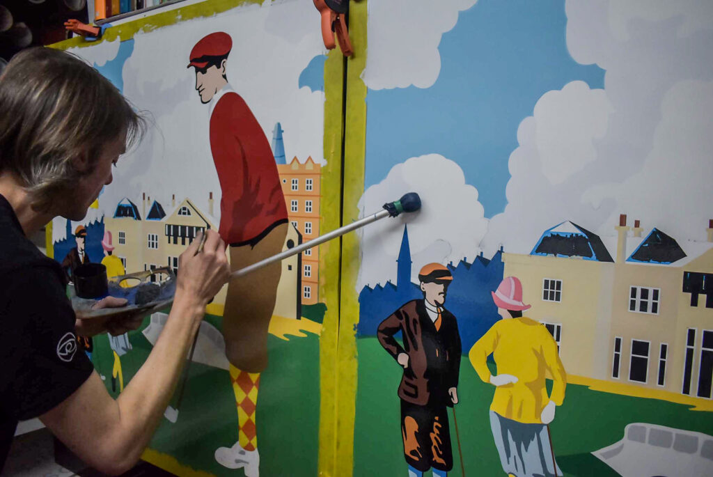
Once the illustrations were completed, it was time to letter the signs. Two coats of white enamel were painted on each panel. I worked quick – the signs were planned for installation the following day.
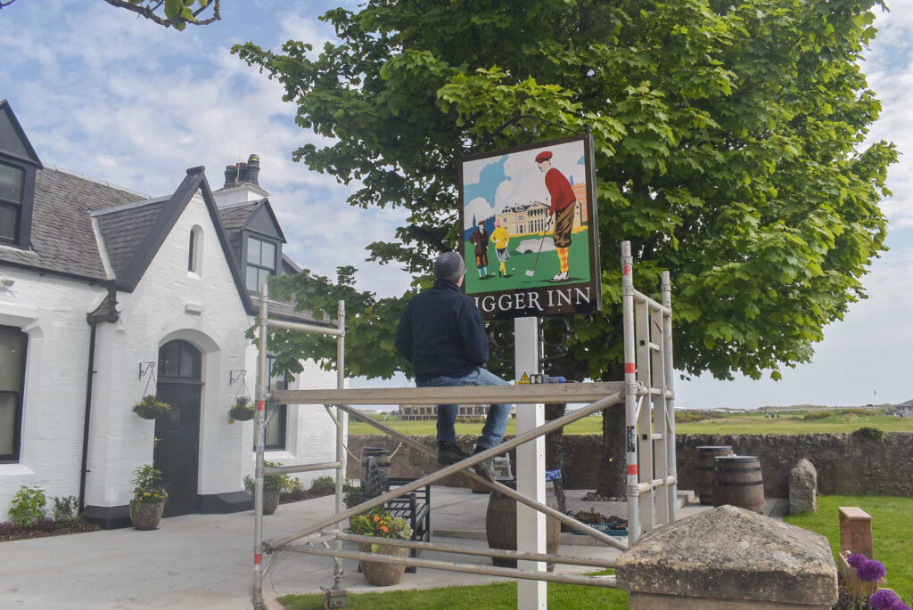
John Rennie fabricates and installs most of the exterior signs I provide. We’ve worked together for around fifteen years. John is a superb tradesman. We have a mutual understanding of process, finish, and professionalism. I met John at the Fife side of the Tay Bridge before we travelled to the site with my tower scaffold.
It was a bright and very windy morning. Typical links conditions. After assembling the scaffold, we removed one side of the existing signs before doing small repair work on the metal framed lugs.
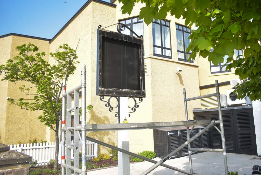
John drilled each sign around the perimeter and with my assistance, he pop riveted the first sign onto the frame. Guests at the Old Course Hotel were already complimenting the new sign and one friendly American kindly offered to purchase one of the old signs as a memento.
His friend advised him of their airline’s luggage restrictions before John and I proceeded to repeat the replacement of the second side of the freestanding sign. At last, the project was complete.
Driving home, I was glad to end the weeks long project. The result was worth the long hours and commitment. Will and Sarah were also pleased to see the new sign standing proudly in front of the renovated Jigger Inn.
Famed across the planet and revered by every golfer, the sign has become a landmark and a selfie hotspot.
Get in touch to discuss your hand painted signs.