
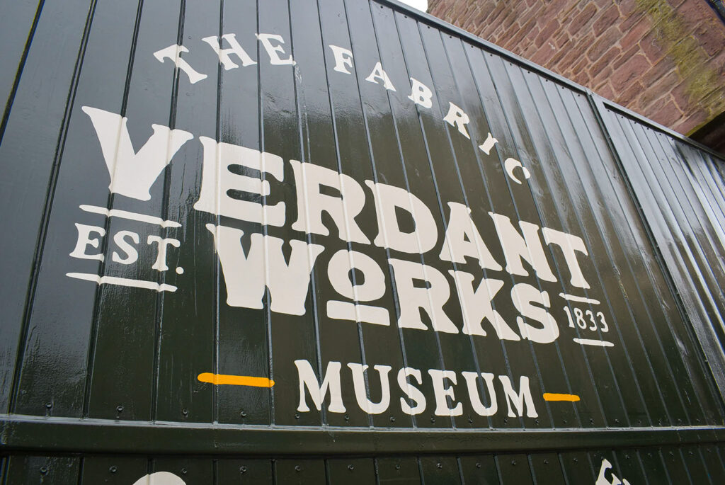
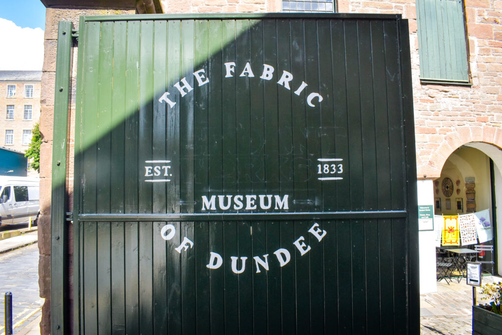
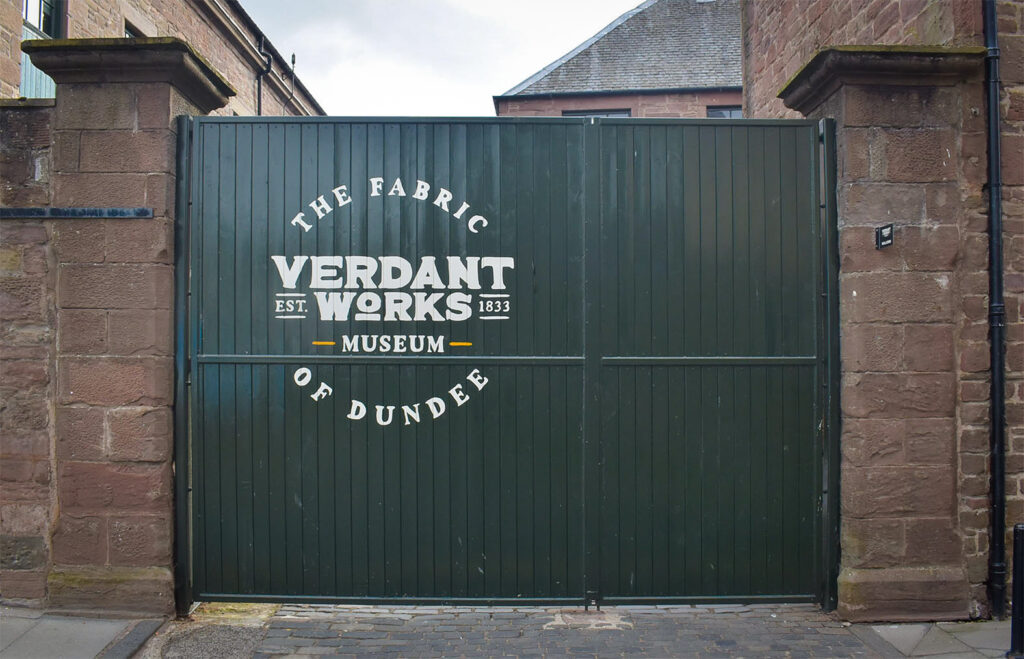
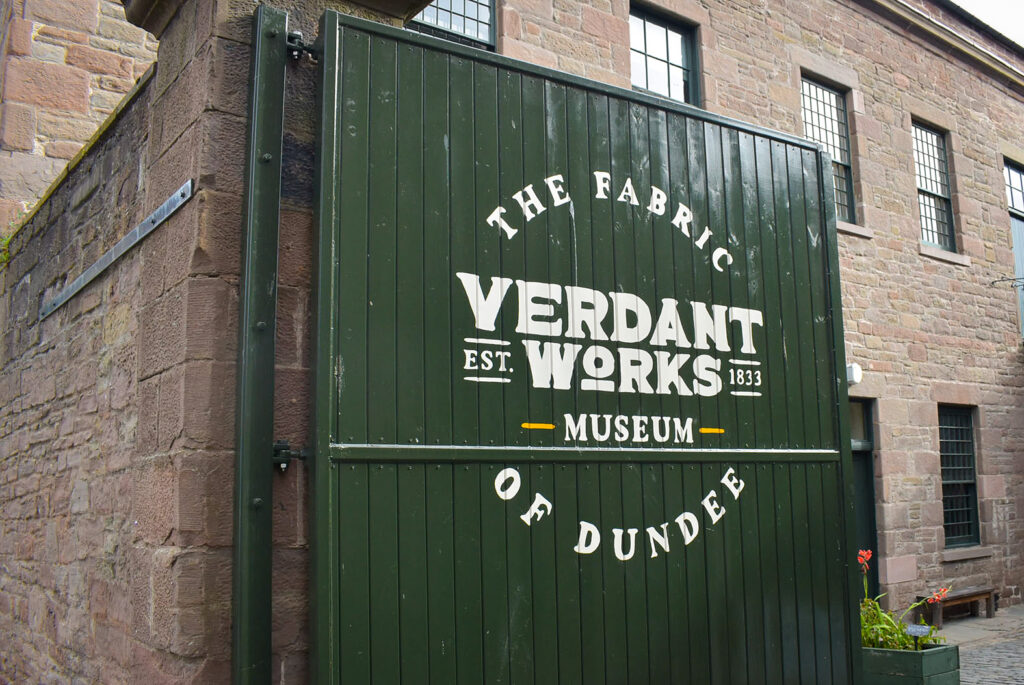
Hand painted lettering was a natural choice for Verdant Works’ new gate.
Before the visual identity relaunch of Dundee’s famous jute mill, the visitor attraction’s new gate needed a sign. Not only in keeping with the era of Verdant Works’ environment, hand lettering was also a perfect fit for the new logo and the gate’s tricky surface.
Signwriting on the iconic entrance gate’s wooden planks is an integral and permanent contribution for the reinvention of the brand.
Located in the centre of the city’s old industrial area, the old mill was renovated and converted into an attraction in 1996. The sprawling building tells a story of Dundee’s industrial legacy.
It’s a museum, a venue, and a snapshot of the past. The attraction, which contains restored mill machinery, artefacts, and archives, educates visitors from all over the world. The Victorian building is a time tunnel into Dundee’s rich social history.
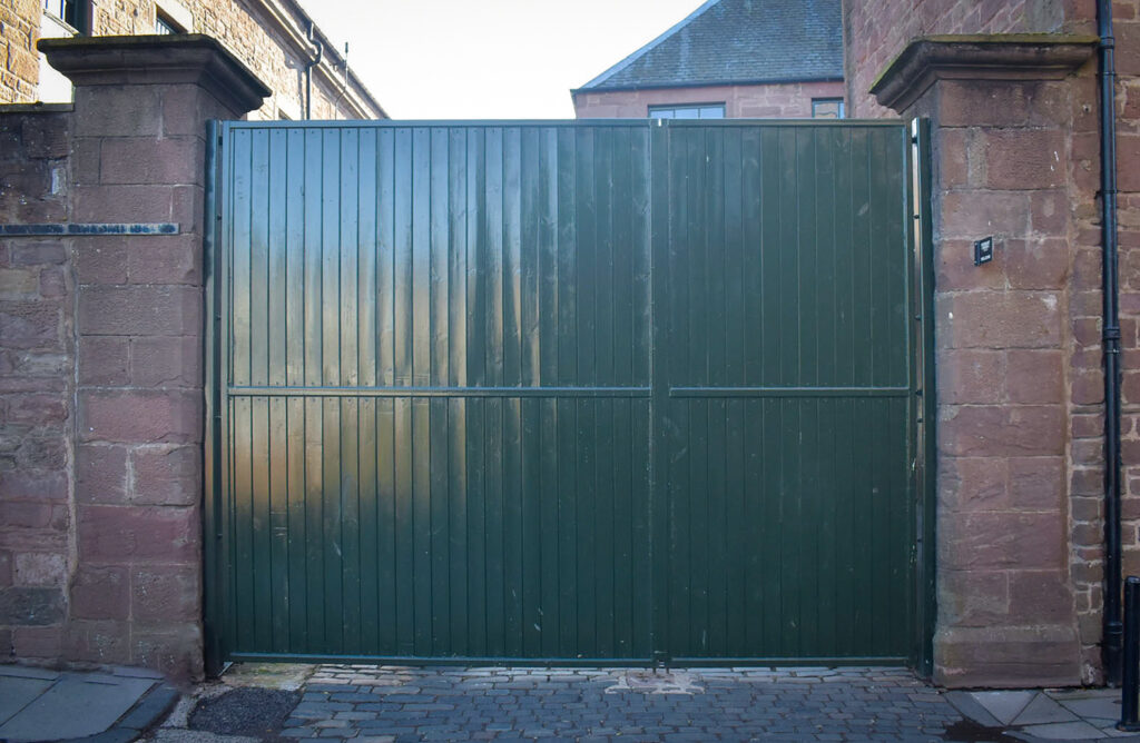
The traditional courtyard gate is the main entrance to the museum. A narrow cobbled road invites visitors into the yard and atmosphere of 1880s Dundee. The gate’s sign was previously hand lettered with a traditional serifed font. The lettering was sharp and tasteful but beginning to look tired. The entire visual identity deserved rejuvenation.
In spring 2024, head of marketing for Dundee Heritage Trust, Julie Cumming emailed me. Julie shared details of Verdant Works’ new visual identity and explained the gate was to be replaced. A new gate was in fabrication and Julie asked for my advice.
We discussed the possibility of painting the new logo on the gate, as well as size and placement. I recommended choosing gloss enamels and explained the availability of colours in addition to the paint’s durability. At this early stage, we agreed to keep in touch and meet on site once the new gate was installed.
Verdant Works’ rebrand was designed by Allegro Creative Agency. Following feedback from extensive interviews with visitors, stakeholders, and employees, the new visual identity incorporated hand drawn lettering on printed products, exterior signs, and the updated website.
Another local signmaker supplied wayfinding and exhibit signs whilst I concentrated on replicating the logo for the gate.
Julie and I met in the summer of 2024 to inspect the newly installed gate before its iconic dark green painting was complete. We discussed colour matching the enamels to the printed products’ palette and agreed on the size and position of the logo.
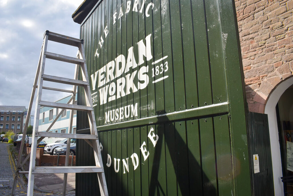
Dome headed screws, flat steel bars, and the pesky chamfered grooves between the gate’s wooden planks would hinder the flow of my brushstrokes. However, I was confident the obstructions wouldn’t detract from the type’s legibility or overall impact of the entrance sign.
Once I’d scaled Julie’s artwork at the dimensions we agreed, I made a perforated paper pattern (a pounce) to transfer the logo onto the gate. The pounce was in three segments for easier handling, which was a godsend due to windy conditions on the day of application.
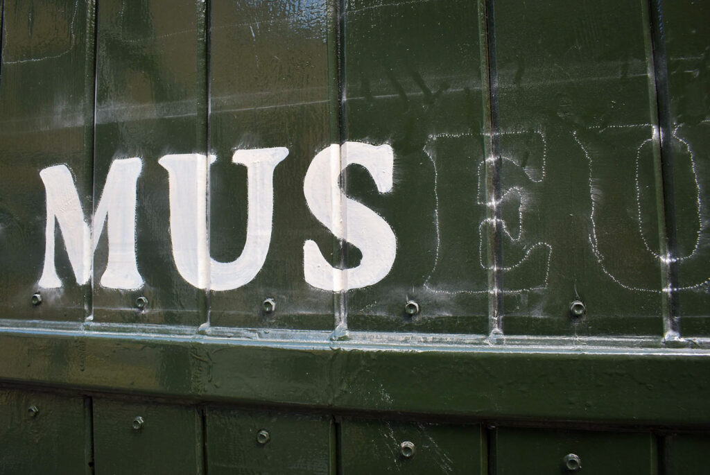
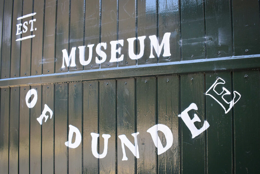
With my pattern transferred, I washed my brush and thinned a light ivory enamel to begin at the top. The rough drawn letters were forgiving but the grooves in the planks were an immediate challenge. Each portion of lettering which overlapped the chamfered edges was carefully painted, stitching individual letters together.
With the sun rising and visitors arriving, I found a steady pace signwriting each portion of the logo. ‘The fabric of Dundee’ was painted first. I expected at least two coats to make the light ivory opaque. A first coat of paint on the smaller lettering allowed me to second coat later in the afternoon.
Once the circular and secondary lettering was painted, I started on Verdant Works. The larger areas of ivory over the planks’ angled edges were quicker to join and inevitably, the paint ran down the seams. I had to keep the enamel thin for workability especially due to the strong breeze that day. Working in windy conditions feels frustrating and makes a job more challenging when handling a writing brush.
The force of the wind reduced later in the afternoon, and I thought there might be an opportunity to second coat everything that day. I’d already started coating the smaller lettering and I was satisfied with the finish. However, the runs between the planks were hard to avoid.
I was cold and fatigued by around 6 pm. My fingers were freezing, the gate was locked for the day and I decided to return the next morning to complete the project.
Arriving at the gate around 7 am, I zipped my jacket and steadied my stepladders on the cobbled road. Low temperatures adversely affect signwriting enamels. Paint must be thin for good flow and to prevent dragging. In turn, thinner paint reduces opacity. This equates to more coats to make larger areas of light colours solid – especially on dark backgrounds.
This visit lasted longer than I’d expected and I was happy to see the final stages of progress. The artwork was nearly there and lots of people complimented the new sign.
I cracked the lid off of the tin of dark green paint and lashed it over the streaks of ivory, obliterating the paint runs and tidying some furry edges.
Everyone involved with Verdant Works was eagerly awaiting the new artwork. The sign marked a new era for the building and Dundee Heritage Trust.
Julie was over the moon: The gate looks fantastic! Everyone’s so happy to see the new branding in place.’
Get in touch to discuss your hand lettering project.