
An improved logomark, modified type, and hand painted lettering upgraded a refurbished shopfront for independent retailer, Book Attic in Dundee.
Distinctive signs immediately gained positive attention from curious passersby and new customers, proving the value of tastefully executed design.
In 2021, Duncan Lyndsay opened his pre-loved books shop on Perth Road in Dundee’s west end. His mission to reduce his collection of books and slow down a busy life evolved into a steady business.
Duncan admires the craft of traditional hand painted signs and contacted me for advice. We spoke at length about his new enterprise, marketing ideas, and our shared love of books.
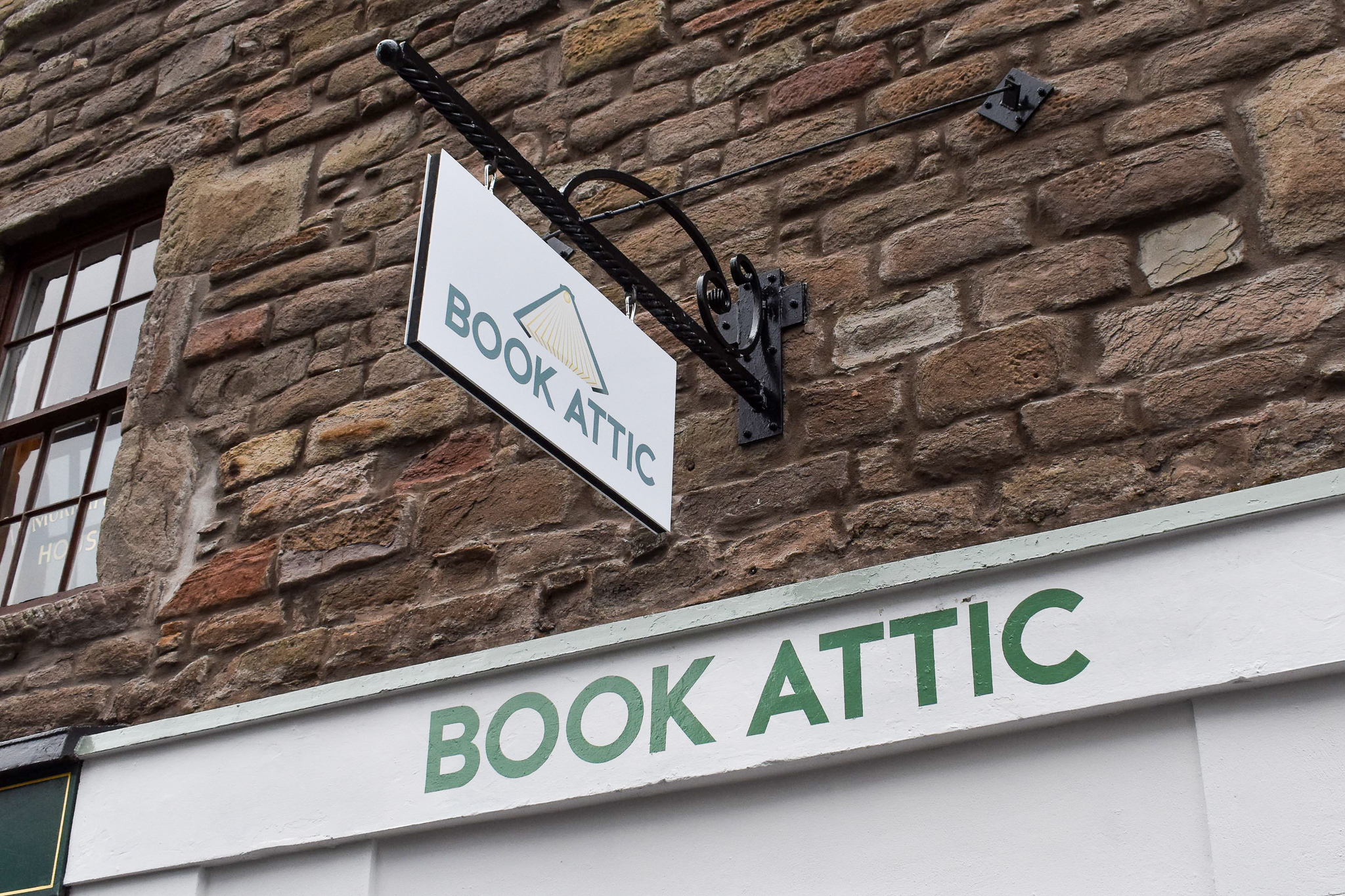
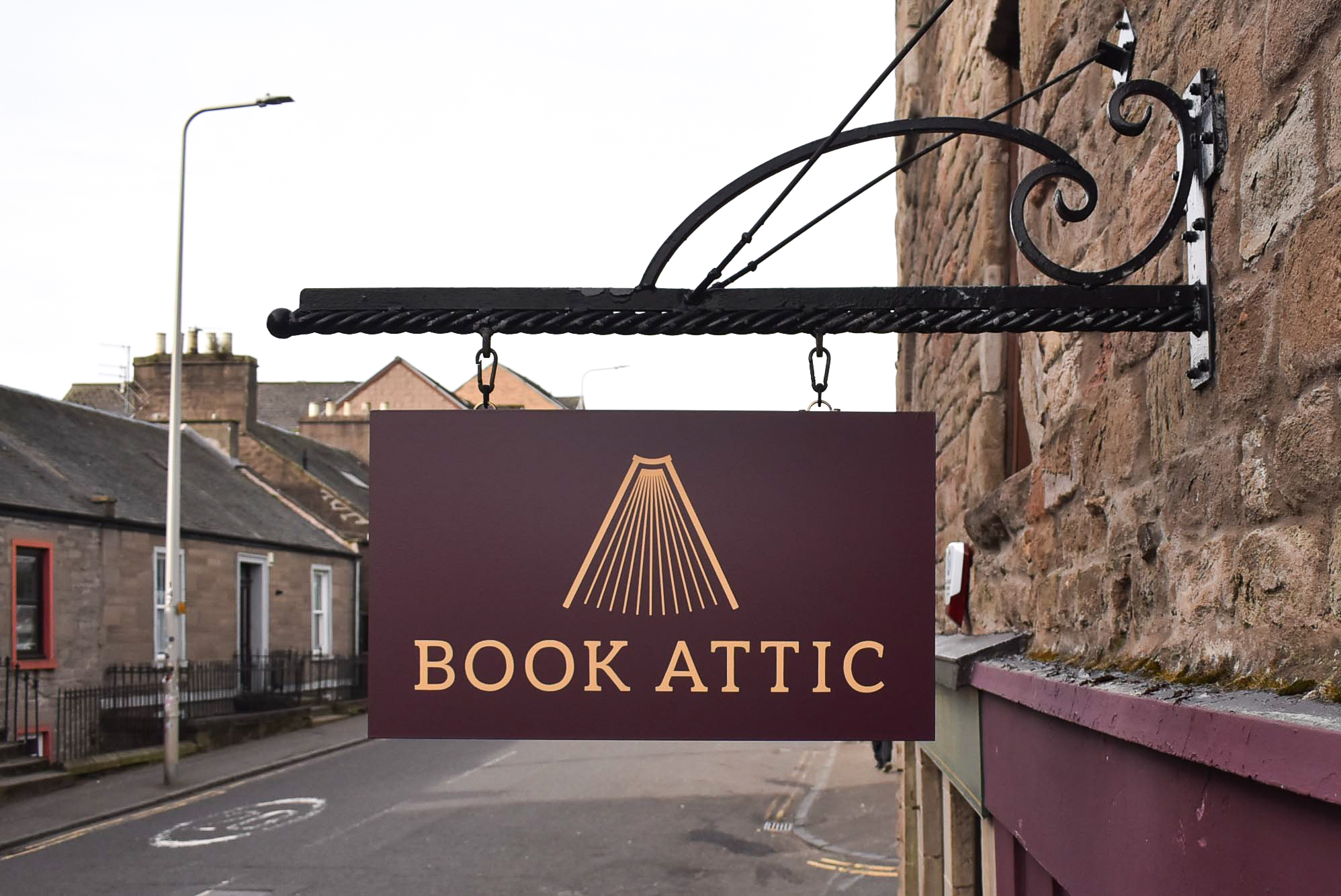
I designed a logo for Book Attic, as well as supplying and installing a double sided hanging sign. The shop fascia was hand lettered too. Duncan was delighted with the result of the 2021 project.
In late October 2025, Duncan phoned to tell me his shopfront was repainted. The original hanging sign was still in situ and in need of replacement. Signwriting the fascia was necessary too.
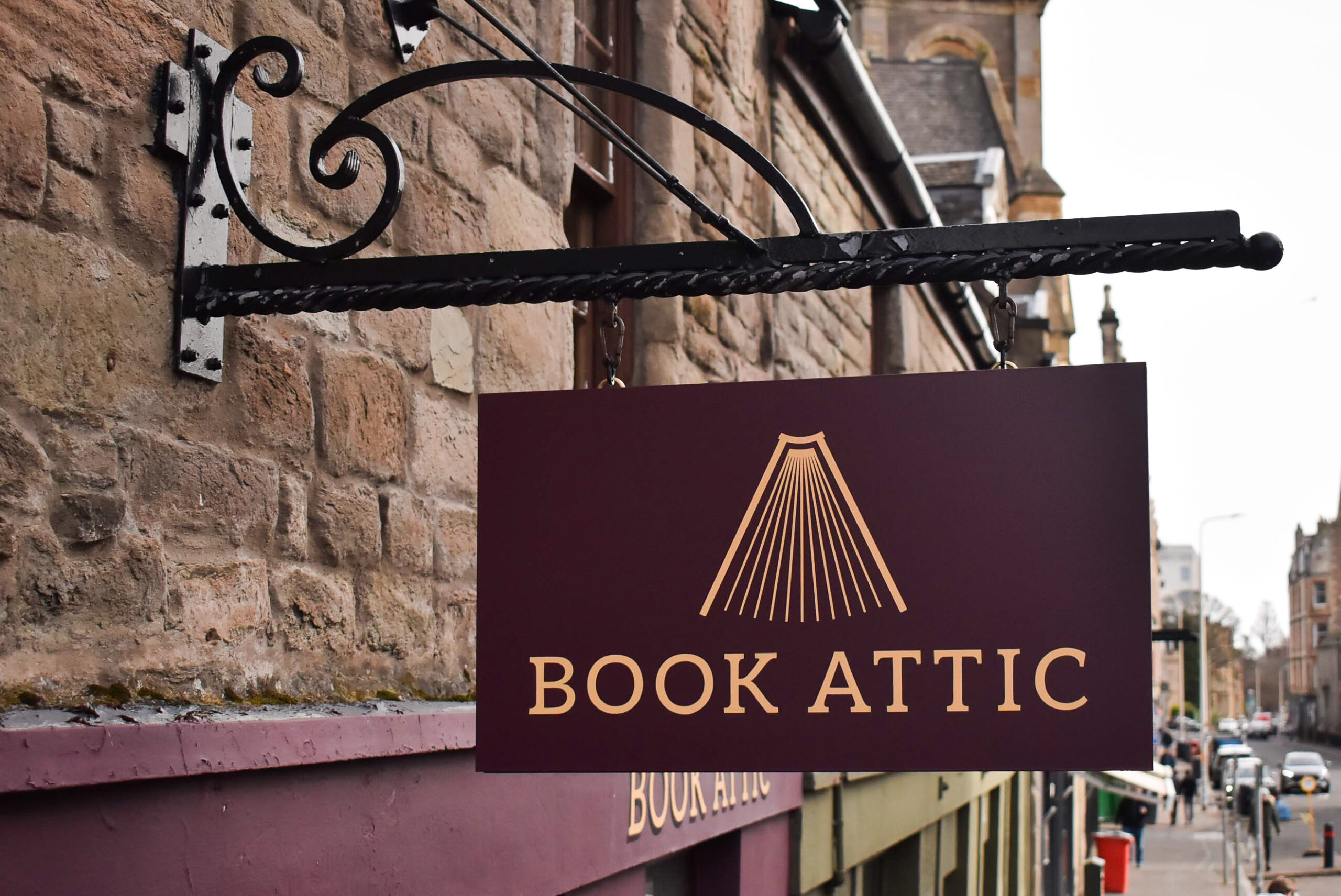
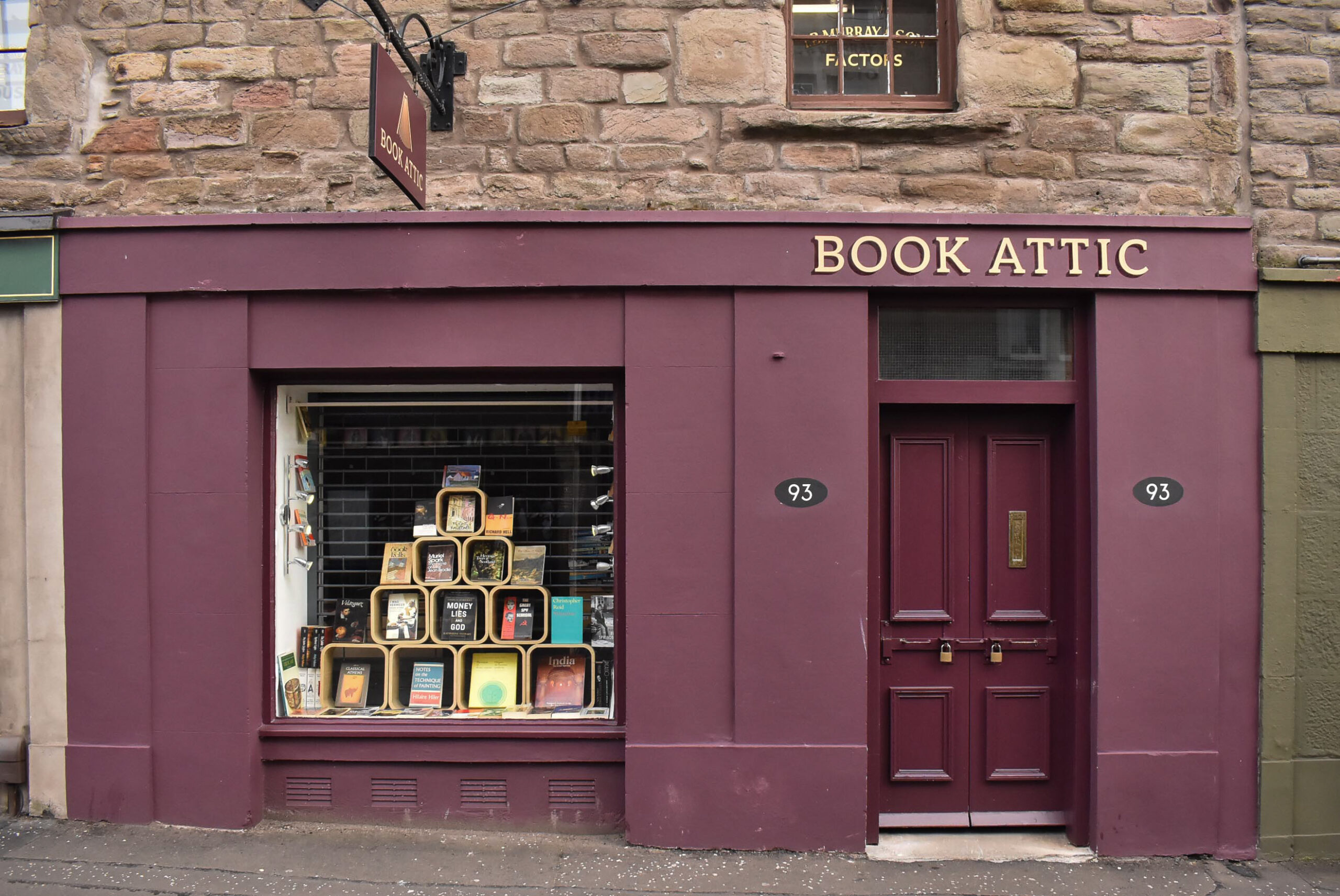
Winter was approaching fast. I visited Book Attic for photos and measurements before committing to dates for the new project. The shopfront was neatly painted with two shades of burgundy, conveying a sophisticated look for Duncan’s established business.
Revising the signs’ design occupied my thoughts. I started sketching ideas that evening.
The logomark combines an open book, as well as the interior space of an attic. The concept satisfies me; however, I think the 2021 version looks clunky and overworked.
Simplifying the graphic elements would strengthen the logomark.
Over the following weeks, I sketched iterations, gradually reducing and altering the shape. My sketches were then digitally replicated and resized until I was happy with the logo’s form and its relation to the type.
Most often, I embark on an identity design project by first considering typefaces and lettering. In this instance, the troubling logomark took the lead. I realised the logo development would influence my choice for the accompanying letters’ style.
My initial sketches of the lettering presented spacing issues with the double O and double T. I wasn’t pleased with the imbalanced pockets surrounding the letters.
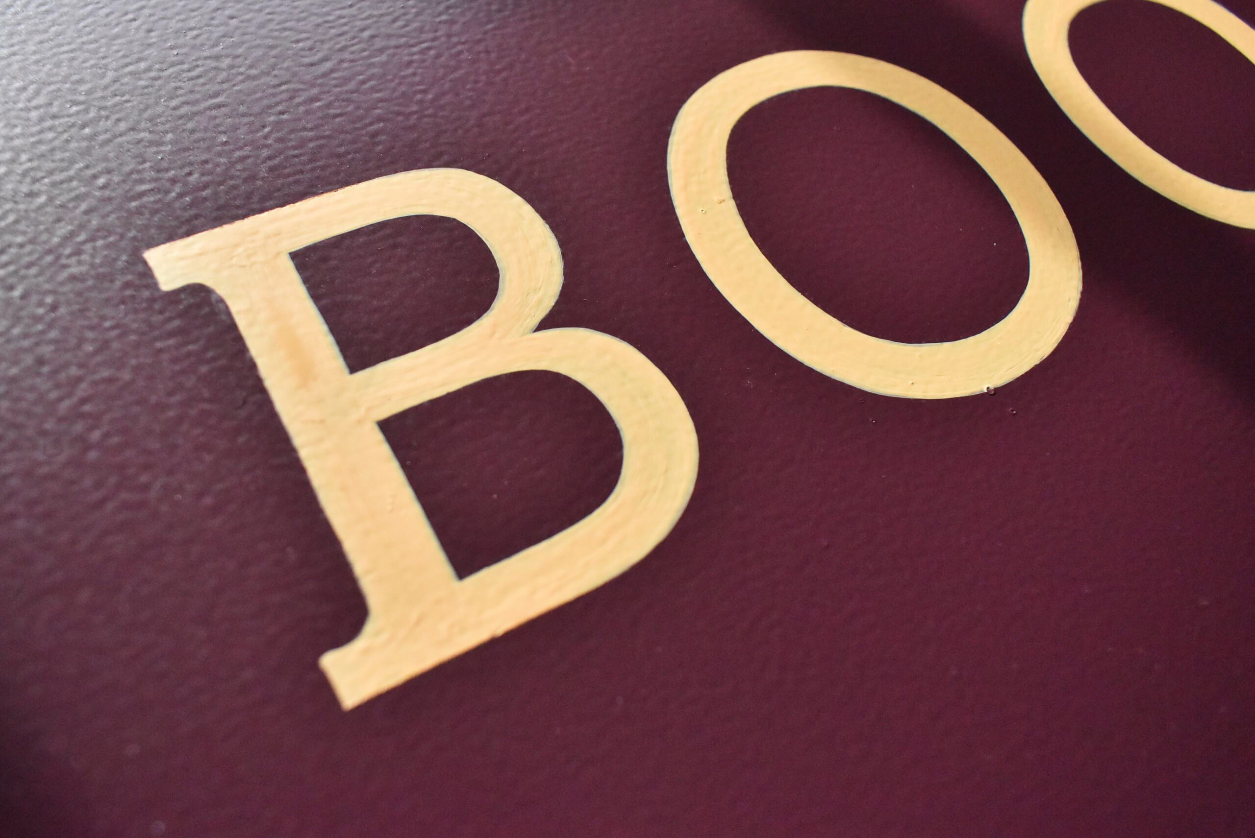
Turning to my vast collection of typefaces for inspiration, I eventually chose a font with the right amount of weight, which would display the feeling I wanted the signs’ design to convey. The font also paired well with the direction I was going with the simplified logomark. However, the font’s serifs bothered me.

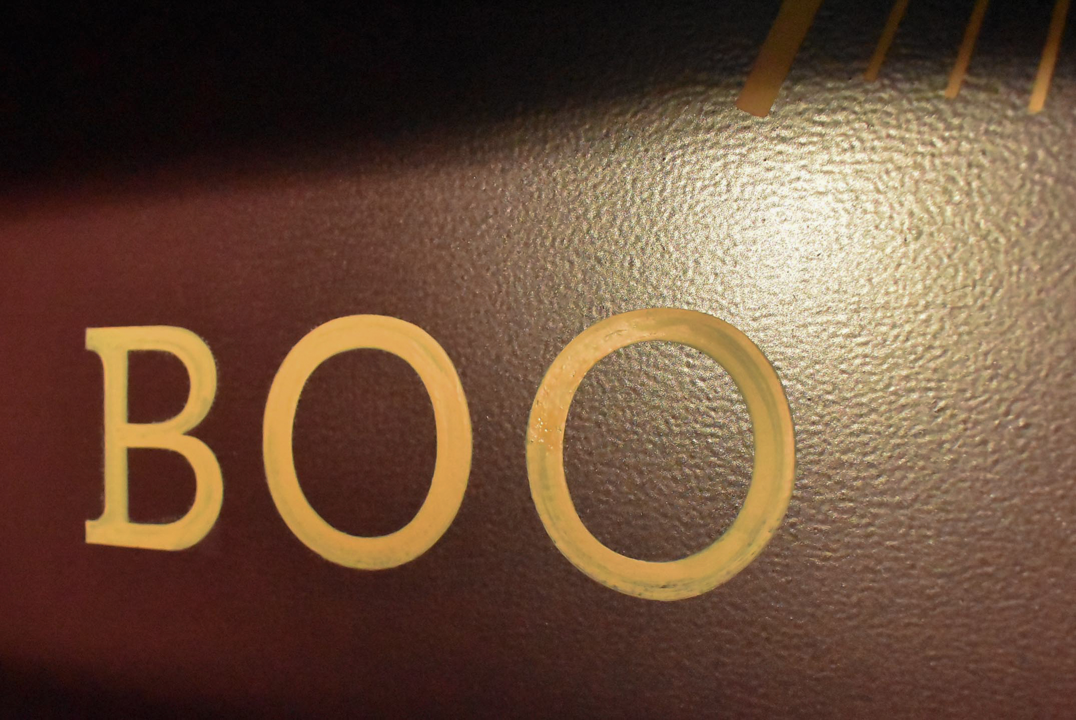
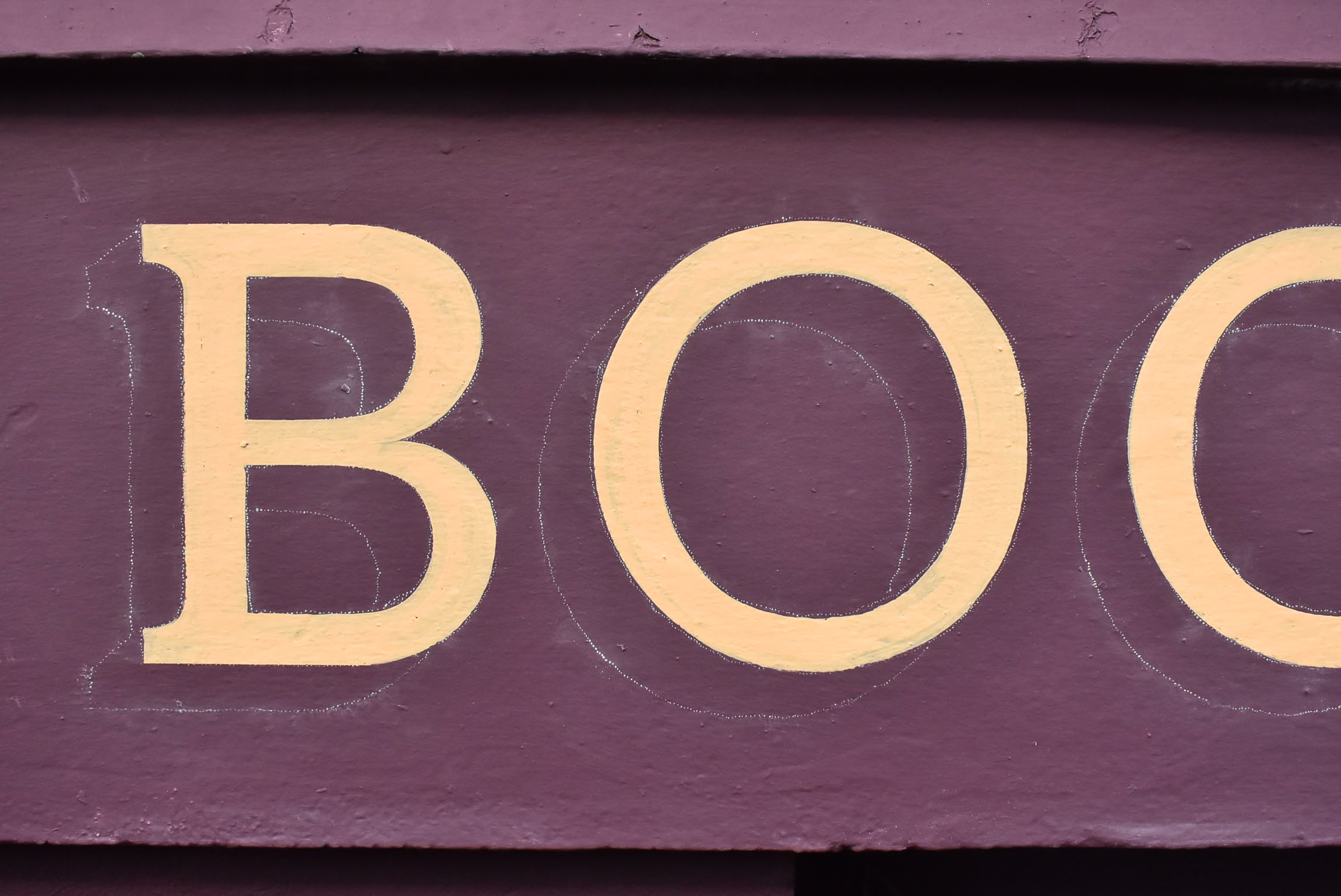
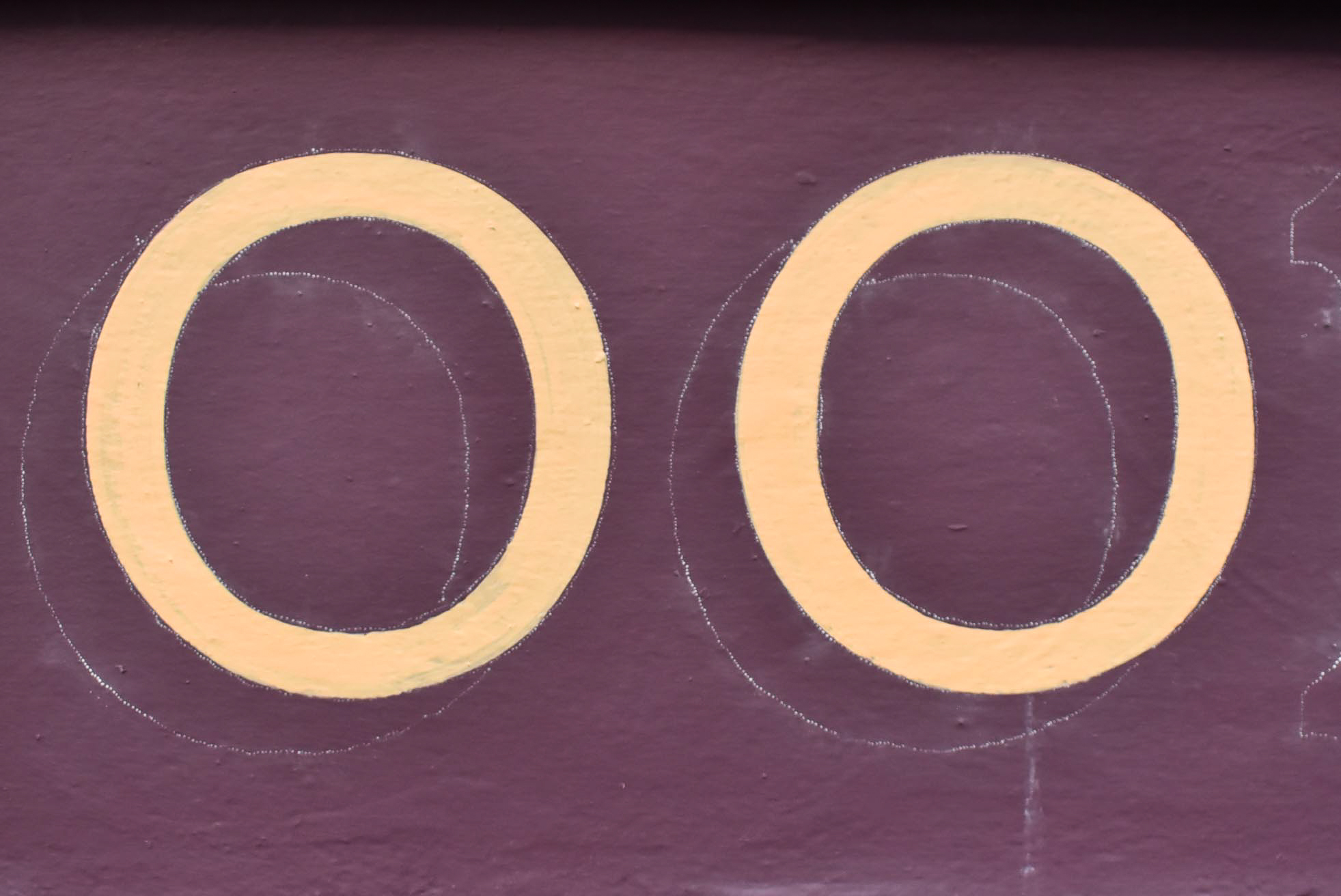
The original radius on the tops of the clubbed serifs made the letters appear too soft. Converting the curves to angles anchored the letters, resulting in a visibly firmer base than the original serifs.
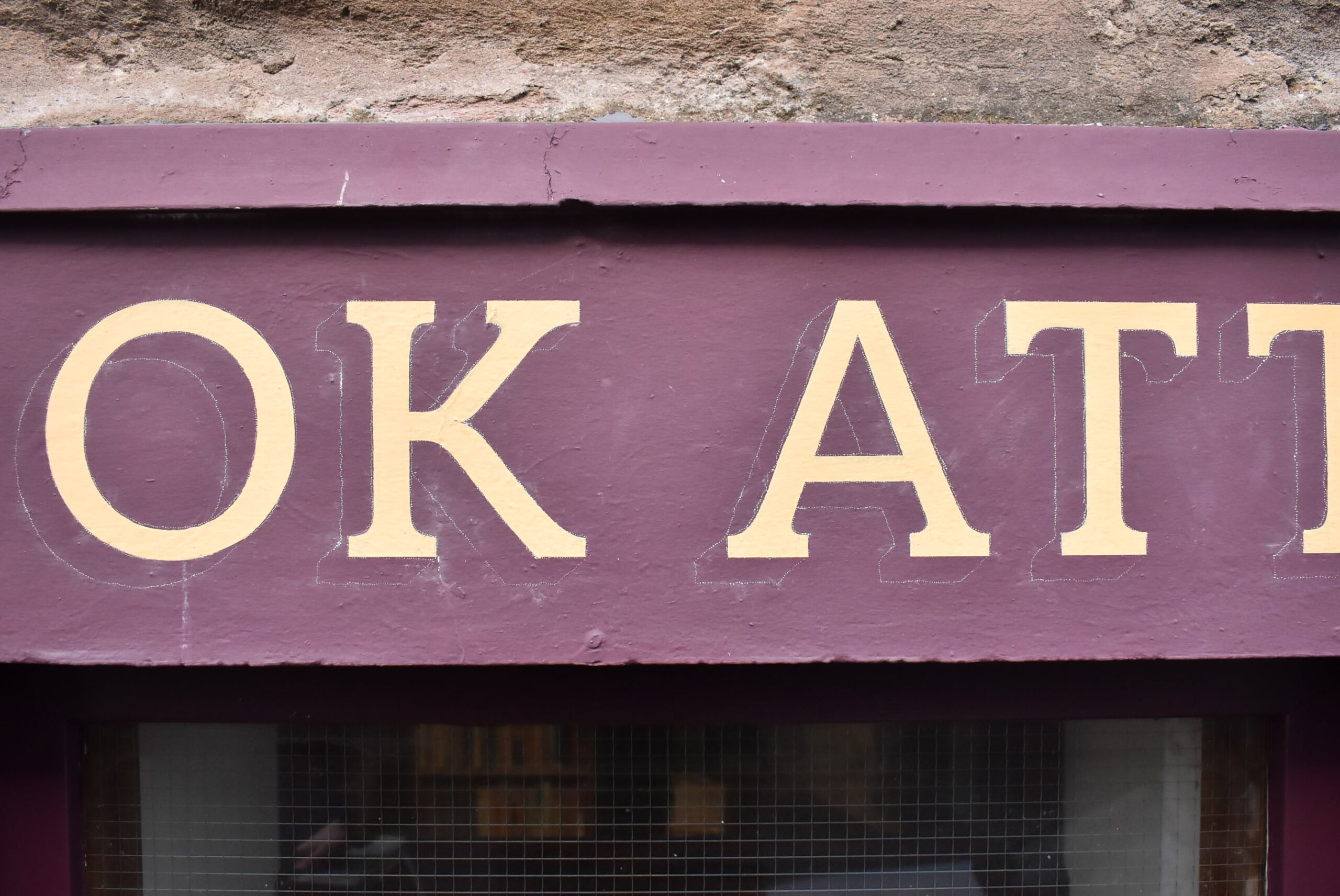
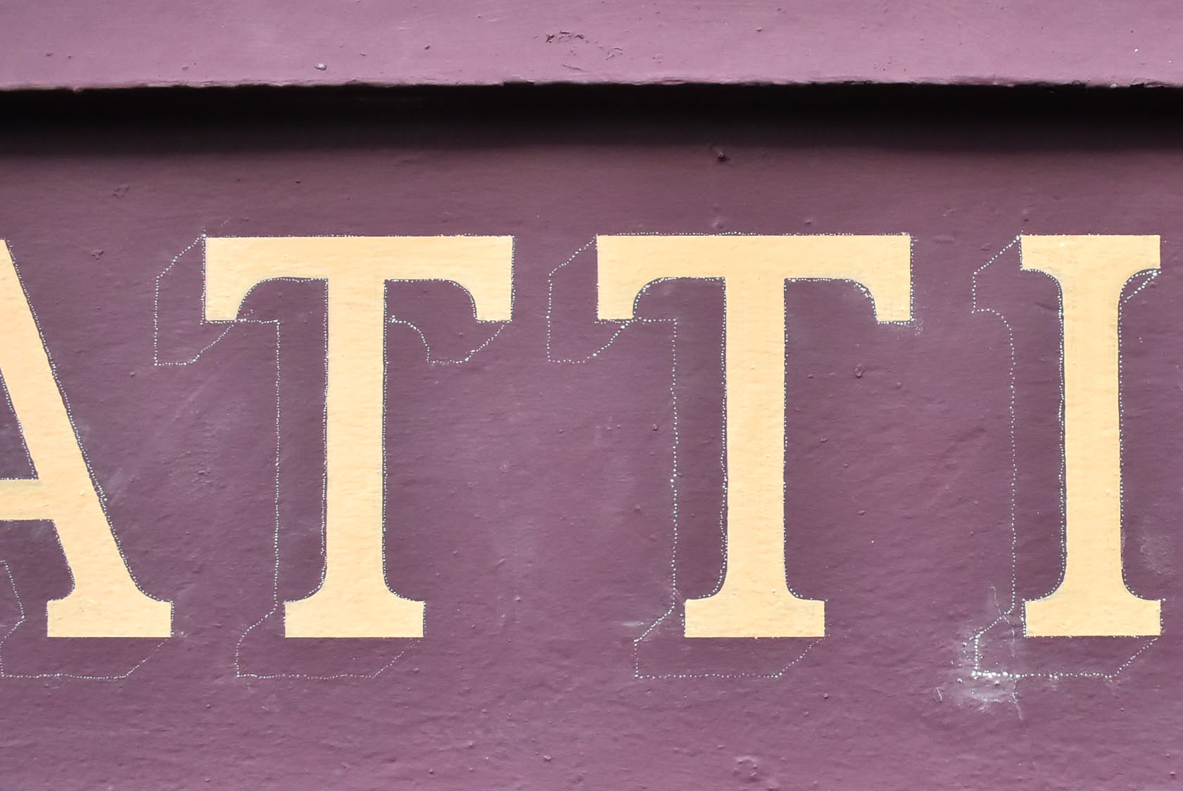
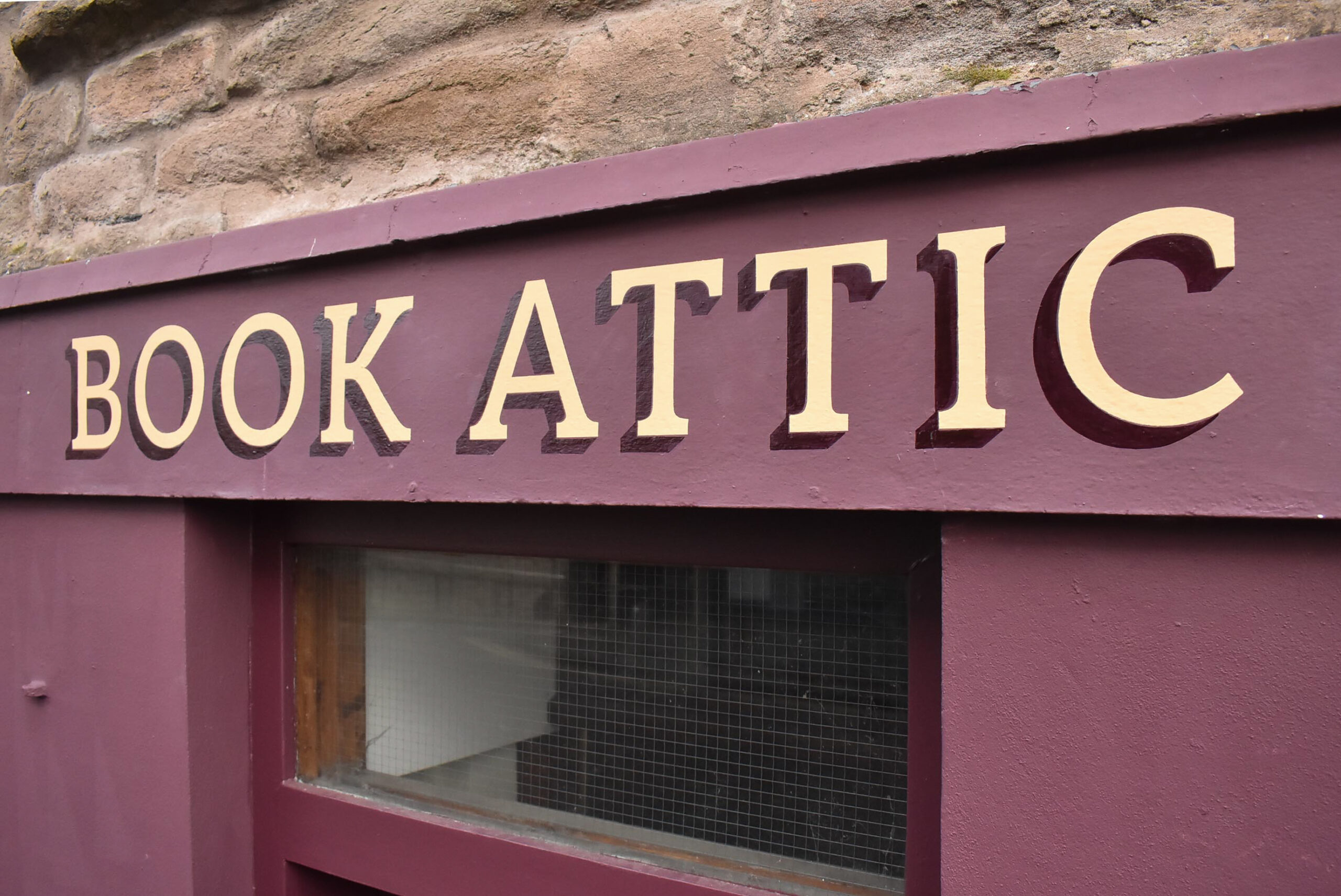
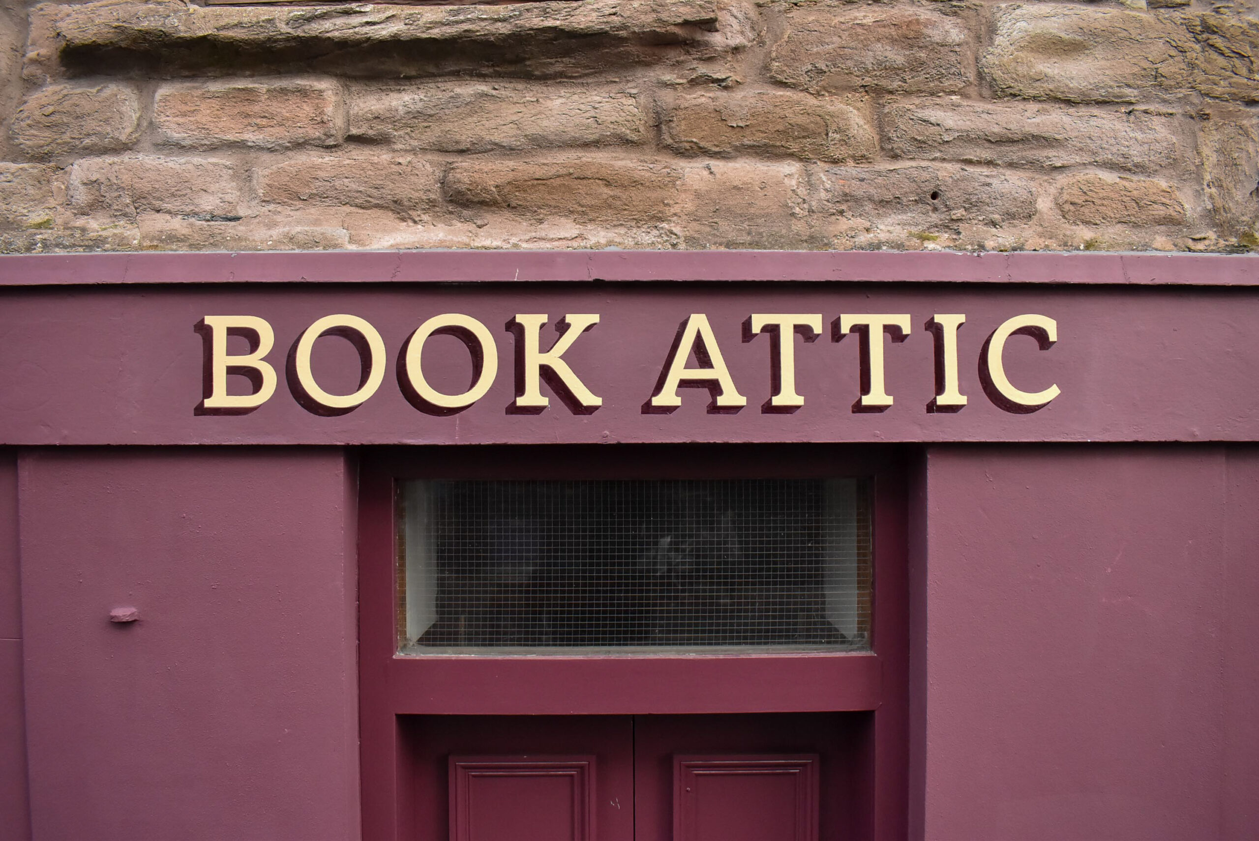
I carefully adjusted the spacing between letters, improving the balance of the negative area caused by the stems of the Ts and the closed counters of Os. The modifications to the rhythmic spacing pleased me. At this stage, I knew the hand lettering would pop on the narrow height fascia.
Duncan asked me to recommend a contrasting colour for the lettering. I visited the shop again with three tins of enamel containing metallic gold, metallic copper, and a rich imitation gold. The latter would dry to leave a matt finish.
I had not long received delivery of a new tin of metallic copper, and its sparkling brilliance twinkled in my eyes. The lush glimmer was attractive, but I was unsure how legible it would make the lettering.
We sampled my enamels outside the shopfront. Both metallics’ visibility performed poorly in the busy street’s exterior shade. We agreed the rich imitation gold was most appropriate.
Nowadays, I rarely choose to add shadow to lettering design. Most often, I format type and create lettering within a broader visual design system for my clients’ reproduction across various media. Embellishments can hinder legibility and complicate production, especially at very small sizes.
Duncan requested a shadow for the fascia signwriting, and I was happy to oblige. I considered a two-tone drop shadow and pondered methods for blending the shade on the masonry fascia. A shadow behind the lettering on the hanging sign would not be added, as the shadow would optically interfere with the stacked logo design’s hierarchy.
I sent an email to Duncan containing mockups of my proposed designs in addition to my quote. There was no reply for several months, so I shelved the project.
Duncan phoned me in late February 2026 and asked if I’d received his emailed approval to proceed. With winter ebbing away, I was happy to schedule production of Duncan’s signs, and I reviewed where I’d left off.
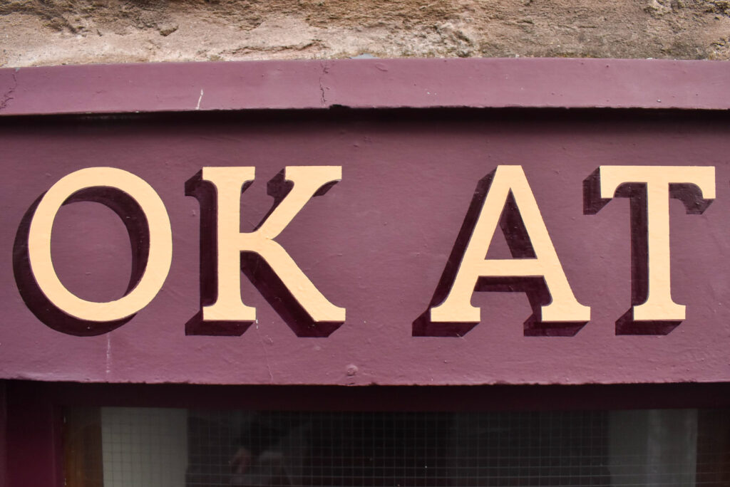
The wrought iron projecting bracket and hanging sign, in addition to books displayed behind the window, cause visual stimulus on the left half of Book Attic’s shopfront. As such, I decided to position the lettering above the entrance door. The height of the lettering, including its depth of shadow, was determined by spacing adjustments and my wish to centralise Book Attic between the entrance pillars.
My attention to the size and positioning of the lettering communicates the tone of Book Attic’s identity. The lettering is understated and doesn’t cram the shopfront. The rich imitation gold and deep burgundy shadow provide the necessary impact to catch attention without screaming on the Perth Road.
Similarly, I adjusted negative spacing surrounding the logo and lettering on the projecting sign. Just enough to allow the words and logomark to breathe. The size of the replacement double sided sign was slightly increased to accommodate my revised design.
3mm thick aluminium composite panels were cut from my stock, then edges were deburred, and faces sanded before two coats of primer. Three more coats of Duncan’s supplied satin finish burgundy paint were rolled on after sanding between each coat. The painted panels were solid after two days and ready for transferring my scaled pattern.
A core panel was also cut out of 19 mm thick black foam PVC. I make projecting signs deliberately heavy. Doing so reduces swing in high winds, and the 19mm thick core enables long screw fixings into the top edge.
Gradually, the faces were hand painted with three coats of matt finish imitation gold. The logo looked splendid.
Sourcing clips for the top edge of the hanging sign involved some legwork. I visited four distributors before returning to the first one, then settling on using clips from the last distributor I visited.
My preferred method for manufacturing and installing this type of sign requires four 80mm screws to tightly grab the hanging panel. The lugs on the underside of the projecting bracket are perpendicular to the top edge of the sign. These caused a small hurdle in attaching the sign to the bracket. Extra time was necessary to find safe and durable fixings.
Hand lettering the fascia lasted over a breezy weekend in March. With my jacket zipped up, I took time to position my lettering pattern before transferring it onto the fascia. I wasn’t happy with the first result, so I wiped off the chalk and reassessed my measurements.
The chalk was pounced through the repositioned paper pattern, and Bingo – I was happy. It was time to start signwriting.
Most of Saturday was spent up and down my stepladders, coating the lettering twice. The fascia surface appears smooth, but it was causing some furry edges on my brush strokes. The wind continued to thicken my enamel, and I pulled my brush slowly to produce clean lines. It was time to shadow by early afternoon.
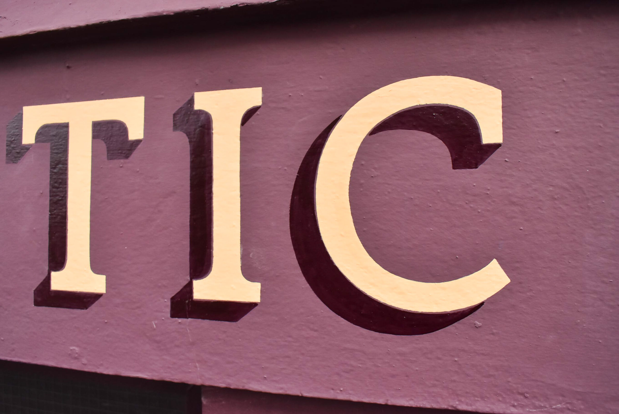
Throughout the type modification process, I envisioned adding a deeper shade of burgundy for the shadow. I prefer to shadow lettering with a darker shade of background colour. Doing so results in a realistic shade which doesn’t compete with the lettering.
That morning, I’d added several tins of blue and red enamel to my signwriting kit before leaving my studio. Along with tinting black, I presumed I could mix a deep plum colour. I was wrong and accepted defeat after half an hour mixing small quantities of paint, nowhere near resembling plum.
Feeling slightly despondent, Saturday’s painting finished with coating the pillars’ black ovals. I drove home and later phoned my dad to explain my shadow paint problem.
On arrival at Book Attic around 8:40am, I was pleased to receive a special delivery. My dad was waiting outside and handed me two tins of burgundy enamel – one was a ‘doctored’ colour from a previous project. Lifesaver.
After a brief chat with my dad about his signwriting class in DCA that day, I tinted his doctored burgundy and flattened it with an additive. The flattener reduces gloss in oil-based enamels to leave a satin or matt finish.
The paint was gloopy and continually thinned for adequate brush strokes. Slowly, I coated around each letter before signwriting the geometric ‘93’s on each of the pillars’ ovals.
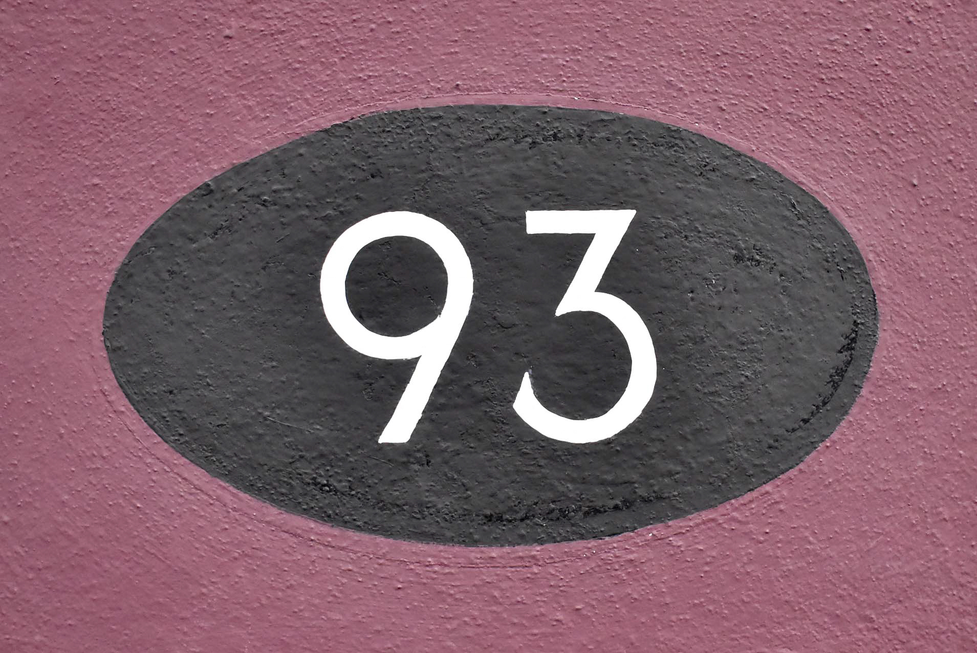
The following morning, I returned to coat the imitation gold a third time and coat the numerals a second time.
Duncan and I spoke two weeks later. He was very happy with the outcome and noticed an increase in new customers. The local community council also commented favourably on choosing traditional signwriting on the Perth Road.
Contact me to discuss your shopfront signs in Dundee.