
The St Andrews Golf Club commissioned signwriting on two bespoke honours boards. Hand lettering pays homage to club members who have won international golf tournaments dating to 1861.
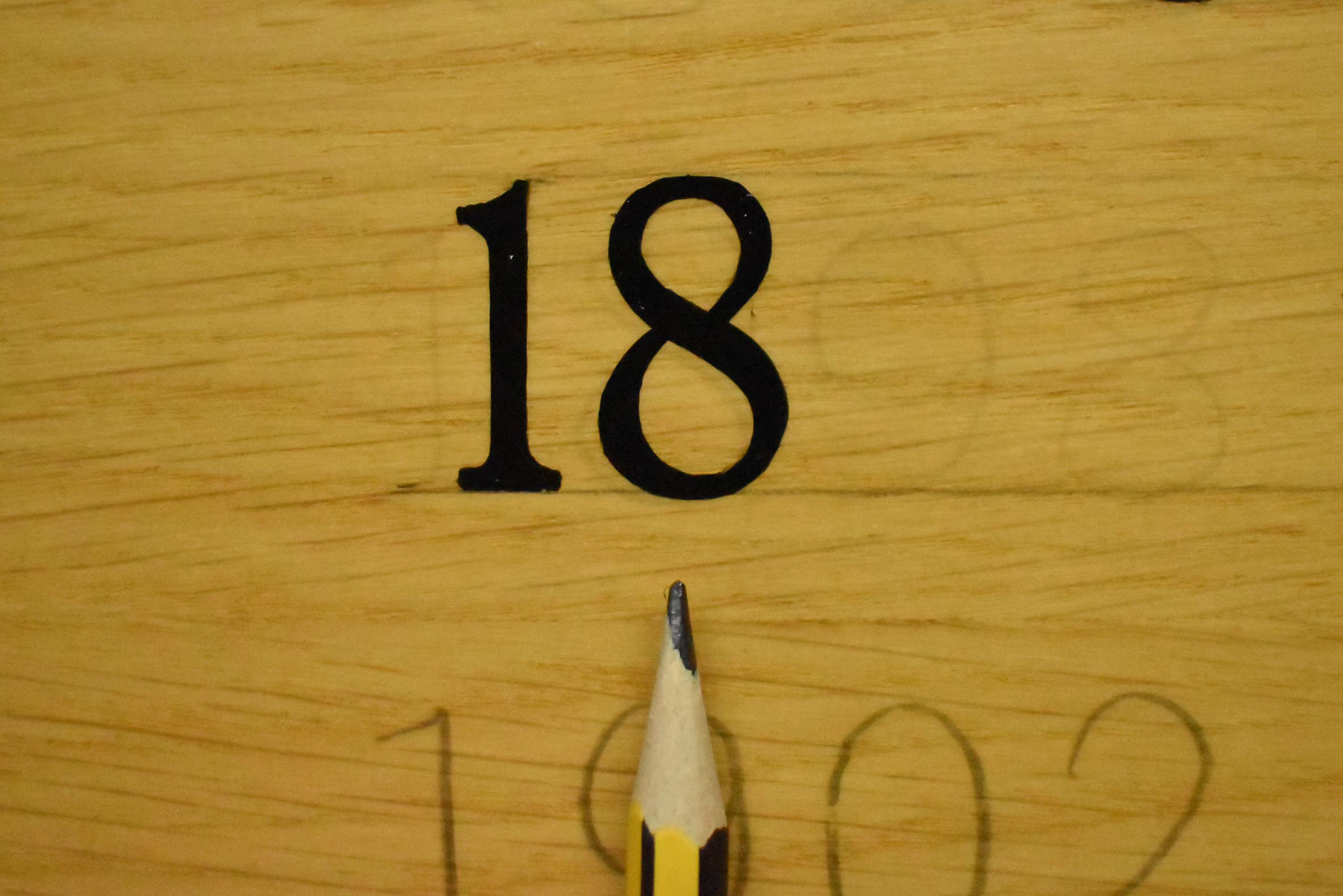
Founded in 1843, The St Andrews Golf Club is steeped in history. The clubhouse was originally built in the 1890s as a Victorian villa and is located just a stone’s throw from the world-famous 18th green on The Old Course.
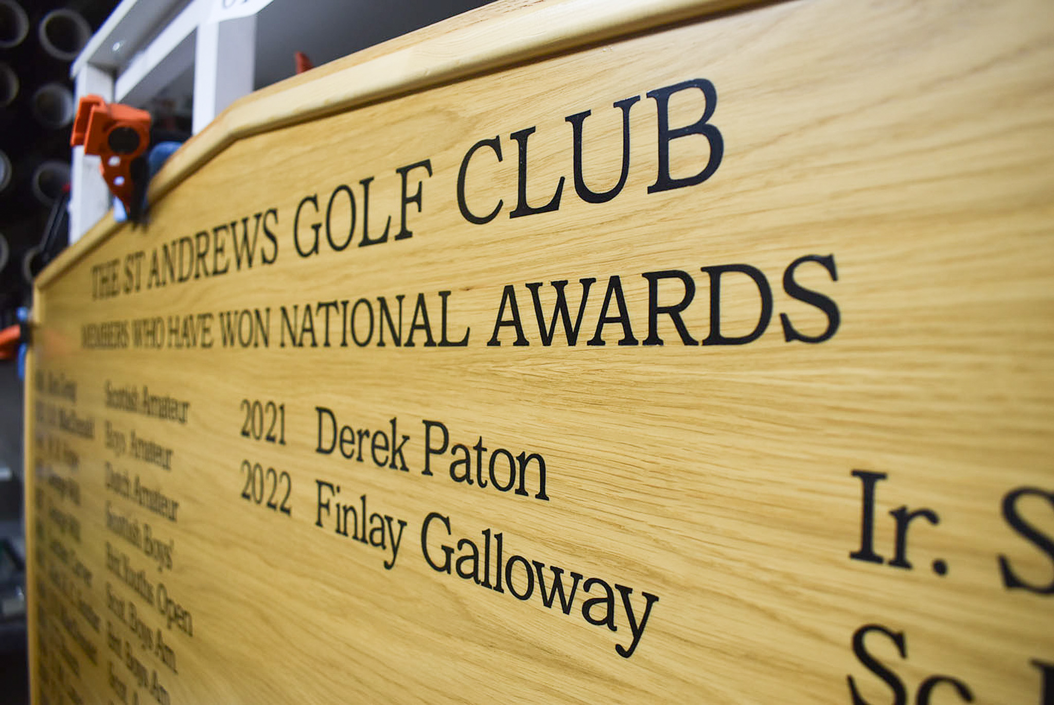
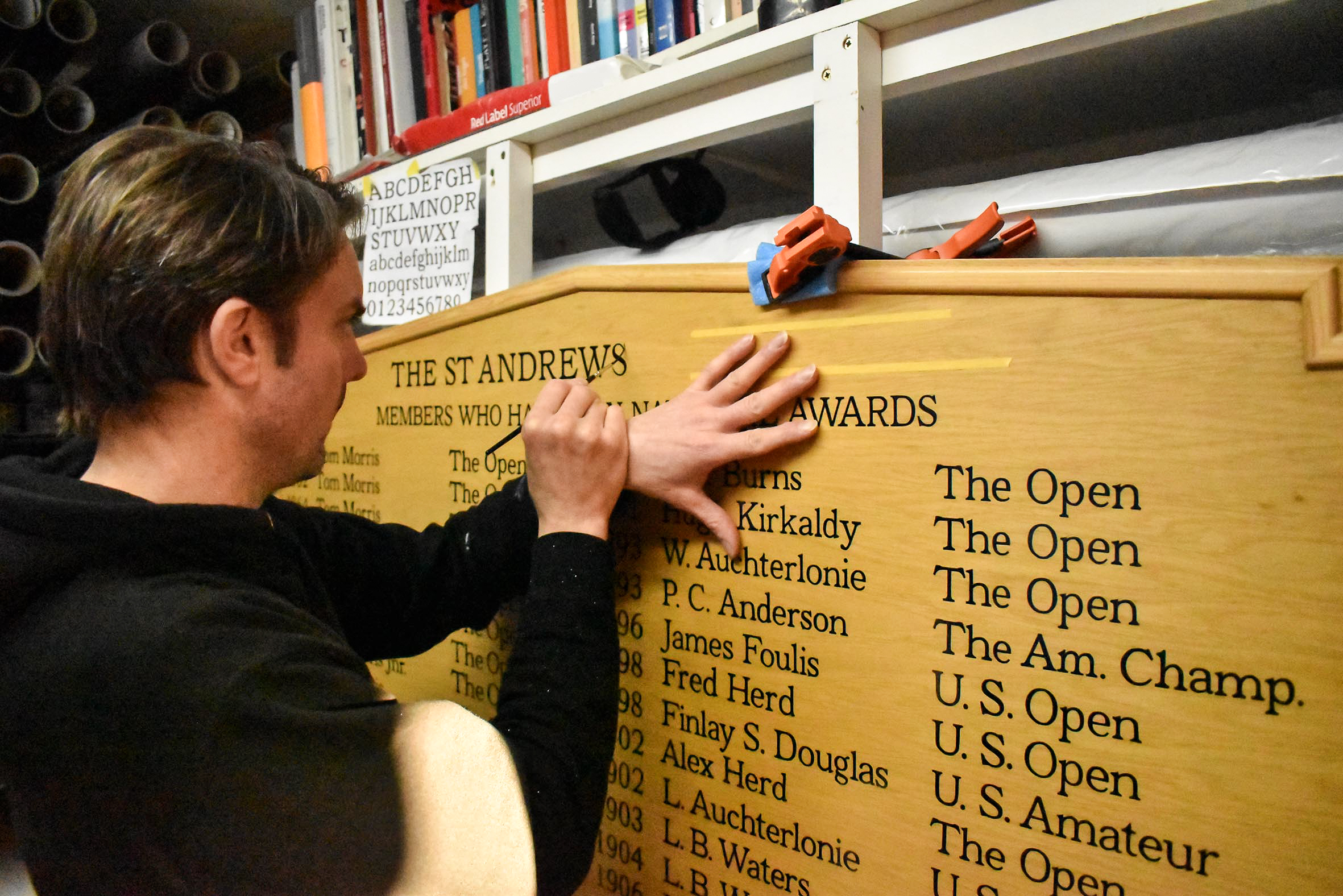
Gold leaf adorns five honours boards on the club’s entrance lobby walls. Long lists of champions include the names of the forefathers of modern golf. Traditional hand painted and gilded lettering on stained, dark wood boards complements the heritage of the club and suits the lobby’s interior décor.
Annually since 2022, I’ve gilded several additions for the club across four honours boards. The honours lists include names and dates respecting club champions, past presidents, and tournaments.
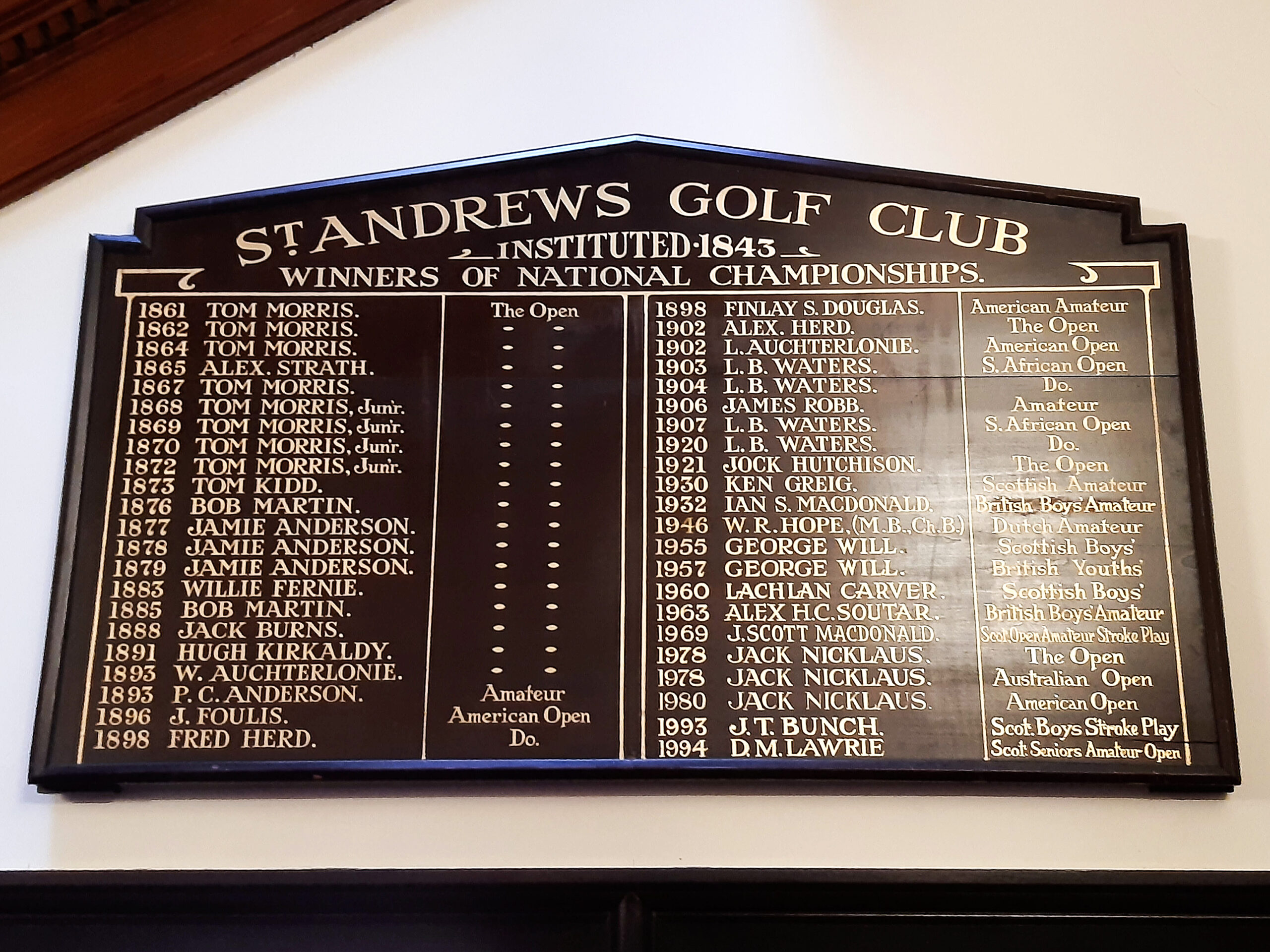
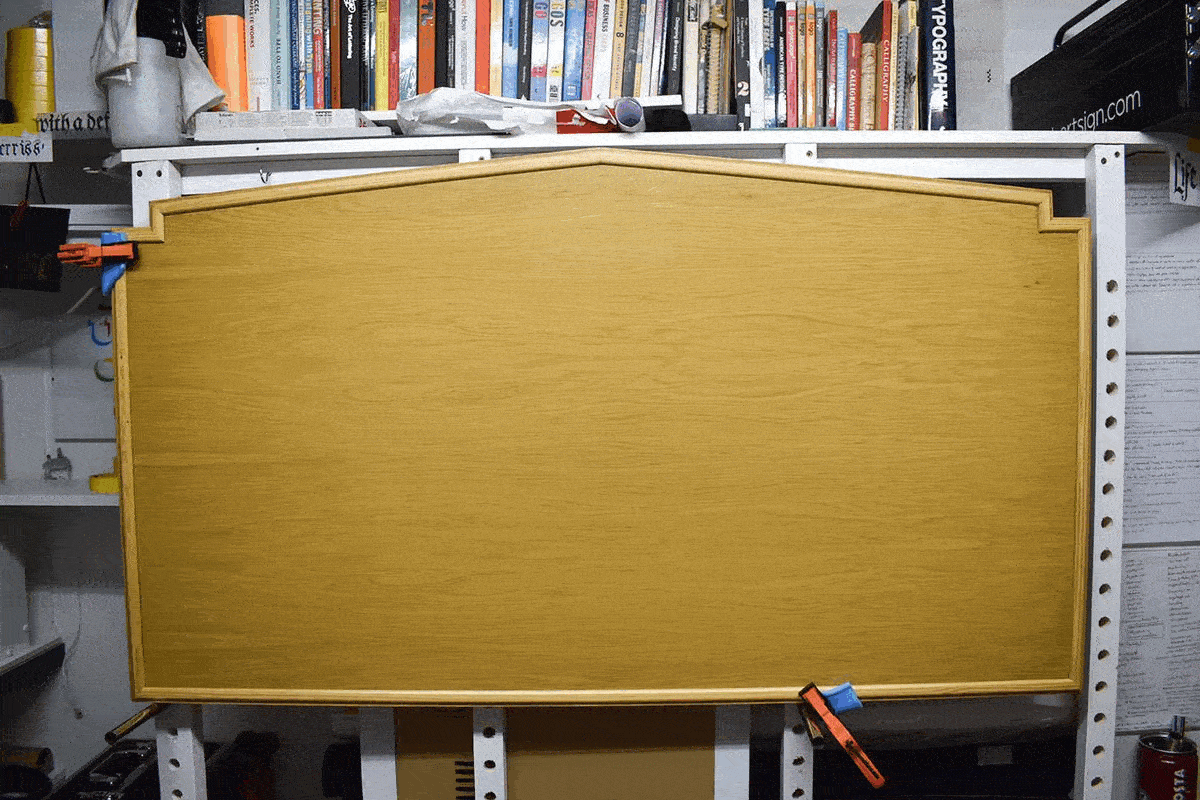
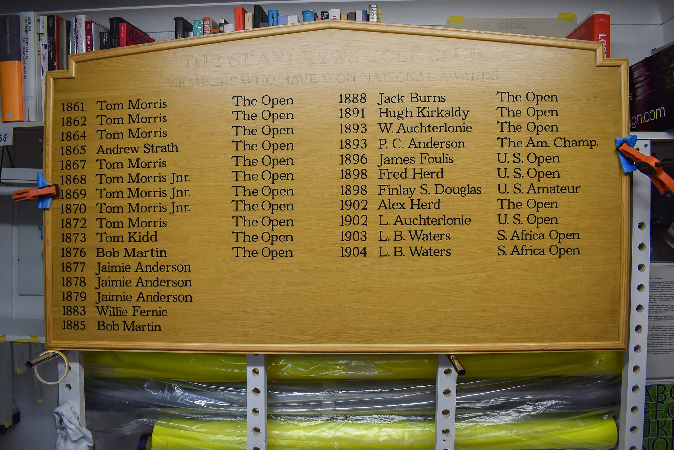
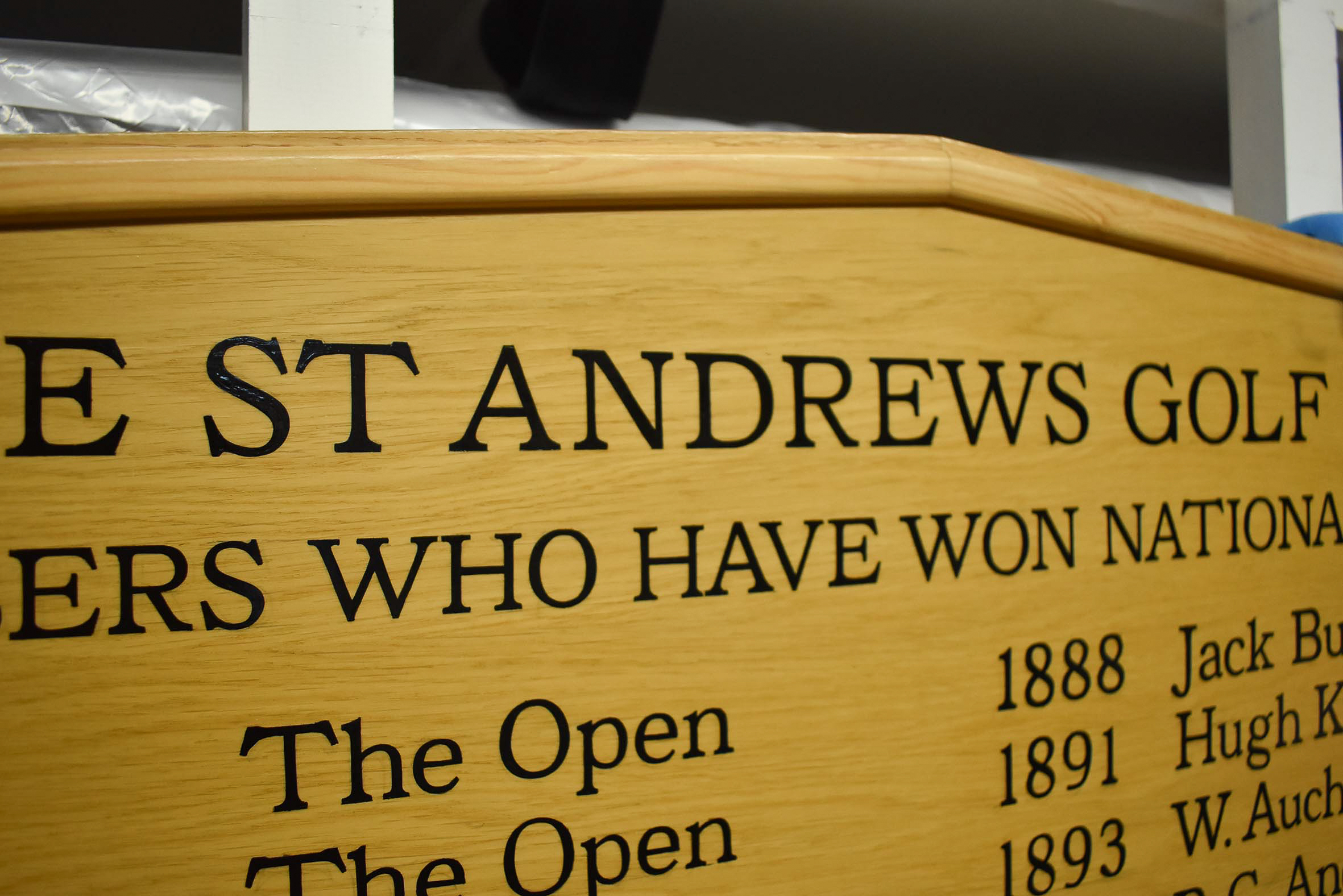
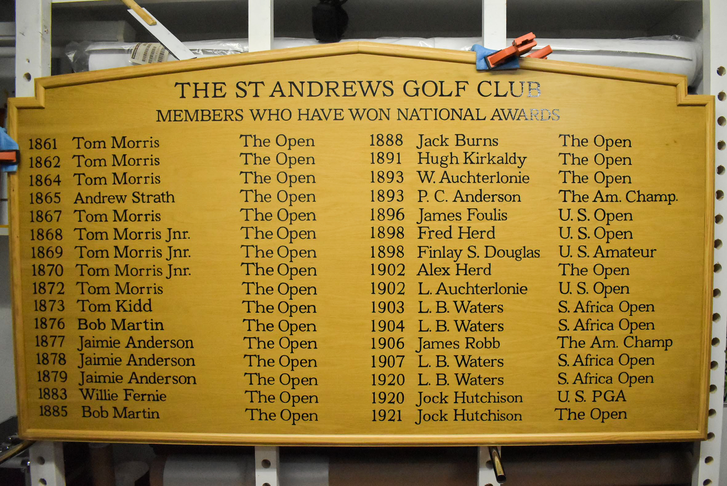
Two of the oldest honours boards on the walls needed to be replaced. Both are approximately 5’ by 3’ and full of gilded lettering approximately one inch (25mm) in height. I was asked to hand letter new, updated content.
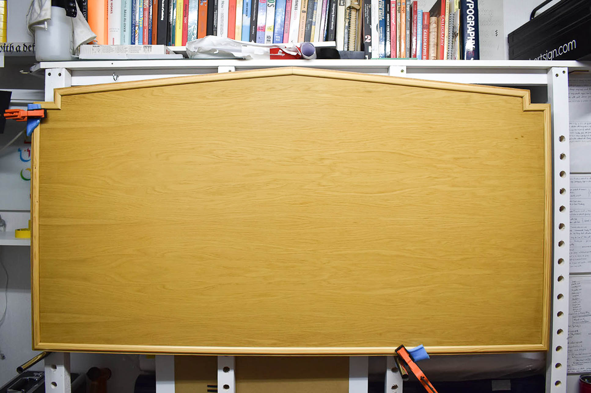
The club’s carpenter manufactured two new boards similar in size and shape to the stained dark wood originals. Both are edged with a softwood frame. The new honours boards break from tradition as the club’s committee decided to choose black lettering on stained light wood backgrounds.
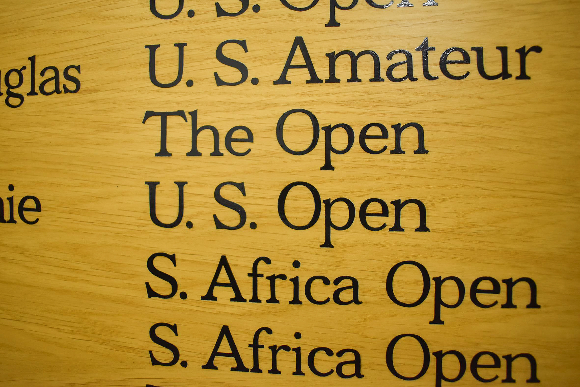
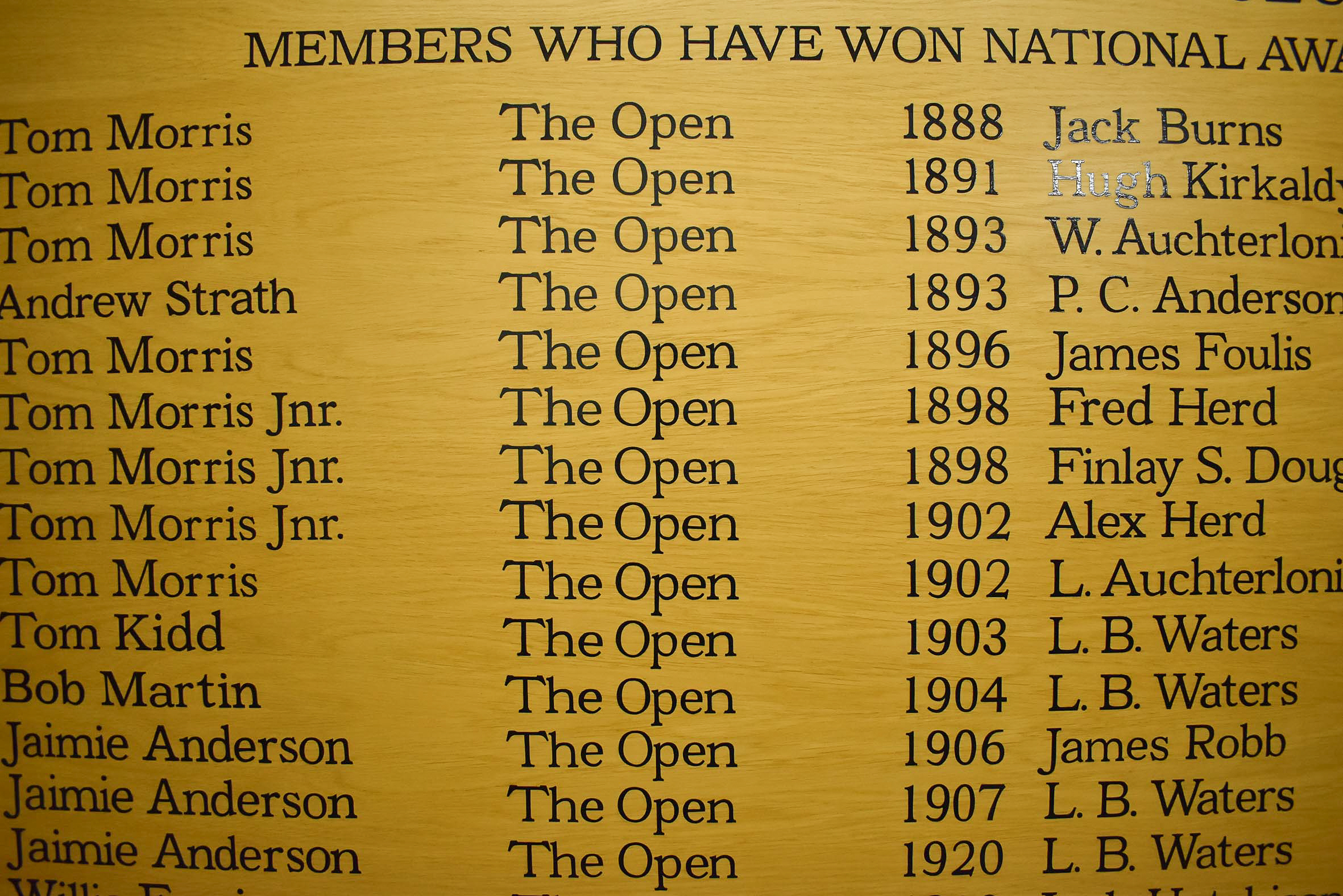
Club secretary Craig Mackie contacted me in late 2022 to arrange my visit. We met with the club’s historian, Mike Ciesla. Mike explained the updated content for the two new honours boards and handed me a list of years, winners, and tournaments. Amendments and additional information differing from the original boards’ honours increased the amount of content for each of the new 5’ by 3’ boards.
I photographed and measured the new boards and explained why I’d provide scaled artwork layouts for their proofing.
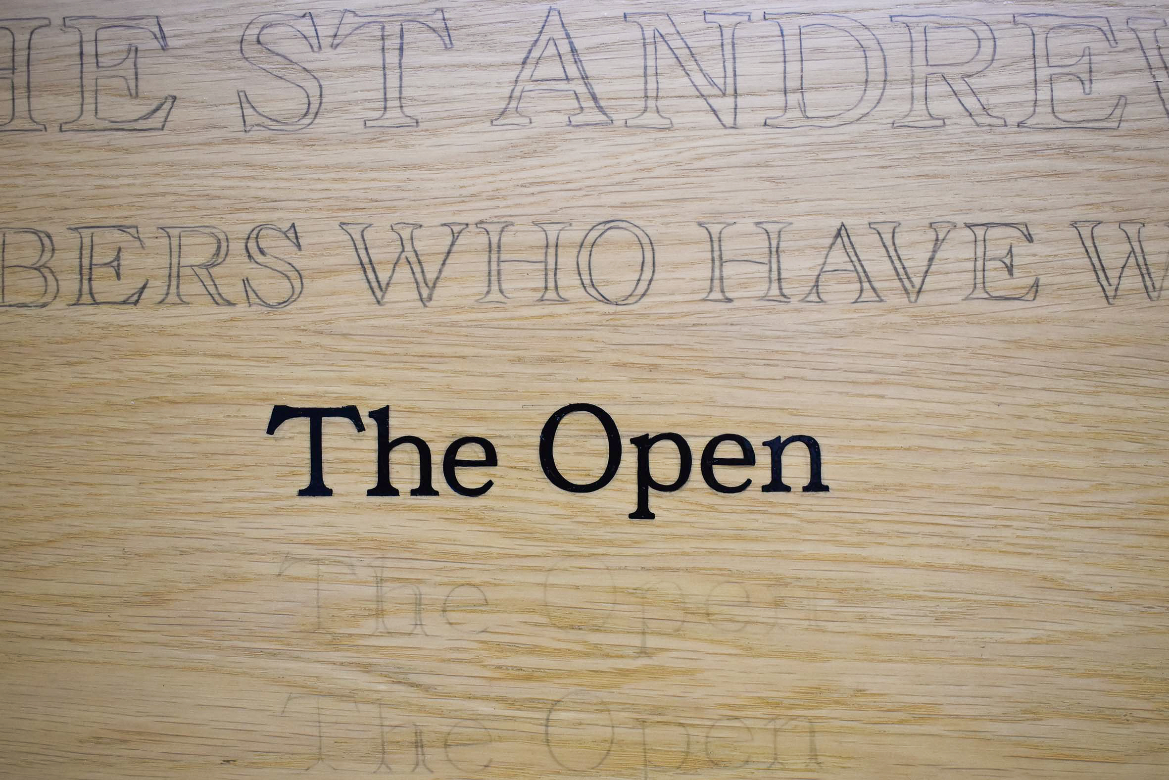
Digitally formatting a scaled layout before signwriting small letters in quantity is prudent. In this case, the scaled layout ensured that each line of copy containing the year, winner’s name, and tournament name would fit adequately in six columns underneath a subheading and title on each board.
The artwork proofing phase also allows my clients to check the content for amendments before their approval.
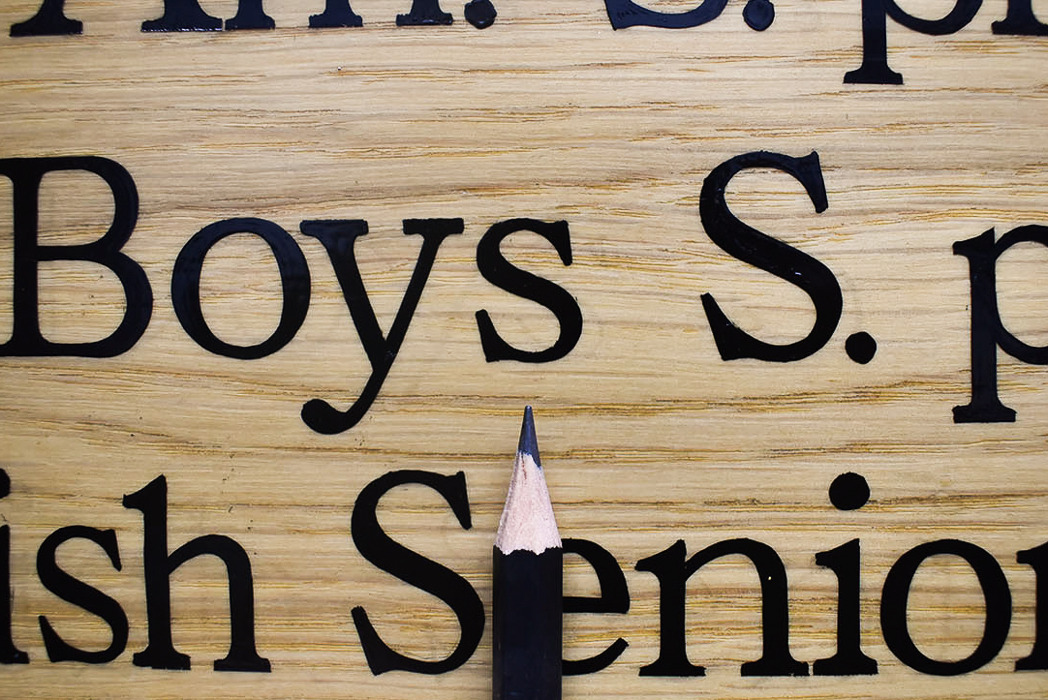
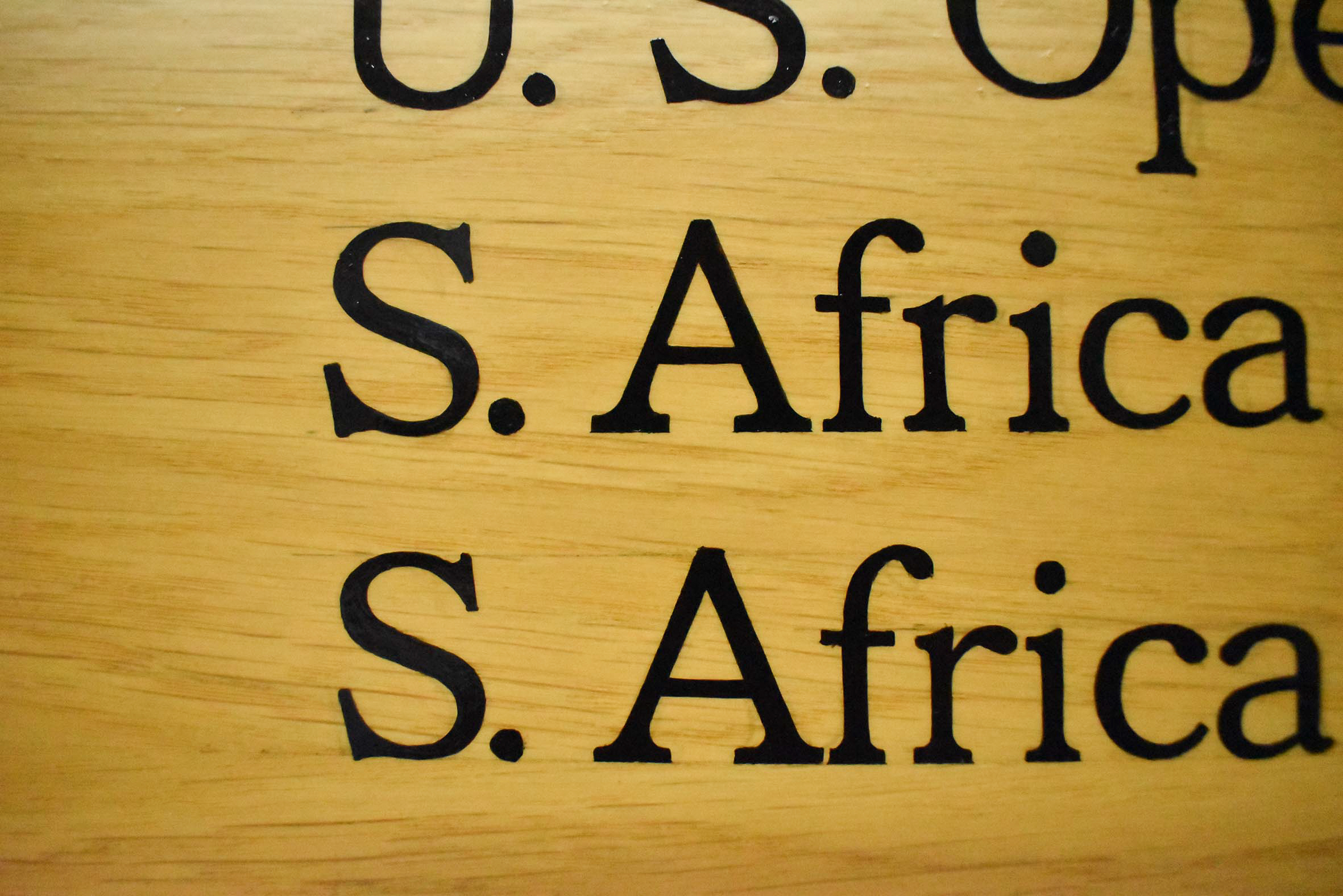
There was a lot of information to fit onto the faces of the already manufactured honours boards. Therefore, I chose to format the copy using upper and lower case type. The inclusion of lower case would accommodate the increased content for each new board, but cause a trickier challenge for lettering with a brush.
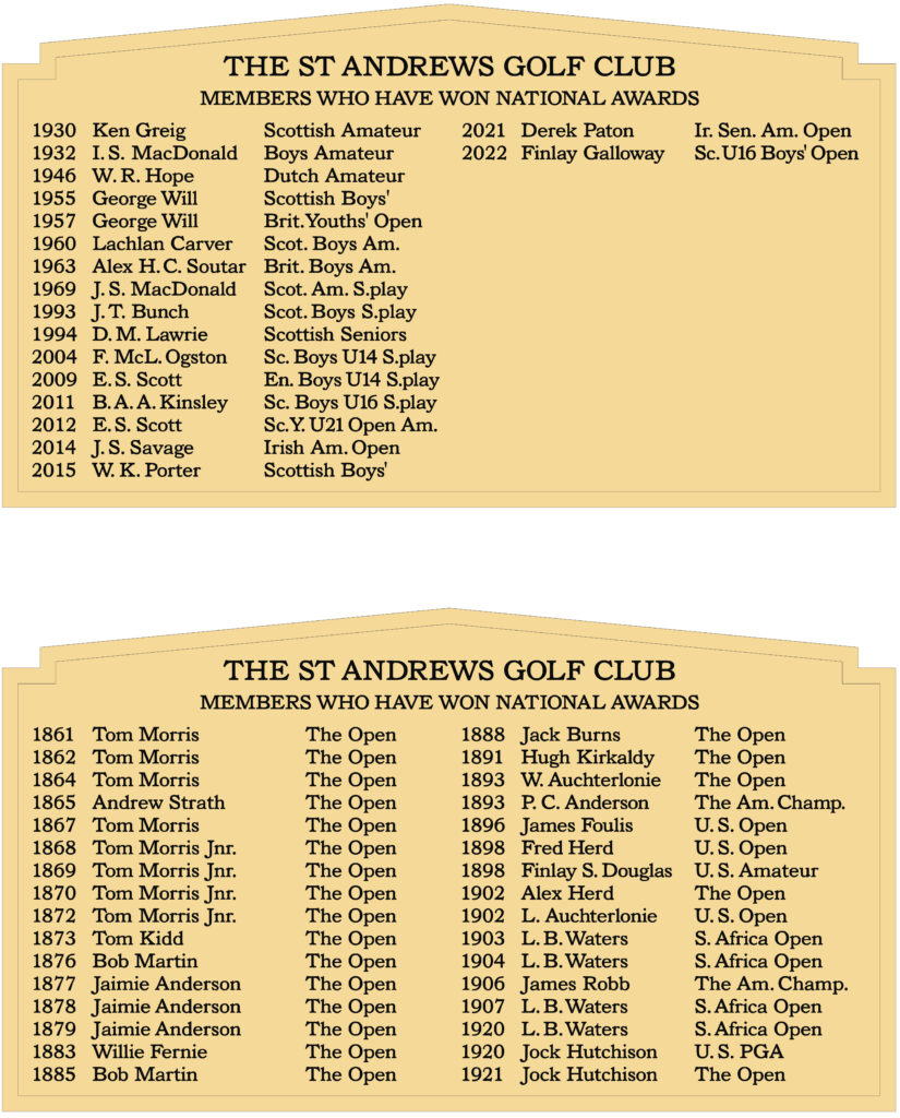
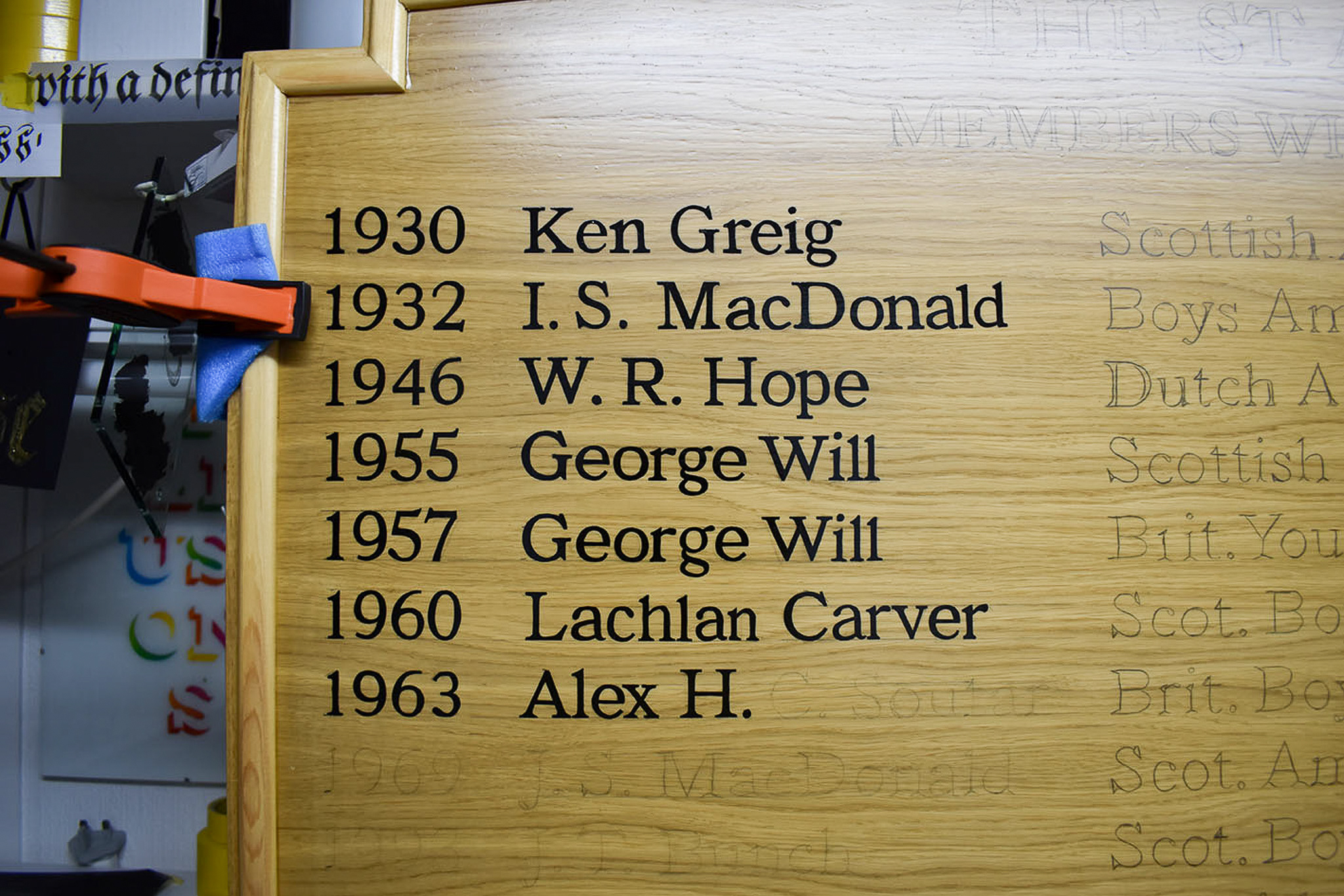
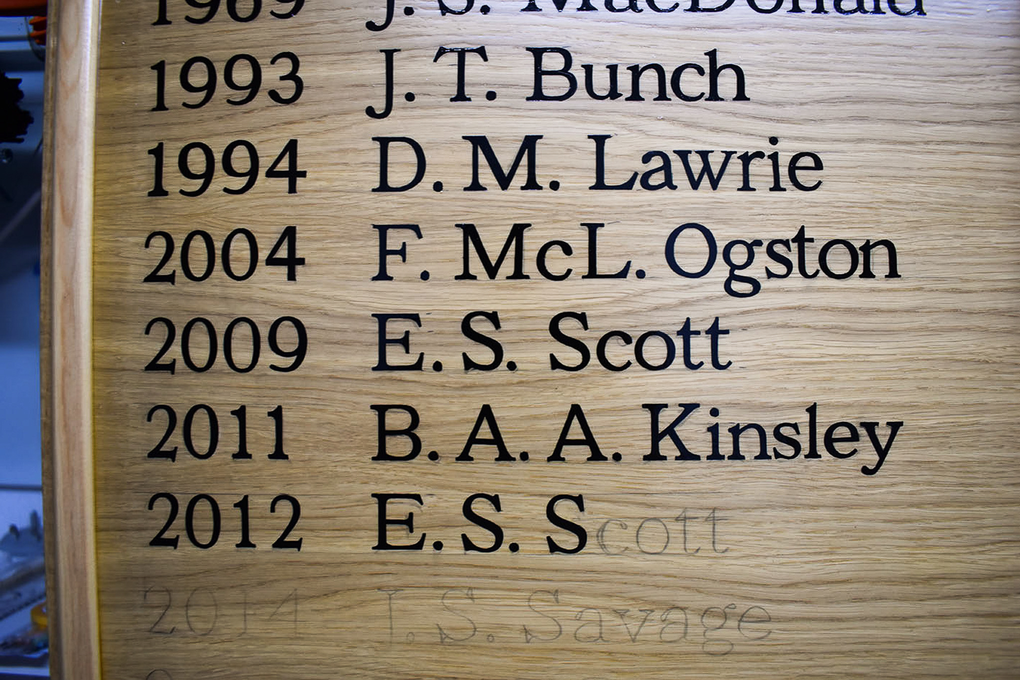
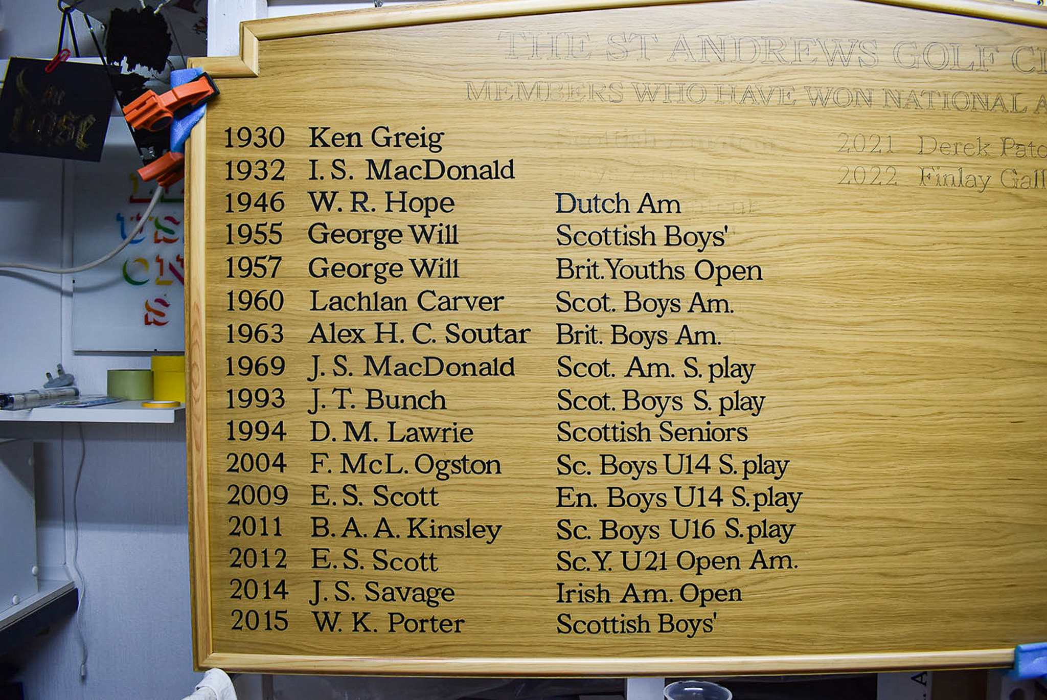
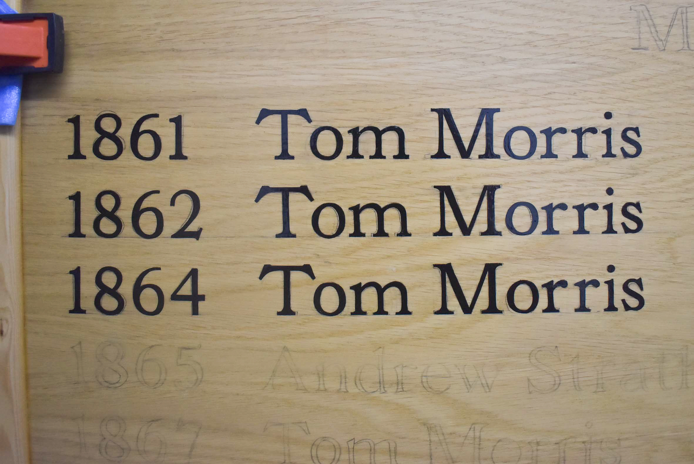
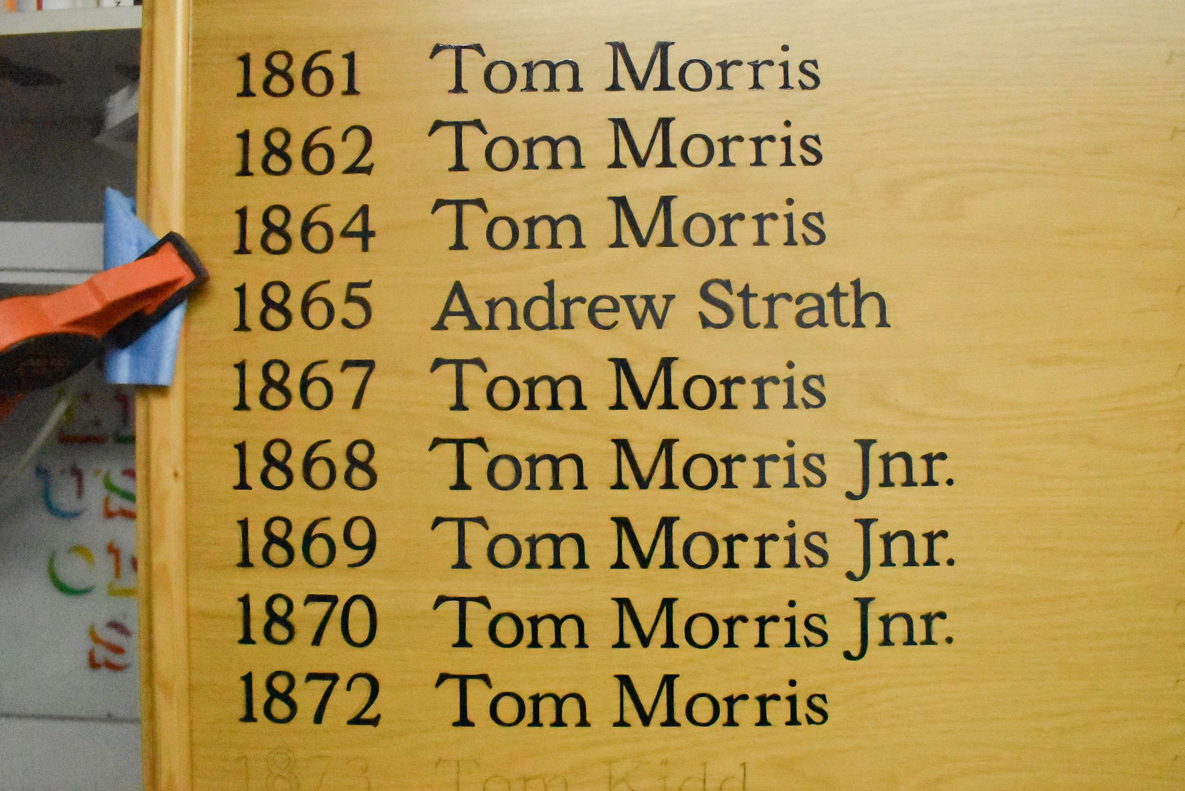
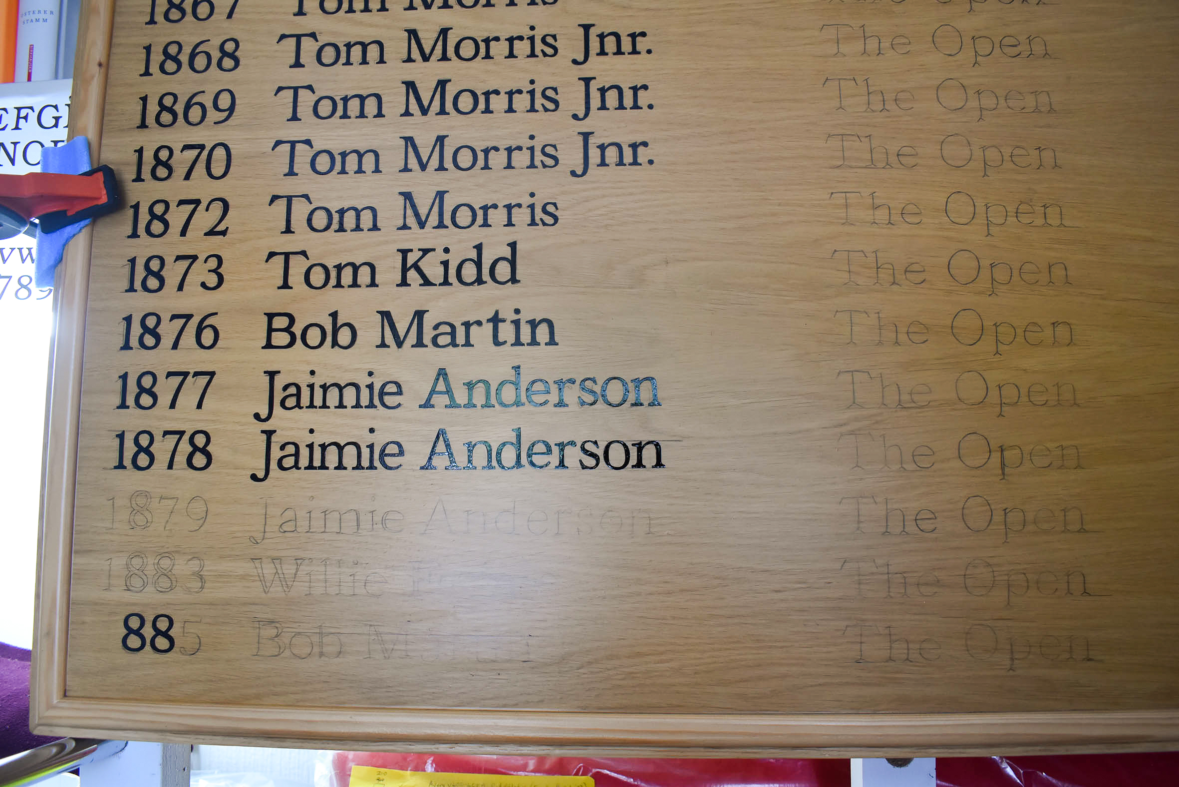
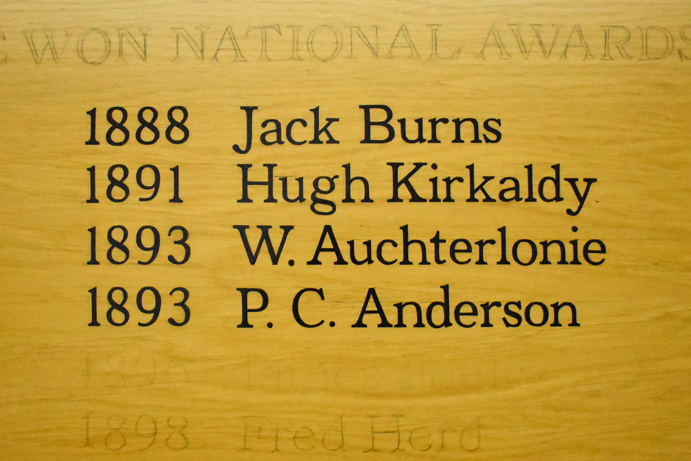
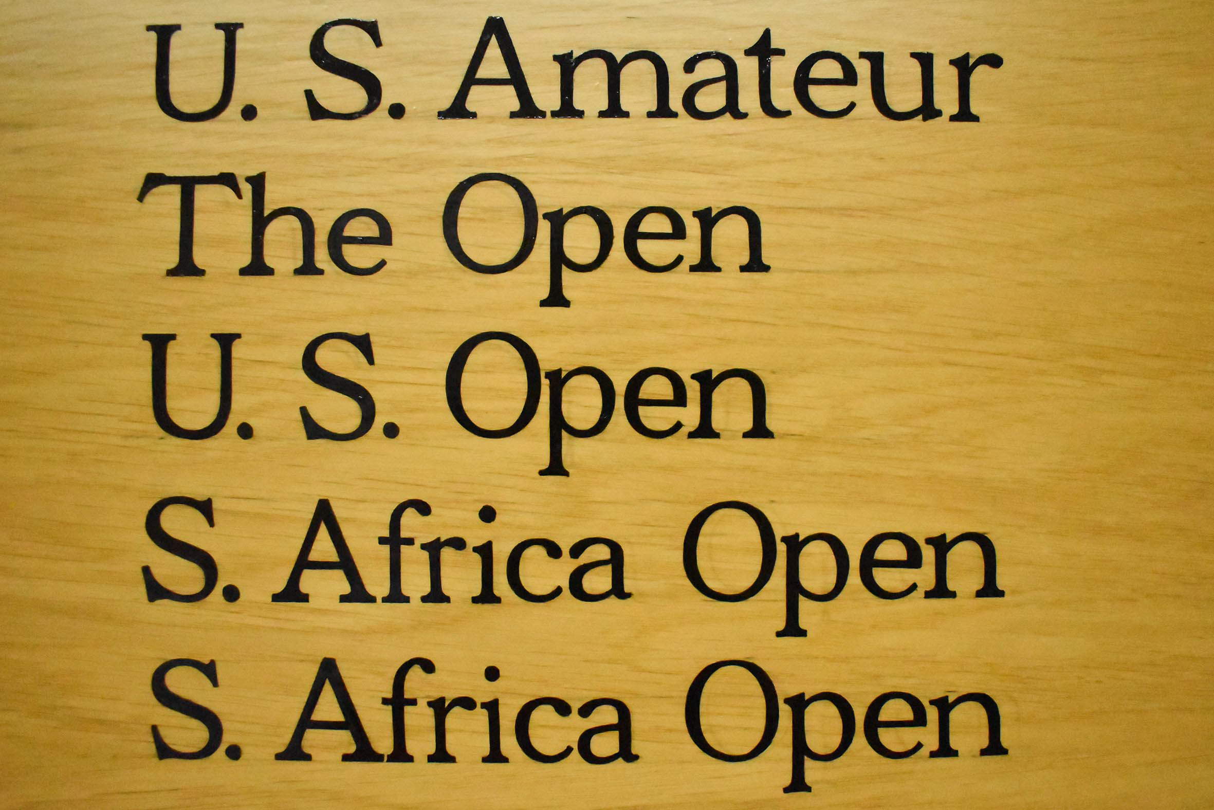
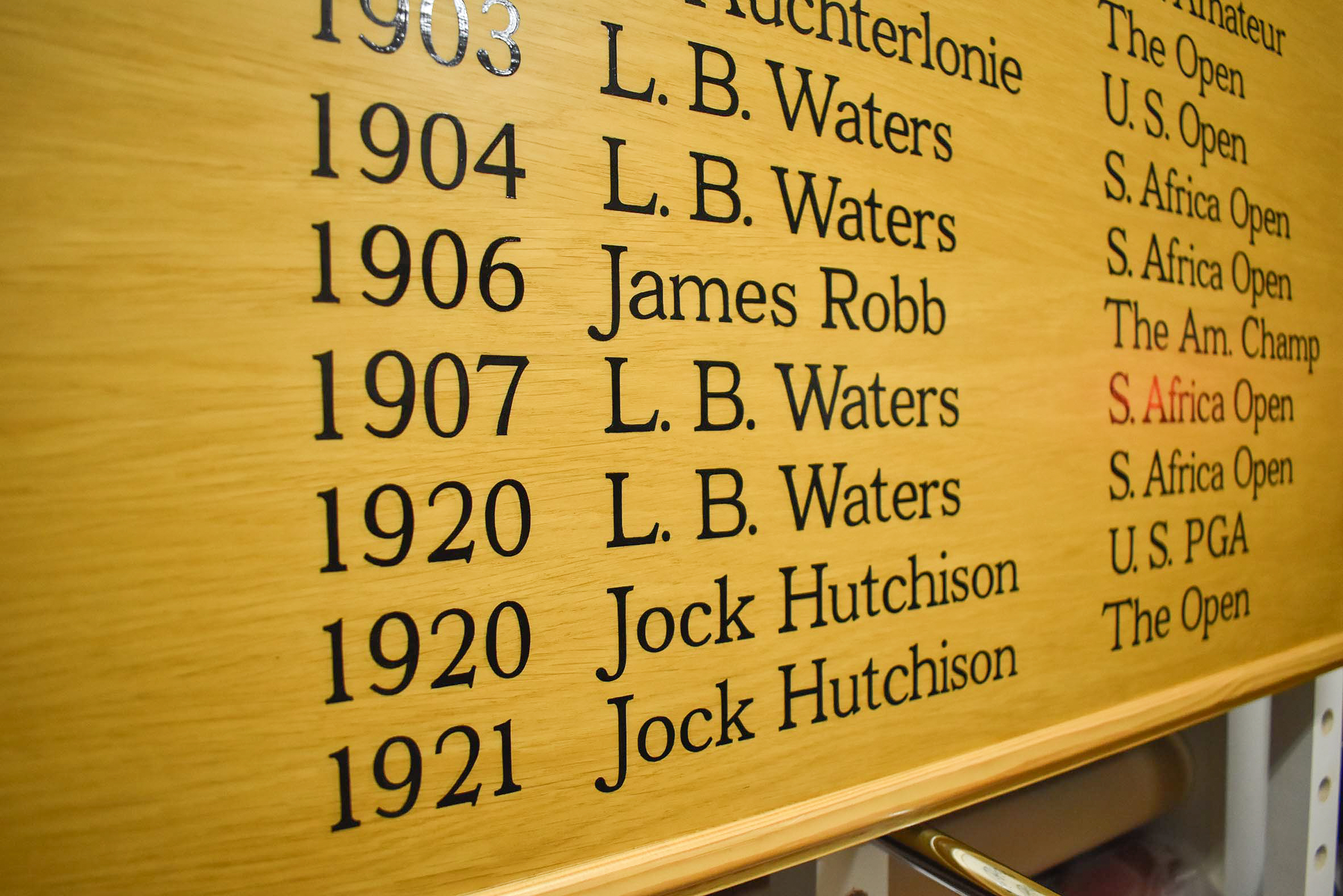
One honours board face is filled with lines of copy displaying tournament winners from 1861 to 1921. The second honours board is approximately half full, starting from 1930 to the present.
My choice of font would reduce upper case height to 23mm and result in 16mm lower case (x height). Inadvertently, my decision to include lower case significantly increased the time necessary for accurately hand lettering each line of letters and numerals.
At this stage, I didn’t think signwriting both boards would take me years to complete.
It was important to me to have a visual reference for each upper case and lower case letter, as well as numerals. A visual reference would ensure I’d paint consistent form throughout all characters, as opposed to signwriting an almost entire font off the top of my head.
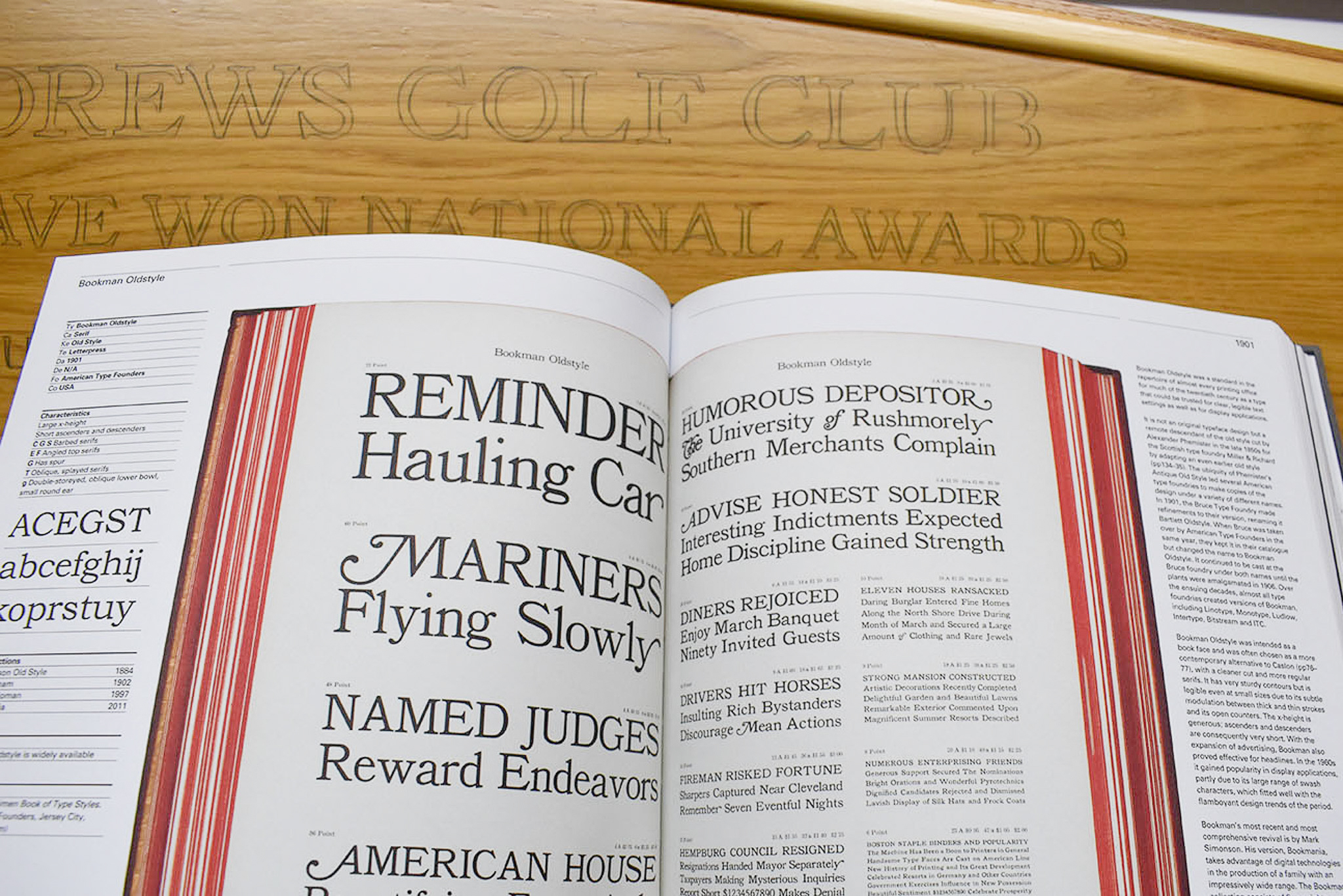
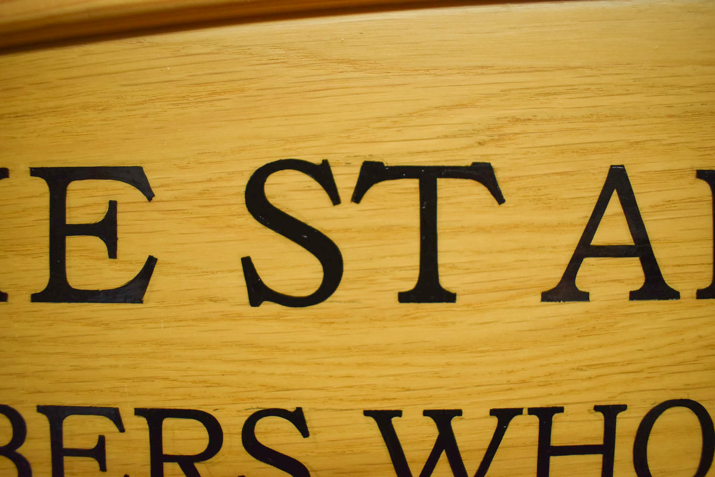
I’d considered categories of typefaces to model my hand lettering on and began researching typefaces with a connection to Scotland. I selected a font called Bookman, originating from an American font foundry in 1901. Bookman possesses short ascenders and descenders enabling tighter space between each line of copy. As its name suggests, the type’s fine legibility at small size was designed with the intent as a specialist book typeface.
Bookman is rooted in Scottish type design. The font is a remote descendant of an older metal type cut by Alexander Phemister in the late 1850s, for Edinburgh-based type foundry Miller and Richard.
The duality of Bookman’s design and modern golf appealed to me. Both were developed in Scotland and exported globally around the same time, with huge influence in their respective fields.
With hindsight, I made a serious oversight by not painting scaled sample lettering before deciding on the style to hand letter. Bookman’s serifs are bracketed. They’re almost rectangular slabbed but with a slight radius from the straight strokes. My choice would eventually teach me a long lesson.
I formatted the copy, designed the scaled honours boards layouts, and emailed my comments and artwork to Craig and Mike. Approximately three artwork revisions followed. Often, on receipt of artwork for proofing, and especially when long lists of names and dates are included, errors such as incorrect punctuation are noticed.
Mike and the club’s captain were also unsure of the subheading’s words and whether they wanted the title of the honours boards horizontal or curved.
I was eager to begin signwriting the honours, but I had to be patient. Oil based enamel is permanent, and mistakes at this stage would result in disaster. However, I was keen to start painting.
The dead matt finish and openness of the woodgrain faces of the boards concerned me. To remedy, I brushed the two boards three times with a clear satin finish. The satin varnish finish was an improvement and avoided permanent staining of the woodgrain, when I’d inevitably make small strokes in error with my lettering brush.
After a short delay, the artwork’s final revision was approved by the committee. I scheduled the following weekend to set up my projector.
Each board’s scaled digital artwork was exported from my signmaking software and saved as Jpegs. My projector was connected to my hard drive, and after fiddling with wires, dials, and perspectives, the scaled artwork appeared as it should – albeit in light form, beamed onto the boards’ faces in my studio.
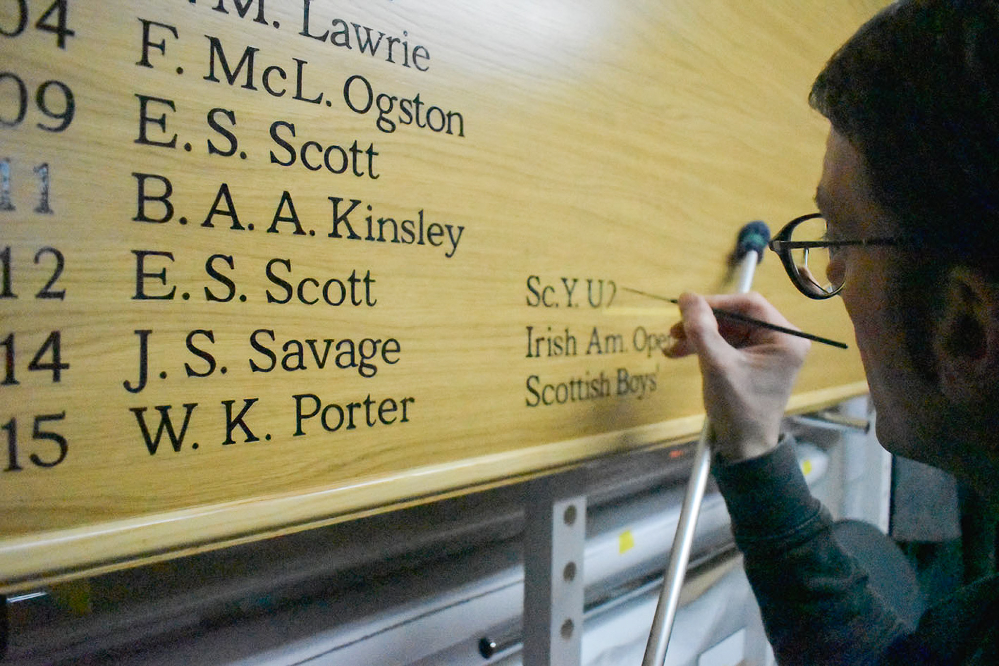
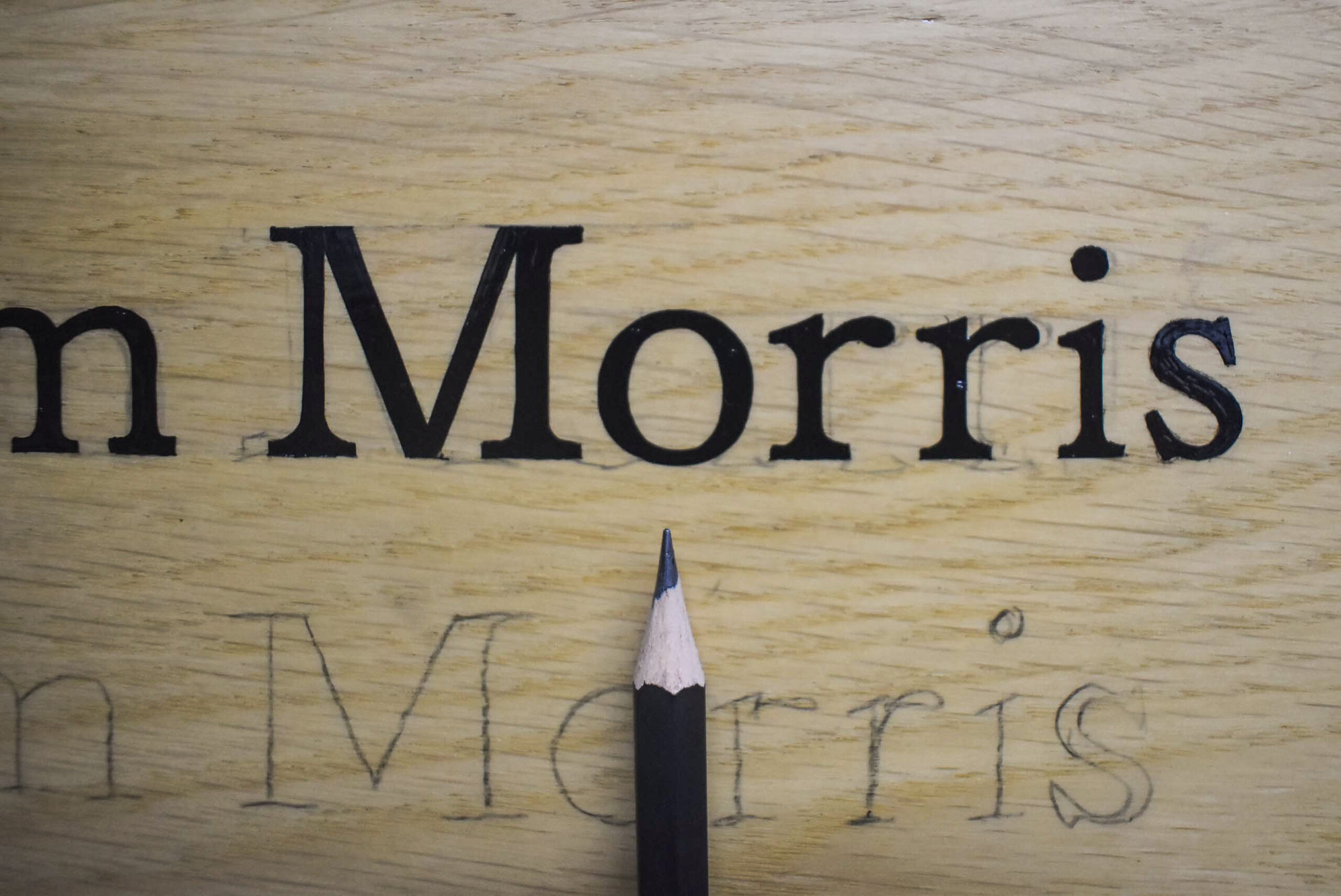
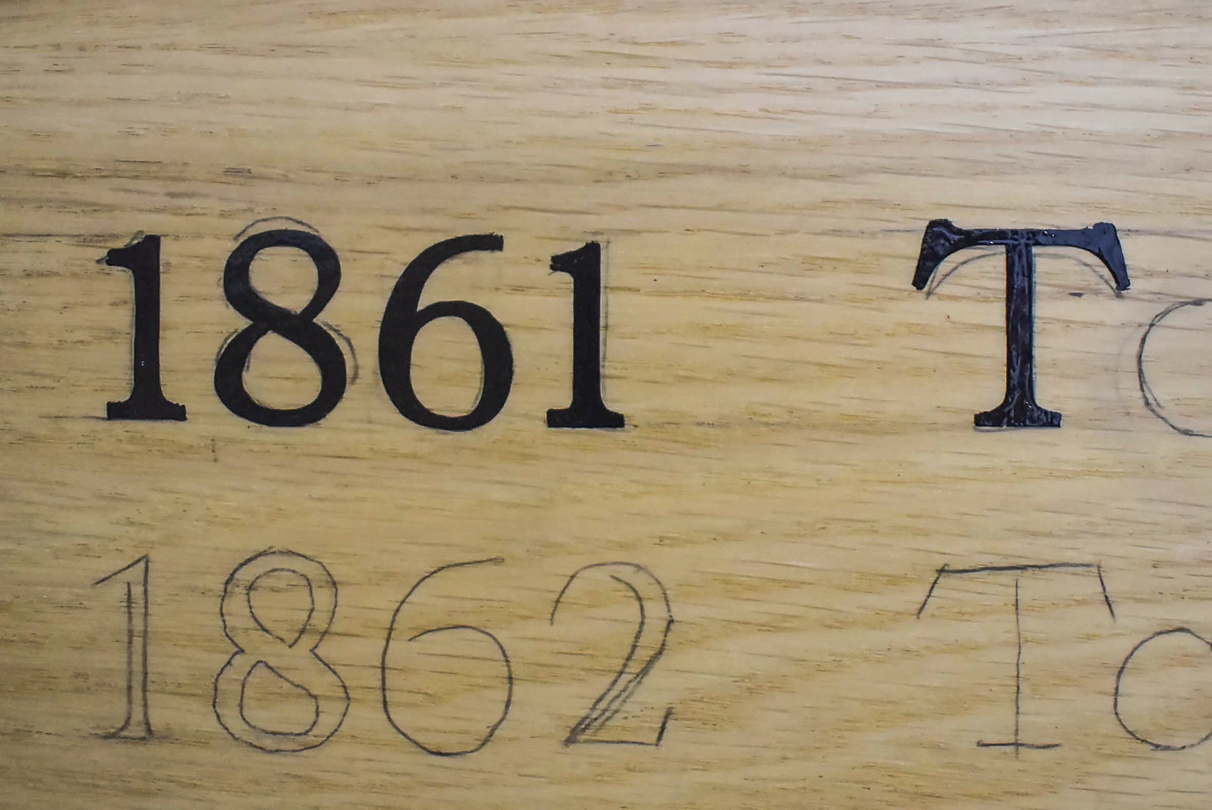
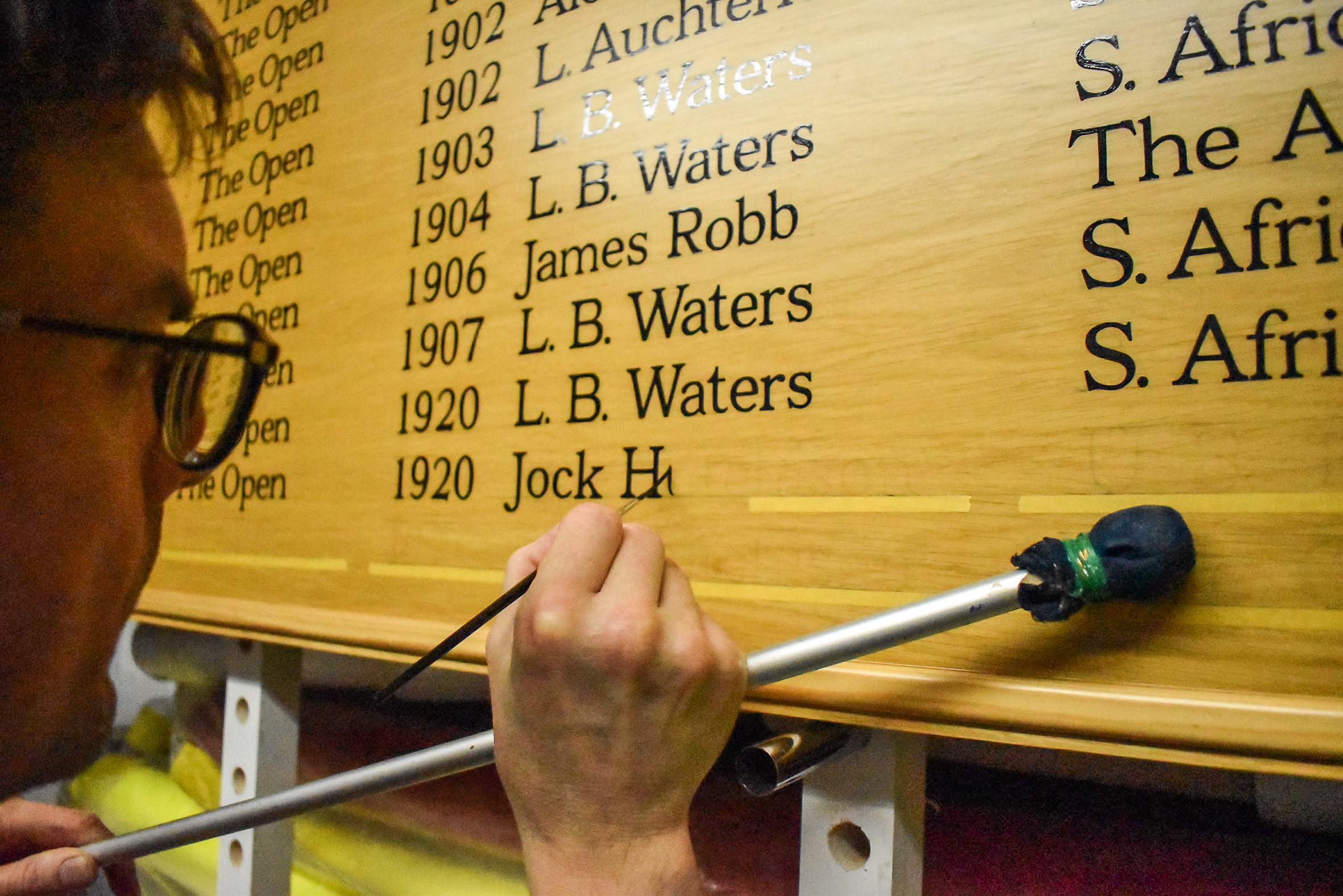
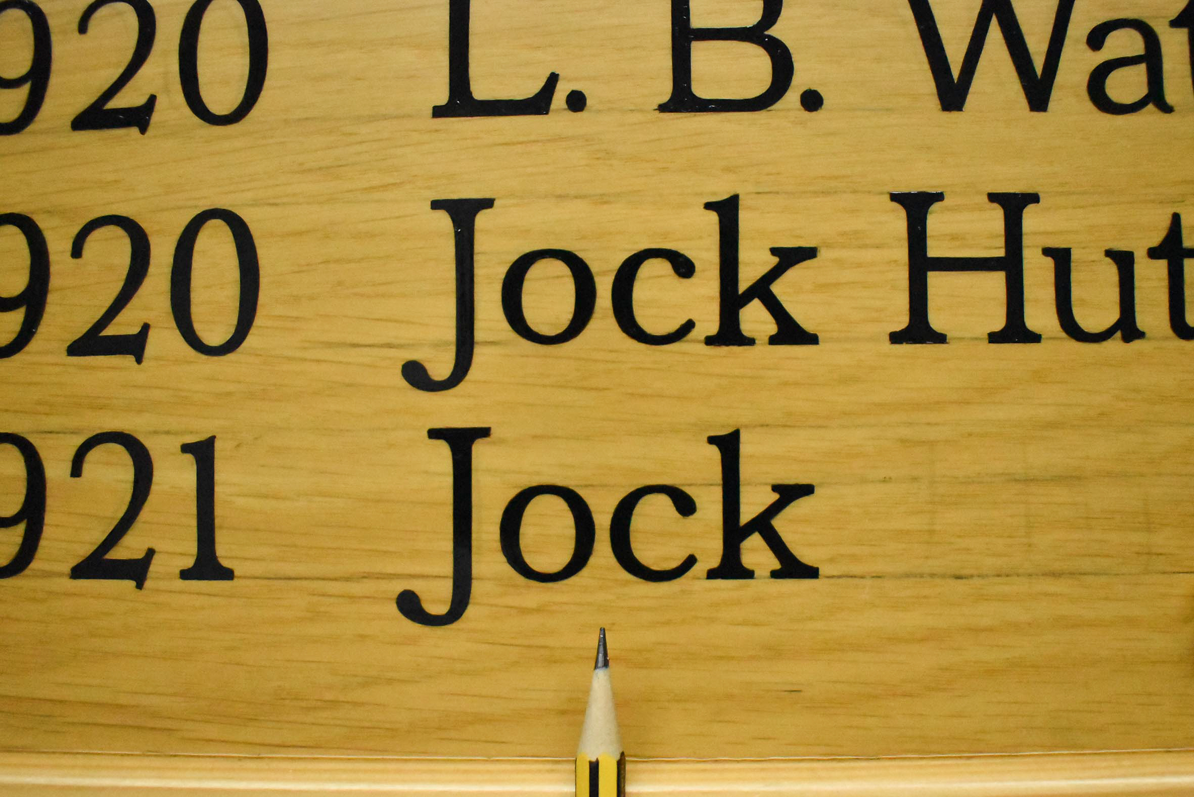
Using a black Stabilo pencil, I gently and patiently drew the skeleton form of every letter and numeral. It was a peaceful Saturday, providing space to think about how I would tackle the extensive signwriting.
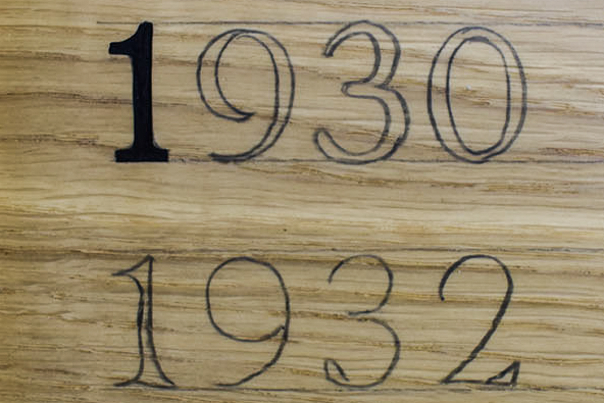
Beginning with the second of the two honours boards, the year 1930 was hand painted first.
As soon as my enamel loaded signwriting brush touched the first numeral one skeleton, my bristles slid on the satin finish surface. There was no bite. I realised I’d have to handle the brush more tactfully.
Acute curves approximately ten millimetres in diameter would be almost constant. Especially when painting the numerals. Twisting the brush with the correct amount of pressure on such a small turning circle would prove to be a challenge.
Accurately signwriting very small text to a good standard is difficult.
Too much pressure on the bristles, mistiming the turning and lifting of the brush, as well as loading the brush with too much enamel, will result in thicker strokes. Half of one millimetre too thick is obvious on stroke widths of approximately three millimetres.
Hand lettering the first honours board was the most difficult signwriting project I’ve encountered.
Following delivery of the first completed honours board, Mike said, ‘That has been a herculean effort, Barry, and I feel sure the final products will be extremely well received’.
I allowed myself a longer than planned interval after completing the first honours board and starting the second. However, I found it difficult to commit to hand lettering in my studio every day. I also had to serve my other clients and their projects.
By this stage, I was aware of my massive underestimation of the time and level of difficulty hand lettering the two boards to my satisfaction. Each line of copy took me at least an entire day to complete. I was overwhelmed.
I’d explained my concerns to Craig about the delivery of the first completed honours board. Craig understood and reassured me no pressure from the club and expectation of a deadline. I felt a temporary lift of my anxiety towards the project and tried to reason with myself.
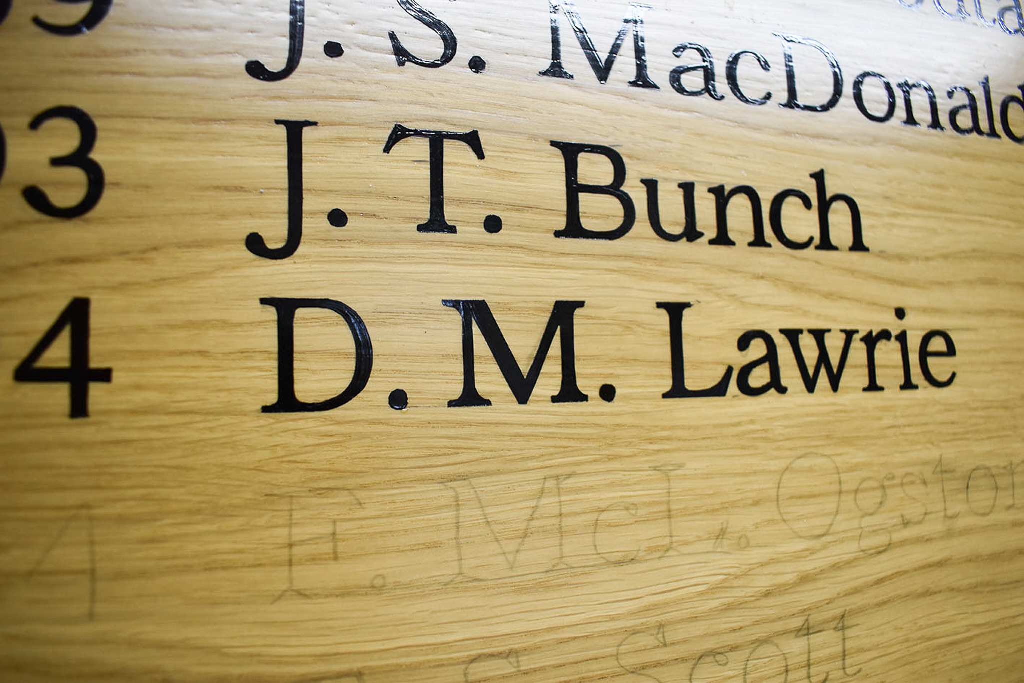
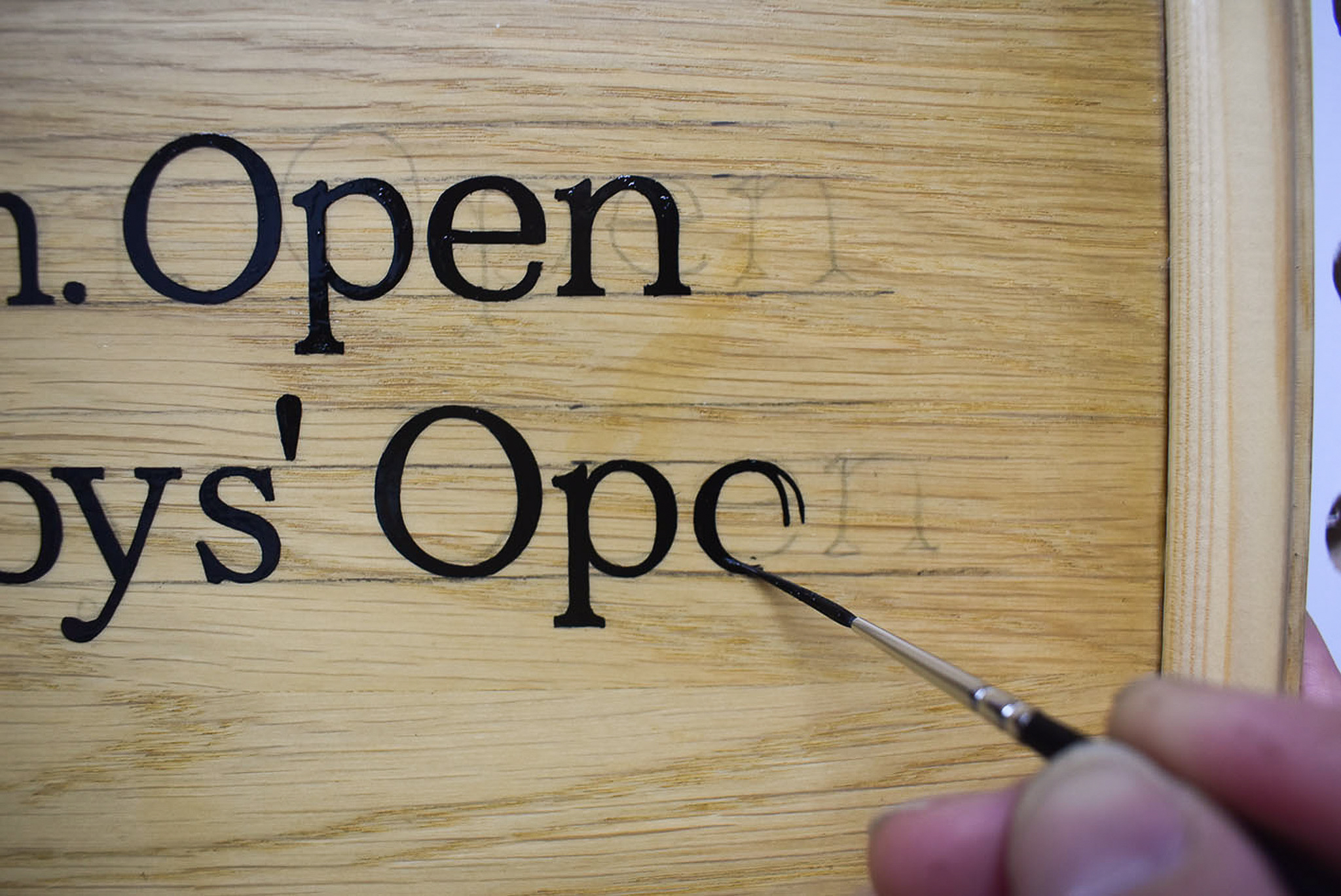
The bracketed serifs were a constant hurdle. Each serif on every letter involved four to five separate movements of my brush.
Usually, signwriters and those proficient with brush lettering will choose a flowing vertical or diagonal stroke, which includes curling the brush to or from stroke ends. The curling from the straight strokes creates a smooth, flared serif – shaped like the end of a trumpet.
My serif oversight increased the difficulty to execute the letters accurately with a brush.
The byproduct of countless hours of hand painting was a noticeable improvement in my brush handling. I was becoming a better signwriter.
Signwriting started on the second board in autumn 2023. The first column of names repeated the same name seven times. It was important that the names in subsequent lines underneath appeared identical. Tom Morris deserved no room for error.
In stages and over many months, I hand lettered small bursts of progress. The end seemed forever away. I regularly scheduled time to work on the board, but I didn’t. Procrastination, distractions, tiredness, and several other excuses. The second board was beginning to beat me.
By mid-November 2025, I’d hand lettered approximately half of the content on the second honours board. I wasn’t pleased with myself. The lesson in underestimating and overcommitting was loud and clear.
Teachings from an ever present heavy workload forced me to begin explaining to my clients and new enquiries that my diary was closed until the next year. The second honours board had waited long enough for completion.
I was scheduled to gild the club’s new president’s name on their honours board on January 5th, 2026. I committed to completing the second honours board for delivery that day.
From 1st December to 3rd January, almost every day included hand lettering what was left to paint on the second honours board. A few sessions of hand lettering were a struggle, but most days were blissful. The project pushed my ability in signwriting as far as it’s ever been.
I made space in my schedule for the first time in years. I had peace to reflect on the predicament I’d created. My doubt and anxiety slowly diminished with every day of hand lettering. Overall, I was relaxed and motivated. I wanted the progress to continue, even when I felt fatigue and my body was resisting.
The second honours board was completed on Saturday, 3rd January 2026. I was proud to finally deliver it to The St Andrews Golf Club.
Interested in signwriting in St Andrews? Get in touch to find out more.