
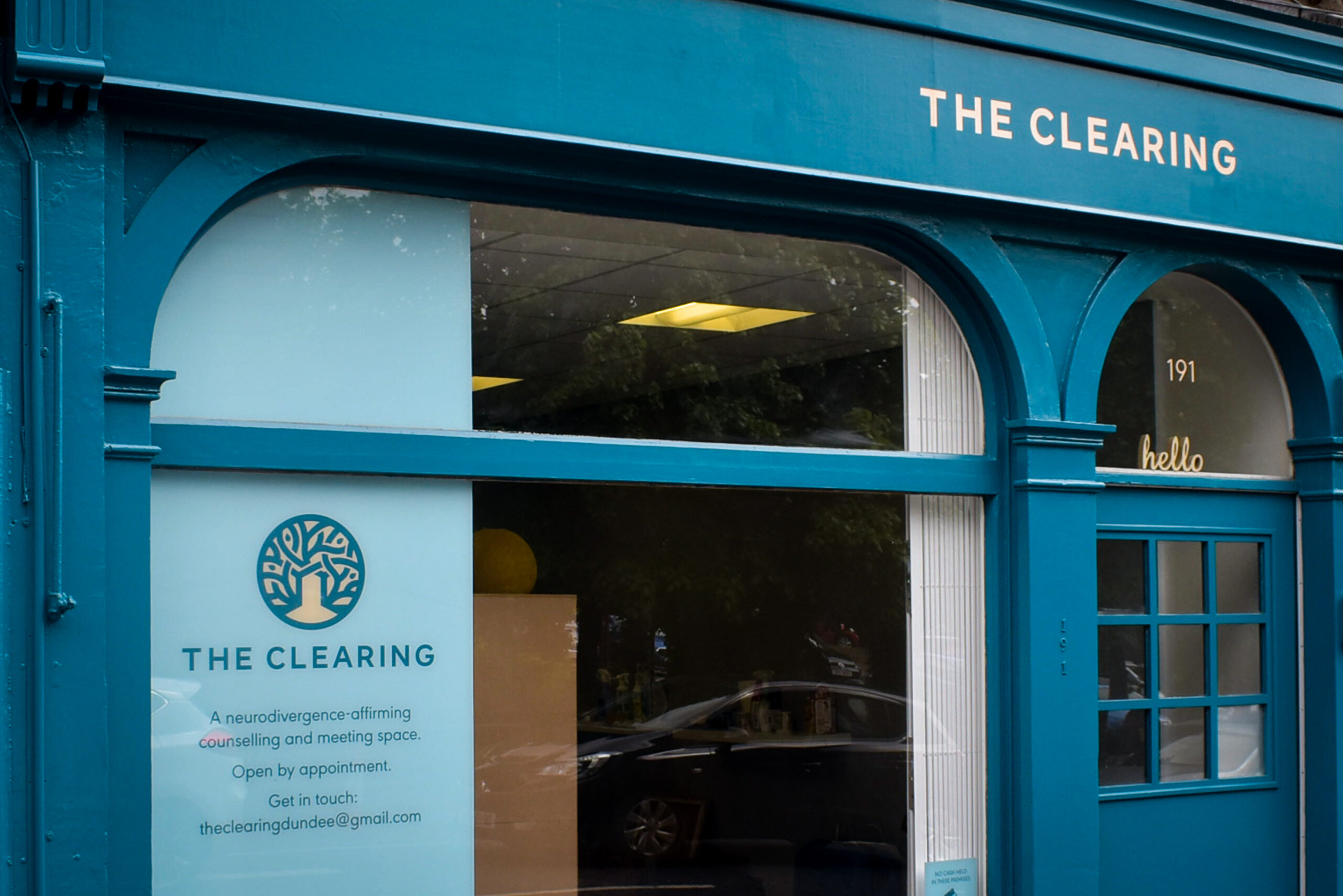
The Clearing is a neurodivergence-affirming counselling and meeting space in Princes Street, Dundee.
Lynn Simpson Davies is The Clearing’s founder. Lynn is neurodivergent and she specialises in autism-friendly counselling. In spring 2024, Lynn asked me to provide a quote for hand lettering her new practice’s shopfront fascia only.
I advised Lynn to consider her business’ broader visual identity and how the identity across various touchpoints (shopfront, stationery, social channel, etc.) would make her clients feel. Designing and implementing a consistent visual system saves time and expense in the long run. Decisions for marketing become easier too.
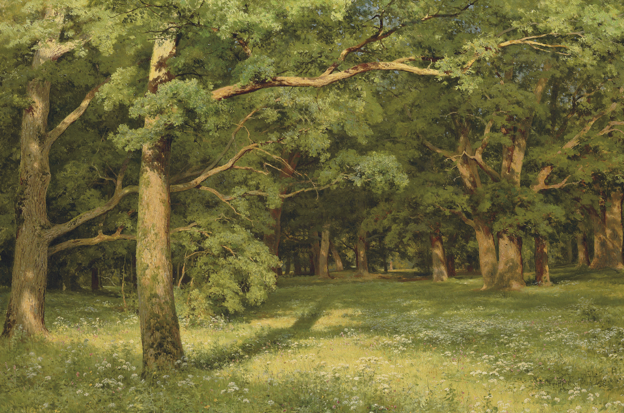
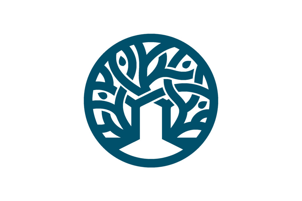
Hanging on the wall of Lynn’s office is a copy of Russian landscape painter, Ivan Ivanovich Shishkin’s, The Forest Clearing. The painting projects deep meaning to Lynn and inspired the name of The Clearing.
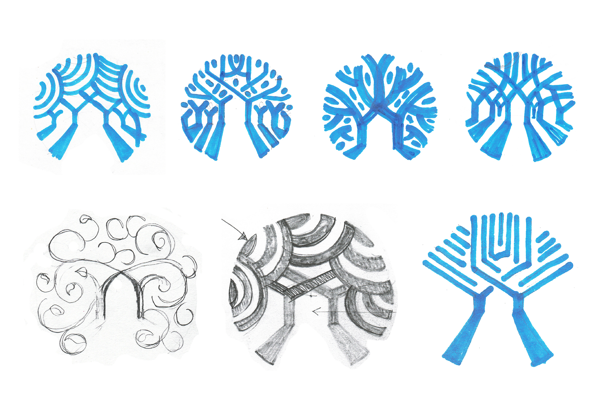
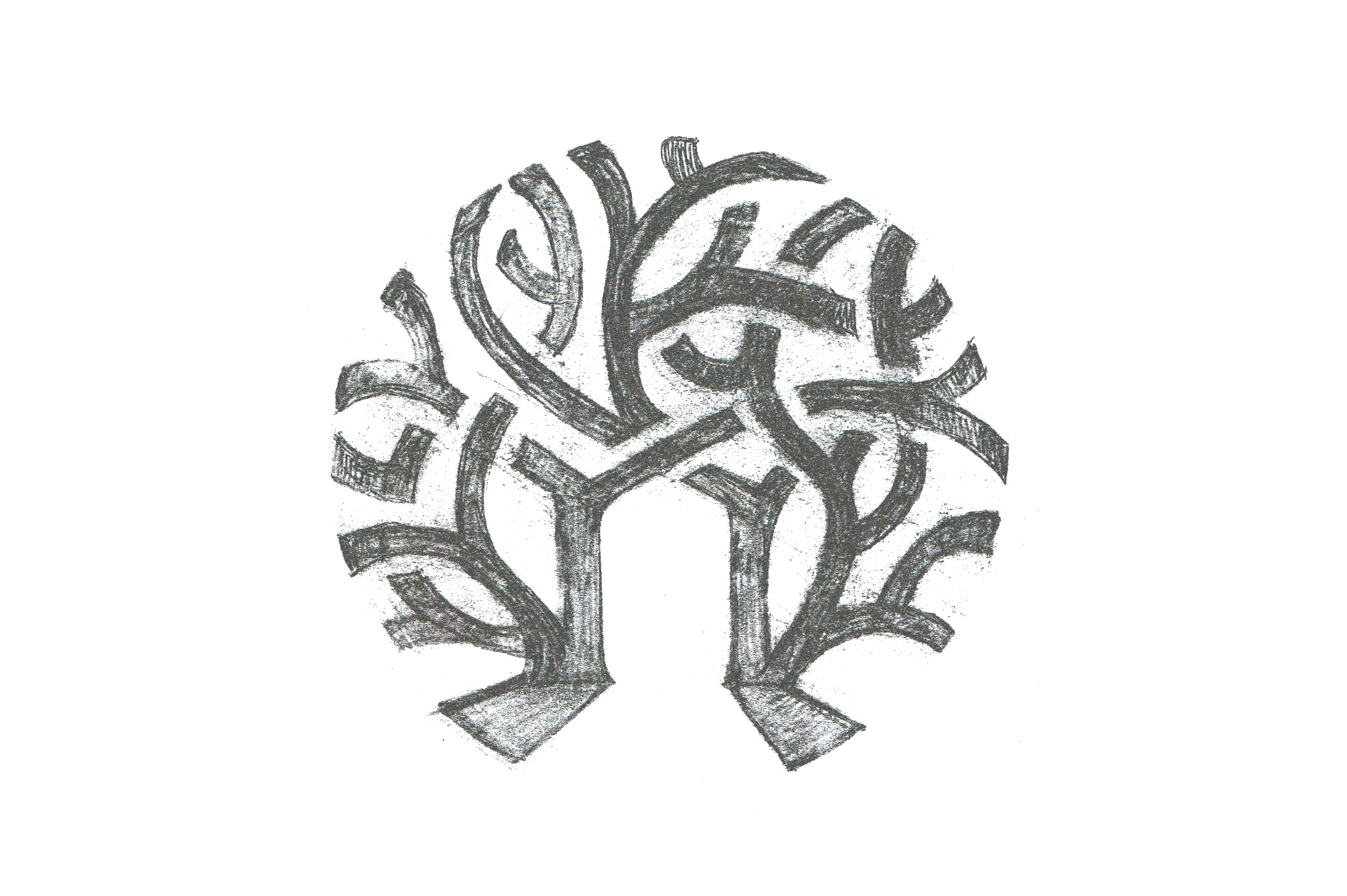
In my pages of sketches, I explored ways to depict a path through an opening in crowded trees. The final sketch symbolises a route through entangled thoughts, feelings, and emotions.
Lynn and I discussed how certain colours make some neurodivergent people feel uncomfortable. We chose appropriate (non-jarring) colours.
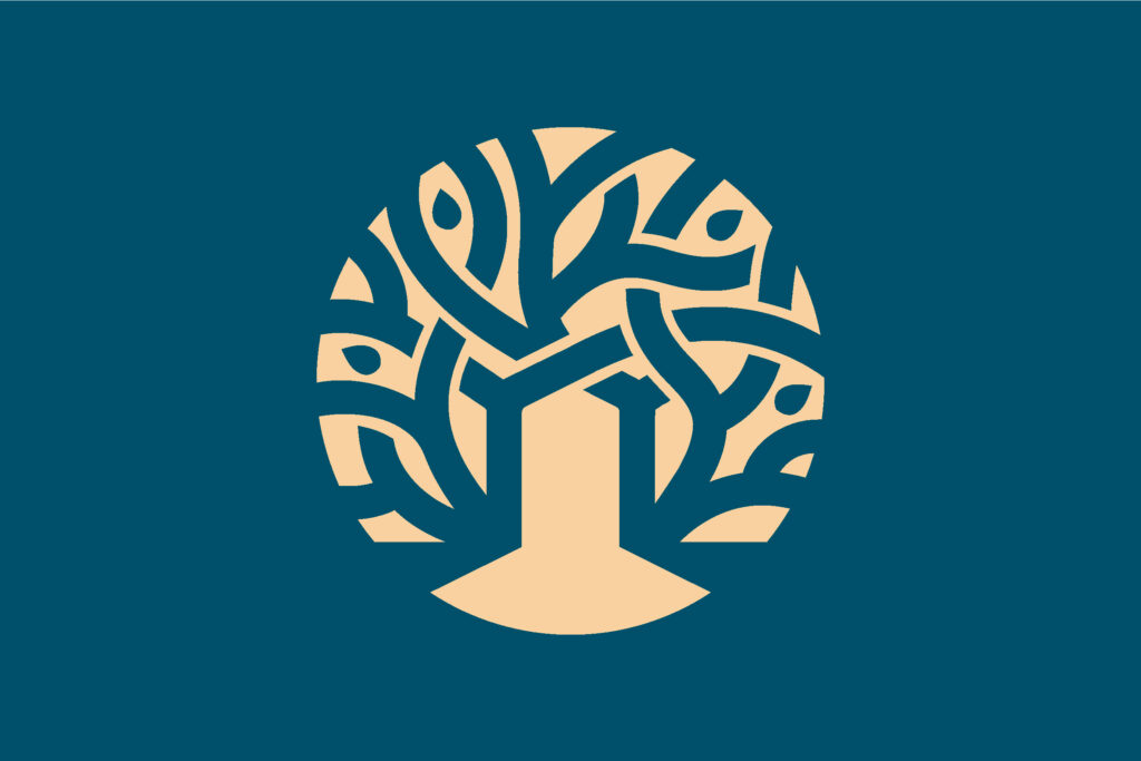
Dark teal, thick drapes envelope Lynn’s counselling suite. The calming, neutral colour was a natural choice for The Clearing’s primary colour. A warm and welcoming beige contrasts with teal and evokes dawn light.
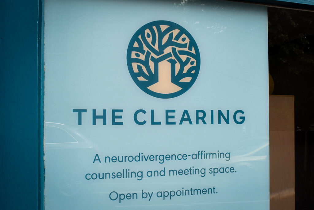
A clean sans serif, all in upper case with increased spacing emphasises clarity and improves legibility.
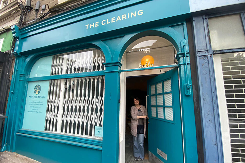
Eye level text was positioned on a window graphic to explain what The Clearing does and how to make an appointment. The fascia lettering was also considerately sized and positioned.
The understated shopfront impacts with minimal text.
Interested in creating a visual identity for your business? Get in touch to learn more.
Visit here to see another successful shopfront project.