
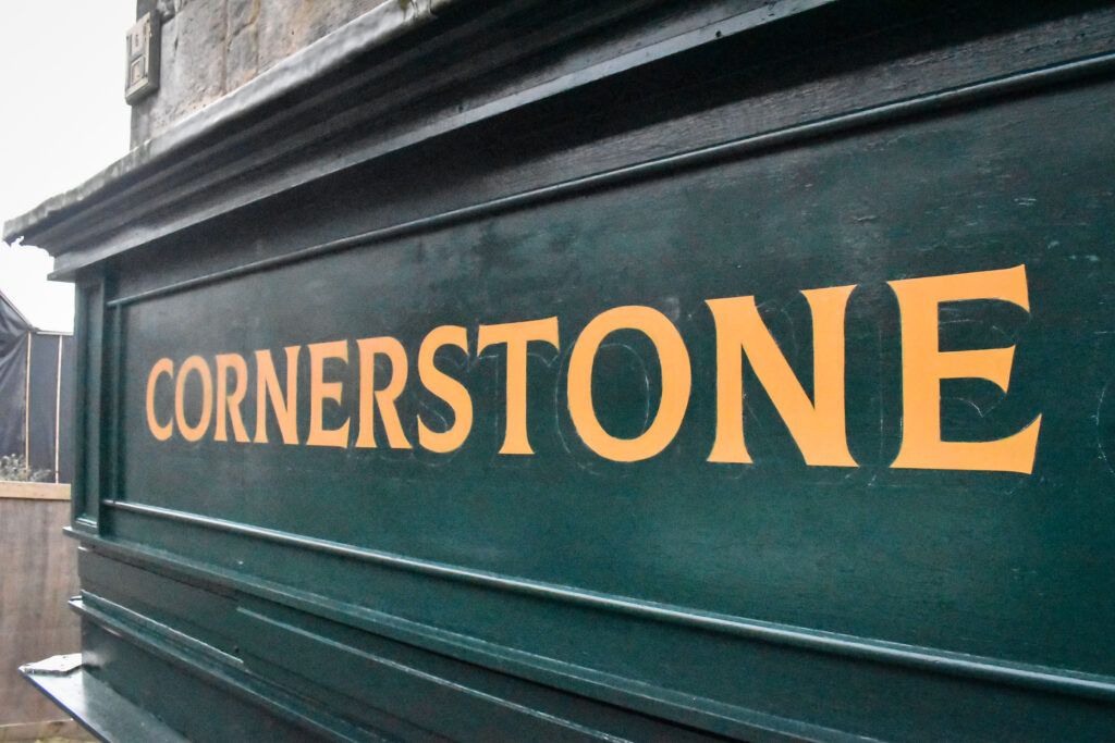
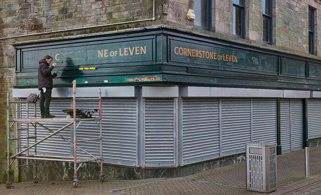
Over five days in early December 2024, I hand lettered the fascia of a historic building in Leven’s High Street. The signwriting project culminated following weeks of research, planning, and artwork design for an expanding business with a community focused initiative.
Situated near the newly built train station at the end of a busy retail precinct, signwriting Cornerstone of Leven gained lots of attention from locals. The hand lettering process itself proved to be a clever piece of marketing.
Passersby were already inquisitive and eager to learn more about the refurbishment inside the old department store. Inadvertently, the talk of the town had begun to create foundations for a brand.
In Autumn 2024, Doug Couper-Fleming phoned me to ask if I was interested in hand lettering his new shop. Doug initially asked for gold leaf and briefly described the location. I asked Doug to send me his project brief. A description with photos of his building would help me to understand what he wanted to achieve.
Two days later, Doug e-mailed a bundle of reference photos showing examples of traditional hand lettering. Some images were shopfronts from around the early twentieth century. Doug wished to emulate a lettering style to compliment the detailing on his vintage storefront as well as suggest the era of products the business dealt with.
In addition, Doug explained the purpose of his new enterprise. Originally named The Cornerstone of Leven, Doug and partner Brett were amid extensive renovations inside the High Street’s historic department store.
Their main business was buying and selling mid twentieth century furniture. Nearby, their existing place of business, East Coast Eclectics, was crammed with antiques and furnishings. The recently purchased six floor building in Leven’s High Street would eventually become their primary address.
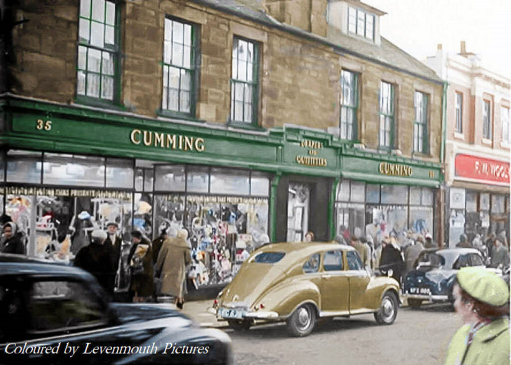
Originally (and for decades), the building served the people of Leven and the east coast region as Cummings, a household name in Fife. Cummings was a traditional British department store. The building held nostalgic significance in Fife and portrayed a snapshot of High Street times gone by.
I sensed Doug’s enquiry would become a fuller creative project deserving more than fascia lettering.
Leven is an old industrial town in the northeast of Scotland. In research, I learned the Vale of Leven’s rich history of textile manufacture and bleaching, served by the river which bears the town’s name.
With a once huge quarry of ochre, the town is also famous for mining. Many of Leven’s buildings are built from ochre mined and processed by the nearby brickworks. Tons of bricks, tiles, and clay were steamed out of the town by locomotives and shipped to all parts of the country.
At this stage, I started to realise my concept for building the brand.

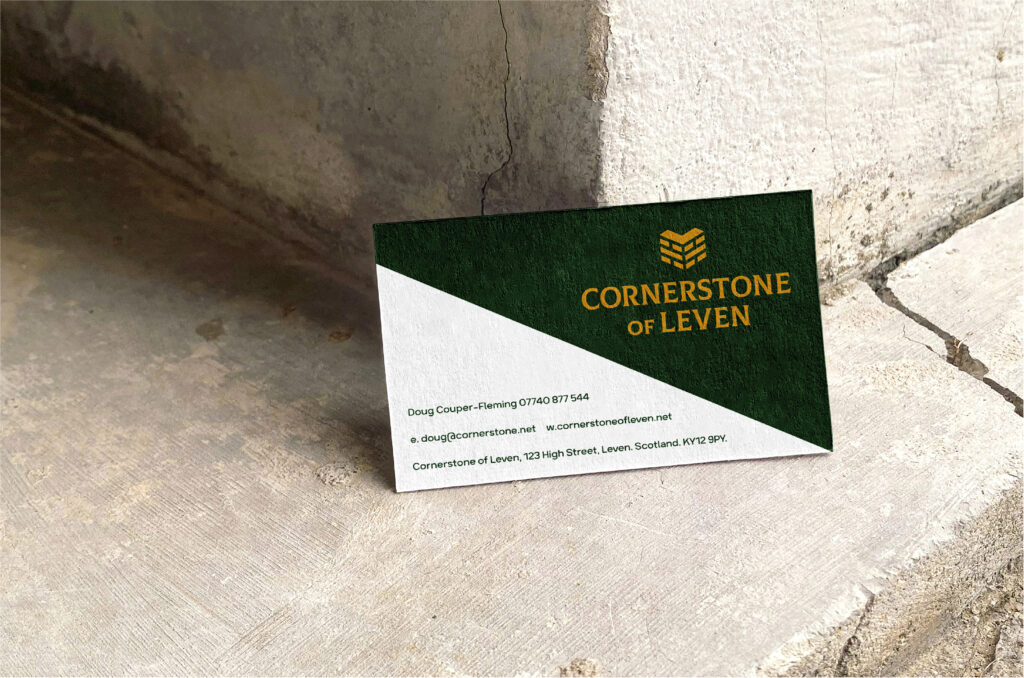
In my opinion, dropping ‘The’ from the business name strengthens the impression relating to the town’s mining heritage and emphasises the building’s corner location. This decision sparked a bigger idea.
I felt Cornerstone of Leven could become more than a place to shop. The brand has an opportunity to become a space for friends of Leven who choose to preserve the past and celebrate all that Vale of Leven has to offer. The building and its legacy held fond memories for locals. It could be reborn as a community lynchpin. I later learned Doug and Brett were already on this path.
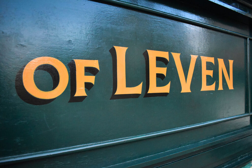
Inspired by this notion and influenced by Doug’s photos, I had an idea of the lettering style I’d select for the identity. I envisaged typical Roman capitals engraved in stone. Strong, sharp, and impactful. I finally settled on an open-source, free font designed by one of my favourite font foundries, Font Fabric.
I modified the letters as the downward diagonal of the ‘R’ interfered with neighbouring letters. Also, I wasn’t happy with the shape of the ‘R’s bowl. Further editing ensued to customise the words for the business. Serifs were also adjusted for smoother strokes with my brush.
In reading various web pages of Levenmouth’s history, I considered mimicking the old town seal which led me to think of antique furniture manufacturers’ stamps and eventually inspired the circular format for the logo.
During sketching, I hashed out several iterations of the logomark. Drawing a cornerstone resembled an upper case ‘L’. The form also looked like the shape of a heart. Converting my pencil line drawings into a digital version took more time. I fussed over the height and perspective of the cornerstone before hitting the sweet spot. I was going in the right direction.
In our first phone conversation, I explained the value of a strong visual identity. Elements of an identity should convey the personality of the brand. Creating mock-ups of packaging and printed products helped show where the visual identity would potentially appear. The mock-ups conveyed the mood of a classic establishment.
Doug and Brett had selected dark green for the storefront exterior. Like the original Cummings’ green, it felt reserved and traditional.
Doug’s initial enquiry about gold leaf lettering made me consider the practicalities of producing gilded lettering directly on the fascia. It was tempting however, the temperature at that time of year would cause headaches. I recommended not to choose gold leaf and instead opt for an ochre colour. The deep yellow was a perfect replacement to join yet another dot for the brand’s identity.
I sent my artwork concept to Doug by email, and he loved it. I then sent my indicative quote and lead time, before we agreed to begin in early December for the store’s projected opening by the end of January 2025.
On a fair Sunday morning in late November 2024, I visited Leven High Street to meet Doug and survey the fascia. The side street portion was due to be replaced that week. Equipped with dimensions, we shook hands and looked forward to meeting again.
That week, I finalised and e-mailed artwork files to Doug. The artwork allowed Doug to begin planning and ordering branded products.
I made the scaled lettering patterns for signwriting, ordered two tins of ochre enamel, as well as bought two pairs of gloves in a mountaineering shop in Pitlochry. I suspected there would be a few freezing days ahead.

On day one, just after the break of daylight, I arrived on the side street. Straight into the back of my van, I hauled my tower scaffold out and started to assemble whilst mentally focusing on the four day process ahead. My toes already felt like ice.
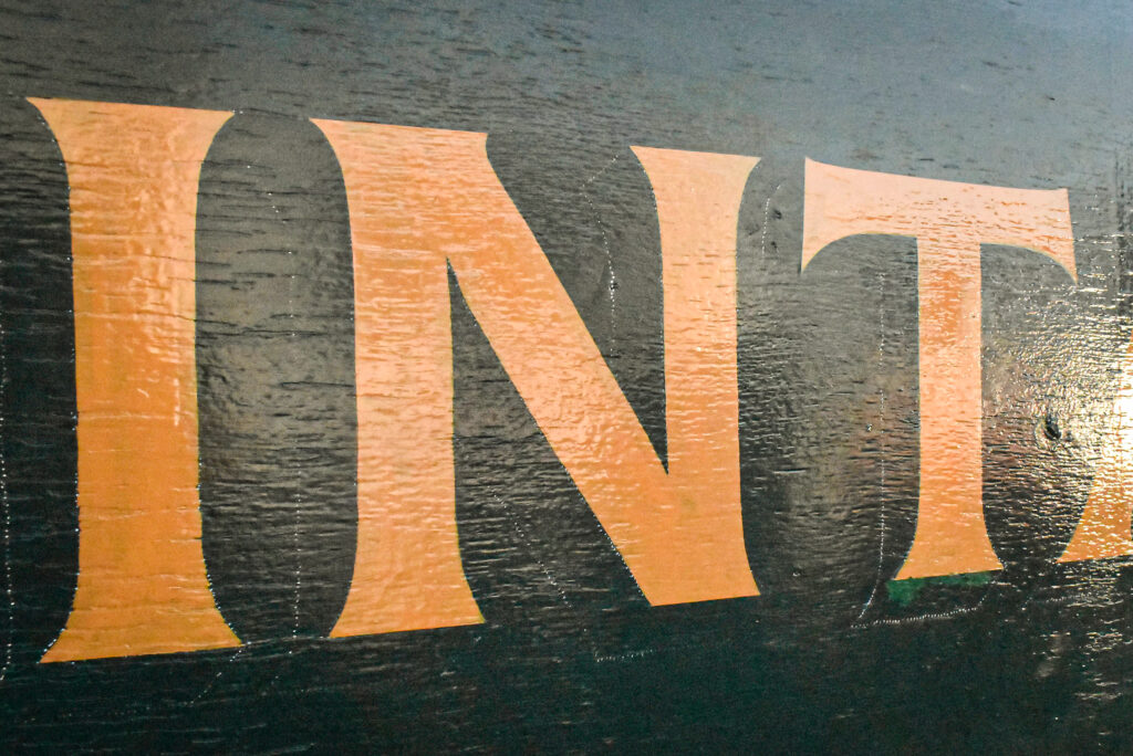
Starting on the right side of the High Street fascia, I discovered the surface was very uneven. Grooves in the paintwork hindered smooth strokes with my writing brush. I was tested.
In the background where I was standing, a busker with a violin started playing beautiful classical music. I swayed with my mahlstick, almost in time with his tempo, zoning into my breathwork and the coordinated handling of my brush. It was blissful.

Over the next four days (excluding a rest on Sunday), I drove the twenty five miles from Dundee and back each day. Gradually, the lettering was painted, second coated and shadowed with black. I regularly added low temperature enhancer to my enamels for an easier flow of paint and smoother coverage.
Working until it was dark almost every day around 5pm, I wore my headlamp until poor light called off the signwriting. The final day of painting landed on Monday, and I was delighted to see the result.
The strong ochre lettering was perfectly proportioned on the long ornate fascia. It was a privilege for me to add to the building’s history as well as the foundations for a brand new business.

Working four days in December’s low temperatures was difficult. Standing still and handling a brush with freezing fingers for long periods requires stamina, perseverance and concentration. However, I was determined. My flask of coffee was never far away, and an abundance of kind comments from passersby urged me to fight fatigue. It was worth every second.
Feedback was positive from locals and visitors alike. Doug and Brett were also very pleased. With the signwriting project completed, we agreed to meet again at the store’s grand opening.
Get in touch to discuss your hand lettering project.