07740 877 544
Colour Spaces
This is the second of three articles explaining colour spaces in signmaking. The series is written for creatives and decision makers handling artwork design for all types of signage.
Due to a broad range of materials and numerous production methods, several colour spaces exist in signmaking. I’ll explain the purpose of each colour space and how these relate to the colour of your end product.
Modes of colour
Colour spaces are the modes in which we create and perceive colour. Think of colour spaces as languages and individual colours as words. Akin to languages, some colours don’t have an equivalent colour in another colour space. Similarly, translating colour from one space to another is not always possible because of the unequal number of colours which exist in each colour space.
LAB (also known as CIELAB) is the largest range of colours visible to the human eye. It’s independent of the object used to present colour. Think of LAB colour space as a master language which contains all other derived languages. In signmaking, we don’t generally speak LAB.
The main colour production methods for general signs and display graphics are paints, inks, adhesive vinyl and sheet materials. Inclusive of different finishes, there are many colour production combinations.
Translating colour from artwork before generating it into signs and display graphics, regularly interlaces separate colour spaces. Therefore, it’s essential to understand the colour space where artwork colour is created, as well as knowledge of the end products’ media (sheet materials, adhesive vinyl, mesh banners, etc.) and the process for manufacturing signs and display graphics.
Without comprehending colour spaces, we cannot accurately replicate colour.
sRGB colour space explained
RGB stands for red, green and blue. The sRGB (standard RGB) colour space is used almost exclusively for viewing and creating colour on light projecting digital devices. In essence, the sRGB colour space is backlit and makes luminous colour possible.
Some commercial printers will print using only red, green and blue inks. However, sRGB (and hexadecimal/HEX) colour references are inadequate for accurately replicating colour on non-digital signs and display graphics. This incompatibility is due to the subtraction of light which supports the luminosity in how we perceive the sRGB colour space.
Digital screen colours comprise red, green and blue light. Devices such as PC monitors emit light channels to show colour and images as we see them. Wide variations in how sRGB colour is transmitted are dependent on various interfaces.
The type and quality of display screen, graphics cards, and operating systems, as well as the endless variations of brightness, contrast, frequency and temperature settings, multiply variations of individual colours in the sRGB colour space.
A single sRGB colour will appear differently on your PC monitor, mobile phone, and your digital camera. Accurately colour matching digital screens to physical colour swatches is futile due to wide variables.
Avoid matching tangible items such as colour swatches to digital screen displays.
The range of colour within each colour space is known as the colour gamut. The sRGB colour gamut contains more individual colours (nearly seventeen million) than colour spaces used to manufacture tangible coloured products. Accurately matching all sRGB colour in every colour space is not possible because of the spectrum of colour within sRGB.
Adobe RGB colour space explained
Global software corporation, Adobe introduced their extended colour space of sRGB in 1998. Available across Adobe products, the Adobe RGB colour space claims reliable colour reproduction from screen applications (using Adobe software) to printed products.
Adobe RGB is designed to encompass a more accurate reproduction of (printed) CMYK colours when viewing on customised sRGB screens. As well as introducing a consistent workflow across multiple platforms and devices.
The Adobe RGB colour management is based on a standardised format specified by the International Colour Consortium (ICC). In short, ICC profiles colour on devices and media to ensure they’ll appear consistently across different platforms.
Adobe RGB colour space is ideal when using Adobe products and colour production devices which translate the Adobe RGB profile. However, your entire workflow from design software to colour output devices has to be calibrated for consistent colour output. Without Adobe RGB specific devices, Adobe RGB colour space cannot be viewed in its entirety.
Colour calibrating digital devices
The effectiveness of calibration tools depends on your hardware, budget and print professional’s cooperation. Begin with fine-tuning your digital screen. Check your device’s display settings before designing artwork digitally. Operating systems such as Windows have helpful guides to optimise colour viewed in sRGB mode. There are plenty of tutorials online.
Creating colour by digital means will present variables across different platforms. ICC may provide colour profiles for your devices, plus combinations of hardware and media. In addition, colour calibration tools will help display more accurate representations of colour on your screen. Perhaps you may choose to upgrade your monitor too.
Specialist software is also available to flexibly manage colour across different print hardware and substrates. Although this product is focused more on printing packaging, more options will benefit larger colour management projects.
The aforementioned are worthwhile but costly. However, your investment is justified if producing the end product with your hardware. Print your own library of colour swatches for quick reference. Save the swatches artwork document in your software and copy relevant colours for future projects. You’ll then be sure of how specific colours look.
If you’re outsourcing printing, your print provider must calibrate hardware, as well as the media used to produce your sign or display graphic to match the colours you see on your screen. Alternatively, order your printed library of colour swatches from your print provider and adjust your screen settings to represent the tangible printed colours.
Precise colour calibration requires effort. Realistically, your concern should focus on how the colour appears on the finished item(s), not your digital screen.
Additionally, be aware of how artificial light affects colour calibration on your studio’s digital devices. Particularly when creating artwork for products exclusively viewed outside.
Ask for samples of your artwork on the media chosen for your sign or display graphic. Samples will allay concern with colour output and finish, especially for large pieces or quantities.
CMYK colour space explained
CMYK is a printing process consisting of four colours of transparent ink: cyan, magenta, yellow and black. Confusingly, ‘K’ stands for key (black) and is a historical reference to print production using inks and powders.
CMYK colour recipes are denoted by percentages. The percentage of each ink will alter each CMYK colour. These percentages are known as the CMYK colour values.
CMYK colour values are widely used and accepted for colour matching signage and display graphics. When the four colours are printed, thousands of tiny dots are layered to create an image. This print process is most effective for photographs and complex coloured imagery.
There are many variations of CMYK output when different combinations of ink and media are used (papers, adhesive vinyl and rigid sheet materials, to name a few). Different print hardware printing identical CMYK colour values with contrasting brands of inks and onto varied surfaces will produce noticeably different results.
Repeat use of the same print hardware, the same manufacturer of inks and the same media achieves consistent results. Changing any of these during batch production of identical artworks can alter the appearance of the printed colour.
True representation of CMYK colours is dependent on printing onto white surfaces. 100% cyan is sharp blue. 100% magenta is vivid pink. 50% of each makes purple. The media’s white surface acts as the base and enables opaque printed colour. Altering the colour of the media’s surface will affect how CMYK colour is supported.
Four colour process printing can also be used on transparent surfaces such as clear vinyl, where colour opacity is reduced and then appears diluted. Multiple passes of printing gradually increase the opacity of ink on transparent surfaces. Alternatively, a background colour is applied for an opaque base, such as white ink or a white substrate.
CMYK Limitations
The CMYK colour space is limited. CMYK colours cannot reproduce every colour from wider colour gamuts such as sRGB, nor match every colour in the Pantone colour system. According to Pantone, around 55% of Pantone spot colours can be mixed by printing CMYK.
Four colour printing generally results in a duller appearance of colour than how the sRGB colour space displays. There are options for additional inks such as orange, violet and green (CMYKOVG) to match the luminance of sRGB and provide an expanded selection of colours.
Some print hardware includes up to twelve colours of ink to increase the colour gamut and produce stronger hues. According to Pantone, CMYKOVG will achieve around 90% of Pantone spot colours. However, adding OVG inks and others tends to serve specific areas of the print sector, such as paper and packaging.
Barriers exist between print hardware and compatible print media for signmaking. Often, there aren’t practical options for wider colour gamuts in some categories of signage production. Production costs for unjustifiable quantities when ordering single items or small batches can also increase.
Your signmaker or printer should advise how to achieve the closest match to your choice of colour, with the most appropriate media for your CMYK printed product.
Spot colours explained
Unlike layered colours such as CMYKOVG, spot (or solid) colour is manufactured as a single, specific colour. Each spot colour is intended to be applied to a substrate one at a time.
Predominantly used in the paper and packaging printing industry, recipes of pre-mixed inks are spot colours. Off-the-shelf paints and signmakers’ coloured adhesive vinyl are also spot colours. As well as powders used for powder coating items such as aluminium sign trays. Finishes such as metallics and fluorescents are also classed as spot colours.
Spot colours also exist throughout various colour spaces. They’re the safest assurance of accurately replicating colour.
One of the main benefits of choosing spot colours is universal colour matching when using the same media. Spot colours can also be more affordable than processed colour production, especially when covering large areas in one colour.
Standardised colour references are necessary for consistent spot colour production. In signmaking, spot colour references are sourced mainly from paint colour charts, vinyl manufacturers’ colour swatches, rigid sheet material samples or the Pantone Matching System (PMS).
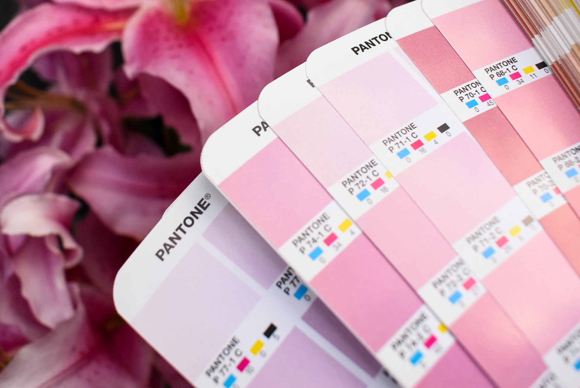
Pantone colour references explained
Pantone is a global corporation which governs spot colour recipes, producing a range of colour guides, with each one serving a specific purpose. In theory, anyone can purchase a Pantone paper swatch book and be assured of replicating Pantone spot colours anywhere in the world.
Graphics professionals and those working with colour use the Pantone Matching System to refer to and match colour for consistent output. The swatches contain colour values for each Pantone colour which can be imported into design software. Digital designs with Pantone embedded colours will output printed colours as shown in the Pantone swatch book.
But there are pitfalls when replicating Pantone colours across different media. The Pantone guides are printed on coated (semi-gloss) and uncoated (matt) paper. Finished results can vary unless artwork colour (when designed digitally), print hardware, inks and media are all calibrated to replicate the Pantone colour values. These results are apparent, especially with CMYK printing.
Pantone’s libraries of colour contain a wider colour gamut than the CMYK colour space. In circumstances where Pantone spot colours cannot be replicated with four colour process printing, some Pantone swatches provide CMYK colour values. The CMYK values offer the closest colour match available from within the CMYK colour space.
It’s important to realise the Pantone Matching System is designed to print solid, pre-mixed inks as individual colours. On the other hand, process printing overlays semi-opaque layers of inks to achieve the desired colour. Both are intended for separate printing methods. Pantone swatches set expectations that some four colour printing processes cannot match.
Nuances between Pantone spot colours and CMYK equivalent colours can be avoided by first selecting a Pantone with identical or very similar CMYK colour. When you know your artwork will be produced on multiple surfaces, forward plan your choice of colour.
British Standard, RAL and NCS references explained
Coloured sheet substrates, adhesive vinyl and various types of plastic and metal components are just some materials used for assembling signs and display graphics. In addition to an assortment of paints and coatings which can also be mixed to order from most paint merchants. These materials often reference colour systems other than CMYK or Pantone.
In the 1930s, the British Colour Council (BCC) first introduced standardised colour ranges for consistent reproduction throughout the interior design and construction industries. The colours were named and numbered to ensure a constant and reliable reference. The BCC’s publications would eventually become the BS 4800 colour range.
Over time, BCC’s colour libraries were cross-referenced with other international colour systems, as well as the British Standards Institute (BSI). The BSI’s first colour standard system was BS 381, published in 1931. It was developed as a range of paint colours for government buildings and the armed forces.
Today, BS 4800 and BS 381 are used in the sign and display sector for colour reference. Alarmingly, many independent vendors supply their version of BS colour charts. Therefore, be aware of potential differences when colour matching BS ranges with physical colour swatches from different vendors.
Ensure your sign or display graphics provider is referencing the same colour swatch as you are.
RAL colour referencing
RAL is a colour standard designed in Germany in 1927. Over 2500 colours across three ranges specify a wide spectrum of colours and finishes including fluorescent and metallic. RAL (paper) colour charts are affordable and easily sourced.
Variations in RAL colour swatches are also different due to different vendors replicating RAL colours. Purchase colour swatches directly from RAL or authorised RAL distributors. Doing so will ensure your colour is produced as RAL intended.
Similar to the British and European (RAL) standards, the Natural Colour System (NCS) is the main colour standard referenced in Sweden, Norway and Spain. It’s also widely used in South Africa and the USA.
NCS colour referencing
NCS is more scientific than BS and RAL. With over two thousand colours, it’s similar to a colour space and based on the colours we perceive. The entire colour range is a mixture and shades of six elementary colours. Each NCS colour is denoted with percentage values of the six elementary colours.
Unlike BS and RAL, copying of NCS colours is prohibited. Therefore, purchasing paper colour charts from authorised NCS swatches distributors will ensure identical cross-referencing anywhere in the world.
Colour standards exist to guarantee consistent colour quality on various products and countless surfaces. Always ask your graphics professional which colour identification system is being used from which colour swatch vendor and synchronise your references.
Benefits of using colour standard systems
In signmaking, these colour ranges are commonly referenced for paint colours. In circumstances where paint will be used extensively, such as an entire shop front, it’s wise to establish one of these standards as your artwork colour. Digital or print reproduction of BS, RAL or NCS colours will be more straightforward to match, rather than matching paint to CMYK or Pantone references.
Interestingly, vinyl manufacturers also base part of their colour ranges on standardised colours. In some circumstances, RAL colours can be identified and matched to European vinyl manufacturers’ colours. If you foresee vinyl being used extensively in your project, identify available vinyl colour swatches early. The resulting RAL matches across mixed paints and vinyl will save you time and effort.
Black and white
I’ll refer to black and white as colours, although they’re not scientifically classed as such.
There are many flavours of black and white. The colours’ tonal ranges vary across different brands of sheet materials, vinyl manufacturers and paints. Differences are noticeable when combining the same products from separate manufacturers, such as white, rigid sheet materials.
Black and white paints from different manufacturers often differ in shade too. Sheen levels also vary and in turn, affect the intensity of colour. Always test your paint with the relevant undercoat on the surface which will be painted. The real finish of black and white is shown rather than how the paper paint swatch displays the colour.
White in signmaking
Where white-based materials are used extensively, such as point of sale displays, always choose the same series of materials, manufacturer and production method. Variant shades of white will be noticeable if you change the manufacturer of white base materials such as aluminium composite panels.
Furthermore, edges will be visible when white media is applied on white surfaces. For example, digitally printed vinyl containing white elements of artwork will be noticeably different when applied on white walls.
Additionally, the function to print white isn’t universal across all print hardware. In these circumstances, white areas present in your artwork will be the print media’s white surface. Ask for a product sample with the relevant finish if you’re concerned about how white base materials will appear. Notably, matt laminated white will appear duller than gloss laminated white.
Black in signmaking
Black has similar variations, especially in finishes. Gloss, satin and matt black are visibly different and often combined for subtle effects. Metallic black vehicles together with matt black graphics create visual interest.
Be aware of how finishes alter tonal ranges of black and white.
Dense black is achieved by choosing a matt finish. A flat black finish absorbs more light than a gloss black surface which will reflect light. Choosing matt black for lettering will benefit legibility, especially on gloss finish surfaces, exhibition display text or large backgrounds such as fascia signs.
Vinyl manufacturers’ black series may also differ. For example, a short term matt black vinyl can be a different shade of black than its permanent term equivalent, even from the same manufacturer. Gloss black vinyl from different manufacturers tends to look identical whilst matt black vinyl ranges in shades.
Printing variances of black with CMYK also displays different results. Printing black as we see it with the four colour process doesn’t necessarily contain 100% black ink. Percentages of CMY can be printed, rather than flooding the media with 100% black ink. Too much black ink on some materials can be detrimental to the printed surface.
You now have knowledge of colour spaces. Read the next article to learn different methods of producing colour in signmaking.